Lofty Ideal
January 13, 2016
City sophistication meets country comfort, bringing a down-to-earth appeal to a young family’s sky-high Boston home.
Text by Dan Shaw Photography by Greg Premru

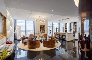
In between the dining and living areas of this downtown Boston high-rise apartment designed by Andra Birkerts, a television floats as effortlessly and elegantly as the clouds outside the windows. Birkerts used a minimalist Italian suspension system that supports the television and two vitrines on a sleek floor-to-ceiling pole. As if it were a rotating piece of sculpture, the television pivots so the homeowners can watch programs whether they are eating at the dining table, lounging on the sectional, or cooking in the open kitchen. “It let me keep the space open and multifunctional without detracting from the views,” Birkerts explains.
Birkerts, who is based in Wellesley, Massachusetts, was determined to maintain the apartment’s airy, urban sensibility while making it a homey pied-a-terre for a couple with four children. “I didn’t want it to be too contemporary,” she says, noting that minor interventions included reconfiguring the master bedroom, removing a utility closet, and adding a laundry room. “They’re a very cozy family who love the outdoors, and I wanted it to have a sense of who they are without it feeling like a log cabin,” the designer says.
Birkerts established a yin-and-yang mediation between country and city beginning in the foyer. She selected a fifteen-piece clay wall sculpture called Pilgrimage by artist Heather Allen Hietala—a conceptual interpretation of canoes, kayaks, and oars representing life’s journey—and installed it above a wood bench on a brushed metal frame by Suzanne Rippe. “It’s furniture that’s art,” says Birkerts about the bench. “It’s an amazing piece that’s outdoorsy but right for an urban setting.”
With walls of windows on two sides, the apartment’s open-plan main room has a sense of “limitless boundaries,” which is why Birkerts built deep coves around the windows and painted them a rich gray “so you don’t feel like you’re going to fall out.” The coves also conceal mechanical shades.
To define the living area, she laid down an abstract-patterned silk area rug and paired it with Ligne Roset’s Feng sectional by Didier Gomez that provides a sense of enclosure; it’s architectonic furniture that’s both sleek and comfortable.
Her treatment of the interior walls further maintains the expansive feeling of the living area. On one wall, she hung a large-format color photograph by Massimo Listri of a grand hall in the rococo Strahov Library in Prague (a nod to the clients’ Czech heritage) that visually extends the space while adding a contrasting Old World element. A floating shelving system by Porada on the wall behind the sectional provides not only crucial storage but also a place for the clients to personalize their home by displaying favorite books and objects.
For a jolt of color, Birkerts gave a Knowlton Brothers dining table with crisscrossed legs a coat of Benjamin Moore’s Mexicana—a color that she describes as “a mix of coral, persimmon, and terra cotta.” At night, a sculptural, multi-arm, raw-brass light fixture by Apparatus Studio in New York seems to mimic the twinkling skyline out the window; it’s suspended from a ceiling covered with a hammered gold wallpaper that “adds texture, warmth, but not glitz,” she says, noting how the gold paper references the lining of the two Tom Dixon pendants over the counter in the kitchen.
Birkerts refreshed the kitchen by adding new hardware and painting the dark cabinets in C2’s Whistler White while maintaining the original wood frames for a crisp, bespoke look.
The three bedrooms each have a distinct personality, but all combine a mix of simple forms and luxurious materials. The children’s room was designed to be youthful yet sophisticated. “It’s the most eclectic space in the apartment,” Birkerts notes. The aquamarine twin trundle beds, which
can accommodate all four children, are set on a colorful abstract carpet from the Rug Company. The room’s showstopper is the cove-like Rewrite Desk from Ligne Roset that looks like a carrel in some futuristic Italian library. “It’s an environment unto itself,” Birkerts says. “It creates a sense of enclosure and privacy.”
The guest room has an understated, organic glamour. The wallcovering that mimics birch bark has a shimmery metallic base, which is echoed by a bureau with one drawer painted a reflective silver. On top of the bureau, Birkerts placed a lemon-yellow four-arm candelabra lamp with a turned base from Dunes and Duchess. “It’s an iconic piece and definitely a counterpoint to the room’s relatively clean lines,” says Birkerts. “Giving every room a surprising element is what we like to do.”
To cosset guests, Birkerts selected a sumptuous Ligne Roset headboard that she upholstered in a deep mauve velvet. On either side, she installed walls lamps with linen shades from Urban Electric. “One of the consistent elements throughout the apartment is suspended light fixtures of quality,” she says.
Birkerts lavished attention on the master suite, maintaining the theme of incorporating nature motifs in a fresh, contemporary manner. The wall behind the bed is covered in a spruce-colored patchwork Paulownia-wood veneer. “It comes in a roll and it’s extremely thin and pliable,” she explains. “The stain takes differently on each segment, so it appears to be different colors but it’s all the same.”
The Parallel Bed with integral nightstands from Design Within Reach is at once snug and sleek. “The reading lamps are pretty cool,” Birkerts says of the Helix Pendant fixtures by the New York lighting designer Bec Brittain. “They are weighted, and at night they function like light sculptures, but they are practical, too, because you can direct the light.”
The leather-topped wood desk in front of the window has a Shaker simplicity that’s both modern and rustic.
Birkerts says the challenge and delight of the project was making sure the nature-loving family would feel at home in the city: “The great thing about this apartment is that you are connected to the sky, but always feel a sense of place and comfort.” •
Interior design: Andra Birkerts, Andra Birkerts Design
Builder: Mike Sander, Sander & Co.
Share
![NEH-Logo_Black[1] NEH-Logo_Black[1]](https://b2915716.smushcdn.com/2915716/wp-content/uploads/2022/08/NEH-Logo_Black1-300x162.jpg?lossy=1&strip=1&webp=1)






You must be logged in to post a comment.