Local Interest
July 11, 2016
A contemporary Martha’s Vineyard home nods to the island vernacular even as it stands as a playful, colorful celebration of personal style.
Text by Lisa E. Harrison Photography by Michael Partenio Produced by Stacy Kunstel
Architect Mark Hutker likes to name the houses he creates, and this one on Martha’s Vineyard he playfully dubbed the “Up Over Between” house.
While these words may sound like three simple directives from a children’s book, in fact, they unlock the keys to a complex—and thoughtful—architectural feat.
The “up” was a necessity. As Hutker tells it, when he and his clients first visited the site—an empty lot a half-mile from where the new homeowners had rented for years—he retrieved a ladder from the roof of his truck to scope out the views over the existing wetland vegetation, all protected conservation land. A clear view to the ocean beyond made certain that the living area would need to be raised about six feet above ground and accessed by a staircase.
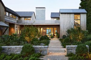
But it wouldn’t be just any staircase. Hutker conceived a crescendoing entry stair that he says would mimic “the wonderful tradition of agrarian stone walls on Martha’s Vineyard.” A half-flight from the parking court deposits visitors at the front door; ascending further up leads to a green roof and breathtaking views of the ocean. From here—and this is where the “over” comes in—one can walk clear across the roof and descend the stone wall steps on the south side of the house to a terrace dotted with chairs and umbrellas and boasting a lap pool.
The “between” refers to the glassed-in living space—kitchen, dining room, living area, and sitting room— that are bookended by the stone walls (another five-foot-wide stone wall clads the chimney).
The clever contemporary design also essentially creates two private wings. The west wing, to the right of the entry stairs, houses the two sons’ bedrooms on the top floor and a pool room, TV area, mudroom, and garage below. The east wing features the master suite on the ground floor and the husband’s office and wife’s art studio above.
In addition to the walls that anchor the property firmly in the Vineyard vernacular, the architect used was he calls “a distilled palate of exterior materials—cedar, bronze, glass, stone, zinc—each chosen to guard against the saltwater environment and age gracefully over time.”
Some of these key materials find their way indoors as well. Hutker explains that, for consistency, anything exposed structurally is made of bronze, from the stair rails to the fireplace to the columns that line the sliding window-wall in the main living quarters. Teak, too, gets a lot of play; it’s used for the built-ins, and vertical cedar boards line the oblong pod just inside the entryway.
The pod, which houses a powder room, coat closet, and small vestibule, serves a couple of design purposes: it provides private space and defines living areas in an otherwise open, glass room, and its soft tilt toward the living room naturally guides the flow of traffic in that direction, explains Hutker.
When it came to choosing furniture and fixtures, the wife took charge: “I can’t do boring!” she says. She collaborated with New York–based designer Pepe Lopez on a contemporary interior that is anything but boring. It all started with the two patent-leather chairs in a vivid aqua hue, the stars of the living room, which the owner spotted in a New York showroom. “Those chairs started turning everyone’s wheels on to the use of strong color,” says Lopez. “It’s good to have a point of departure.”
Looking for a complementary hot shade, they gravitated toward a bright pink, a favorite of the wife.
“I’m a color girl!” she says.
The two colors lend a nice continuity to the open living space, drawing the eye from the bold toss pillows in the living room to the modern Saarinen chairs that flank the custom dining table. Even the sitting room flaunts pink pillows, and Lopez also chose a bright aqua woven-vinyl rug for the pool terrace.
Lopez also incorporated yellow as an architectural accent. The vertical boards on the pod are spaced a half-inch apart, and the gaps between the boards are painted yellow. A similar color reappears in the living room rug.
Not only did the designer use color as a way to soften the edges and angles of the modern architecture, he also introduced texture and shape for the same effect: note the elliptical dining table and the French modernist chairs in the living room, the latter discovered by the owners on a trip to Paris.
Wood, in the form of built-ins, was incorporated as a softening mechanism, and as a means of delineating certain areas in the open floor plan. The buffet that separates the dining room from the living room was designed low so as not to interrupt the visual flow, while the kitchen cabinetry has sliding translucent door panels to expose the space or not, depending on the mood and the occasion.
The goal in the kitchen was modern but warm, says Lopez. Designer Christine Ingraham was brought in to collaborate on the custom-dyed veneer cabinetry. Given that the kitchen is visible from the rest of the living space, the designers wanted the cabinets to read like furniture.
Once all the furnishings and built-ins were in place, the wife took over, sprinkling thoughtfully placed personal effects throughout. “All of the decorative touches spring from her own ideas,” credits Lopez, from the woven panels on the buffet dividing the dining and living rooms to the blown-glass light fixture by the stairs to the large-format artwork by the fireplace. And the Warhol Campbell’s Soup dress by the stairs? “I had that for years in my closet,” she says.
She sums up her vision for the house: “There’s a fine line between having it be interesting and also comfortable because we’re at the beach,” she says. “It’s a sophisticated house, but I infused it with humor and interesting little details throughout.”
And therein lies its success, both architecturally and aesthetically speaking: Up Over Between. And definitely not boring. •
Architecture: Mark Hutker, Hutker Architects
Interior design: Pepe Lopez, Pepe Lopez Design
Builder: Martha’s Vineyard Construction Company
Landscape design: Kris Horiuchi, Horiuchi Solien
Share
![NEH-Logo_Black[1] NEH-Logo_Black[1]](https://b2915716.smushcdn.com/2915716/wp-content/uploads/2022/08/NEH-Logo_Black1-300x162.jpg?lossy=1&strip=1&webp=1)




You must be logged in to post a comment.