Kathleen Walsh Gives a Traditional Home a Colorful Update
April 1, 2021
A Greenwich interior designer dreams up an energetic mix of color and pattern fit for a young family.
Text by Alyssa Bird Photography by John Bessler

It’s not often that a client with an insatiable appetite for color comes around, so when one did, Manhattan-based interior designer Kathleen Walsh didn’t hold back. The client, a couple with three children, had recently purchased a 10,000-square-foot, five-bedroom residence in Greenwich that was calling out for an infusion of spirit to match that of the young family.
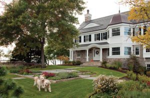
Conceived nearly twenty years ago by New Canaan architect Judy Larson, the house recalls an early 1800s New England Greek Revival. “I drew inspiration from historic homes in Litchfield County, Nantucket, and Vermont,” says Larson.
“It looks modest from the front, but it’s quite deep. It almost looks as though it’s an old property that has been added onto over the years.”The structure itself was still in pristine condition and only required a few cosmetic updates, including a kitchen refresh (painting the cherry cabinets and replacing countertops, hardware, sink fittings, and lighting), and a new main bath. “The clients loved the traditional paneling and moldings that were already in place,” says Walsh, who has decorated a handful of properties designed by Larson. “They also appreciated that it’s not an open floor plan. There’s an intimacy that four walls can provide, especially with a house of this scale.”
And the meandering floor plan is perfectly suited to the couple, who, pre-pandemic, regularly hosted charity events and large family gatherings. “They would entertain sixty people without thinking twice,” explains Walsh. “This is where Judy’s design works wonderfully for them. The archways signal where the more formal entertaining areas are, and the rooms open up to one another beautifully. So often you walk into a traditional home and the proportions just don’t feel right, but that’s never the case with Judy’s houses.”
As with all of Walsh’s projects, it kicked off with what she calls a “discovery day,” which entails “observing what styles the clients are naturally attracted to, and then pushing their boundaries,” she says. “This couple gravitated toward transitional with a touch of traditional. They wanted a formal house, but without the trappings of their parents’ generation, such as rooms that are off limits and never used.”
With that in mind, Walsh gave the family some “young moments” through color and pattern. “It was really fun working with them because I couldn’t seem to give them enough color,” says the designer. “People might walk in and think it’s bold, but your eye adjusts to it very quickly.”
Tempered jewel tones are used strategically on the main floor, with each room sporting a splash of color from the adjacent room. “It’s a way to prepare people’s eyes for what’s to come without them even realizing it,” says Walsh. Perhaps the most dramatic spin of the color wheel took place in the library, where Walsh painted the existing cherry paneling a vibrant high-gloss blue.
Upstairs, the shades become much more soothing. “It’s a softer version of the downstairs palette,” explains the designer. All new lighting throughout and elegant furnishings upholstered in durable, family-friendly fabrics complete the look. “Kathleen’s warm and welcoming style always brings our architecture to life,” says Larson. “It makes me so happy that this house has stood the test of time.”
Interior design: Kathleen Walsh, Kathleen Walsh Interiors
Architecture: Judy Larson, Judith Larson Associates
Builder: Bill Gardiner, Gardiner & Larson Homes
Share
![NEH-Logo_Black[1] NEH-Logo_Black[1]](https://nehomemag.com/wp-content/uploads/2022/08/NEH-Logo_Black1-300x162.jpg)


You must be logged in to post a comment.