Inside a Modern and Minimalist Townhouse
January 4, 2017
A modern, minimalist, but oh-so-elegant redesign brings a venerable old Beacon Hill townhouse back to a state of grace.
Text by Maria LaPiana Photography by Richard Mandelkorn


With its respectable pedigree and good bones, lots of room (at around 8,000 square feet), and a Boston location to rival none, the townhouse had everything going for it.
Could the out-of-town house hunters possibly want for something more?
It was 2011, they were on a mission to find a particular kind of residence, and this one spoke to them. While its layout and its colorful decor didn’t quite suit them, the visionary couple saw promise in every one of its six floors. They knew the grand dame had a renaissance in her. So they went for it, and quickly assembled a team to strip the fuss away from the piece of prime real estate (a corner lot near the top of Beacon Hill) and create a clean, modern canvas with a sense of grace.
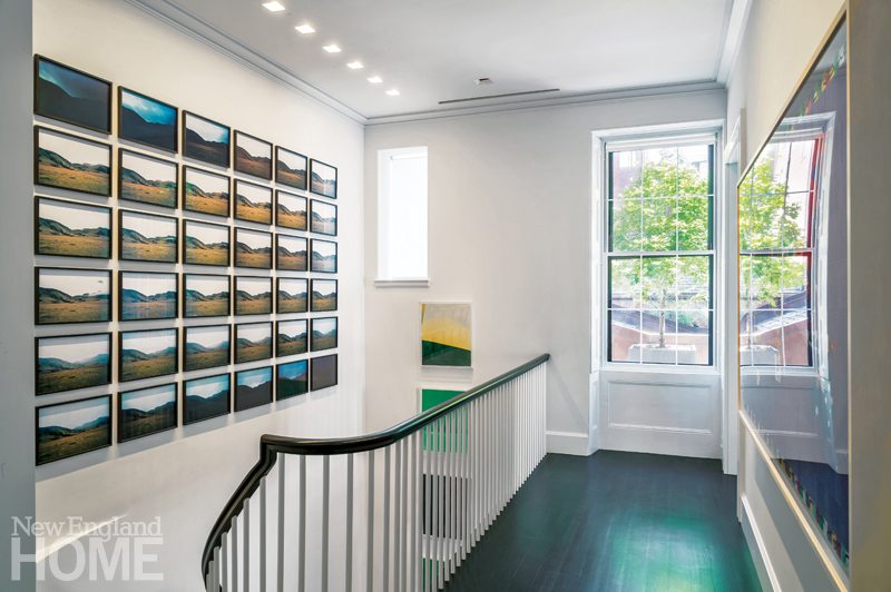
The building had suffered a lot of intrusions over the years. Built in 1833, it was for a time home to Theodore Lyman, an early mayor of Boston. It later served as headquarters for the Unitarian Universalist Association, which over thirty years carved it into office space and dining and sleeping quarters, blurring the architectural lines of the stately Greek Revival. It was reconfigured into a single-family home again, eventually, and although that renovation had aimed to preserve architectural details—from wainscoting and marble fireplaces to a sweeping staircase designed by Alexander Parris—the interior design didn’t suit the new homeowners at all.
The newest transformation took place on three planes. First there was the business of structural changes, assigned to the Cambridge, Massachusetts, firm Charles R. Myer & Partners. The firm’s principal architect on the project, Pete Lackey, says it was the couple’s “large, stellar art collection” that drove A spare aesthetic is the thread that runs throughout. Says de Santaren: “We had to get the permanent elements right. We honored the remodel and knew it had to be cleaned up, top to bottom. It had to be much, much cleaner and simpler.”
A mutual appreciation of that aesthetic helped forge a deep connection between de Santaren and the owners, particularly the wife. “Working with her was a pleasure,” he says. “She is well-informed and has a refined sense of taste. It was a symbiotic process, really.” While shopping together for a houseful of furniture, “we’d always gravitate toward the same things,” he says.
“I knew from looking at her wardrobe that we were going to keep to a very soft palette, so that it would be all about the nuances. There would be no trends, no colors of the moment,” he says. The two parlors, then, are united in their use of pale, streamlined furniture atop rugs with the mere suggestion of pattern. The only place the designer and his clients diverged from the light tones was in the media room, where the neutral palette was darkened to deeper grays and tans.
They created blank canvases at every turn, eliminating a cigar room, murals on the walls of the double parlors, and the black-and-white tiled floor in the foyer. “I’d say the homeowners are almost minimalists. They don’t like superfluous elements in decoration,” says de Santaren. “They came from a classic midcentury modern house and already owned many fine, iconic pieces by Edward Wormley and Billy Haines, among others.”
Classic furniture placement was in order. “When you walk into a space, there’s a sense of proportion you have to honor, and you get an immediate sense of ideal furniture placement,” says the designer. It was clear that the foyer and the staircase would be focal points, and that the two parlors had to relate to one another, he adds.
The kitchen had to serve two purposes: the wife likes to cook, and the couple entertains a lot, so it had to be caterer-friendly, too. Designing the kitchen—a study in white accented with gleaming stainless steel—was easy in the sense that she knew exactly what she wanted: a clean-lined, functional space by Bulthaup, a German manufacturer of upscale kitchens.
The project was completed over three years, and all agree that it was a rare opportunity to recreate such a sophisticated space. For de Santaren, the takeaway was even more special. “I found a kindred spirit,” he says about the wife, “someone who speaks the same language. It really was a project made in heaven.” •
Architecture: Pete Lackey, Charles R. Myer & Partners
Interior design: Manuel de Santaren and Kim Clark, Manuel de Santaren, Inc.
Builder: Cafco Construction Management
Landscape design: Matthew Cunningham, Matthew Cunningham Landscape Design
Share


You must be logged in to post a comment.