Home Run
May 2, 2013
When two designers are given carte blanche, the result is a suburban Boston residence that gives their clients—a professional baseball player and his wife—a warm welcome to New England.
Text by Robert Kiener Photography by James R. Salomon Produced by Kyle Hoepner

“Dream clients” is how interior designers Tricia Roberts and Noelle Micek describe the couple who hired them to design and furnish their sprawling 10,000-foot-plus, recently renovated home in Weston, Massachusetts. “The wife is a great friend of mine and she shares my taste in design and decor,” says Roberts. “So I was thrilled when she told me, ‘Do your own thing. I trust you.’ ”
With a baby on the way and their transfer to the Boston area for the husband’s job as a professional baseball player imminent, the California couple left all the details in the designers’ hands. “We pretty much had carte blanche,” explains Micek. “The wife didn’t even want to see sample fabrics and colors. It was exhilarating.” After a dramatic pause she adds, “It was also terrifying!”
The terror, the factor that could have turned this dream into a nightmare, was that the designers had to finish decorating the three-story, five-bedroom, seven-bath home in just four months. And they had to do most of it from a distance, as they both live and work in California. Their brief included everything from specifying wall colors to choosing carpets and furniture to adding accessories and art. To add to the chaos, the house was still undergoing a major renovation. “We took a couple of deep breaths and jumped on a plane to Boston with the wife,” recalls Roberts.
“I remember telling Tricia and Noelle that I wanted this to look like a home, not a show house,” says the wife. “I told them to make it comfortable but at the same time elegant and classic. Then I let them do their thing.”
The house, which was originally built in 1908 as a 2,300-square-foot farmhouse, had been gutted and expanded by developer Heidi Kennedy’s Weston-based Vintage Properties. “Over the years the house had been restyled into a contemporary model; it was a mess,” says Kennedy. “I wanted to restore its old, historic feel and bring it back to life.”
With the help of Boston-area architects Kevin Gordon and Mark Allen, Kennedy “stripped the house to its bones,” taking out the third floor to allow for higher ceilings, adding bedrooms, a library, a dramatic two-story entryway, a dining room, family room and a 3,000-square-foot basement. The house also got a new garage and kitchen, along with decorative details like classic wainscoting and molding. The renovation more than tripled the living space.
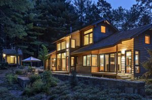
“Weston has a rural feel and we wanted the house to look like it had been there a long time,” says Kennedy. The home sits on a 1.8-acre lot and backs up to conservation land. Kennedy used natural elements such as cedar shingles, copper flashing and fieldstone to create a classic look. “The house’s Shingle style fits the neighborhood and gives it a timeless feel,” says Allen.
Roberts and Micek chose a neutral color palette that flows, with subtle variations, throughout the house. “We used lots of soft blues and grays,” says Micek. Adds Roberts, “We looked to the sea for our inspiration and included some muted ‘beachy’ tones. We wanted to bring a little bit of California to New England.”
To take advantage of the somewhat secluded site, the designers attempted to “bring the outside in” as often as possible. “We didn’t want to detract from the gorgeous views,” says Micek. “So we opted for simple window treatments that would allow the home to be filled with light.” For example, the family room, living room and breakfast room all feature pleated shades that can be pushed back so as not to obscure the oversize windows.
The designers chose furniture that not only blended in with their design palette but was, as Roberts says, “classic yet comfortable.” She adds, “Because we know the couple so well, we knew they wanted a tailored but not a stuffy feel. So we went with a mixture of glamorous and livable.”
In the living room, that translated to a comfy, gray-linen Verellen sofa with beech legs, topped with overstuffed pillows to play against the more austere coffee table with its gold legs and white marble top. “It’s the kind of couch you want to snuggle up on,” says Roberts.
The designers were careful not to overcrowd the rooms. “Maintaining flow is very important to me,” says Micek. “You always have to remember you are designing for a young family and you need to keep everything functional.” The open family room is an example of their “less is more” concept, and they also made sure nothing obscured or overpowered the house’s elegant wainscoting and architectural details.
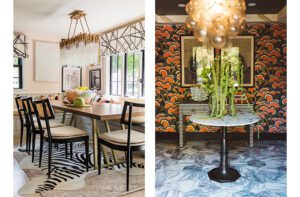
To provide a counterpoint to their classic, tailored design scheme, Micek and Roberts included striking touches throughout the home. They carefully chose lighting fixtures to add a sense of drama. “The wife has a glamorous side,” says Roberts, “and we thought we could reflect that in the chandeliers, some of which we helped design.” Adds Micek, “We used the lighting as pieces of art; all are unique and complement each room.”
Designing for good friends has an advantage. “In addition to knowing what they like and dislike we also know what they are interested in,” says Roberts. The designers filled the home with such personal accessories as coffee table books on baseball, antique wooden shoe forms (the wife had just taken a shoemaking course) and a vintage map of San Diego (both love the city).
The attention to detail paid off. When the wife flew to Massachusetts and met Roberts at the just-completed house, she took one look and started crying. “Everything, from the furniture to the wall color to the throw pillow that had our initials on it, was perfect,” she explains. “I walked around the house in awe. Each room was better than the next. Tricia and Noelle designed a home, not just a house.”
A few weeks later, after she and her husband threw their first dinner party, the wife called both designers. “He just said this already feels like our home,” she told them. “It’s as if we’ve always lived here.” For the clients and designers, the dream had come true. •
Architecture: Kevin Gordon, Design West, and Mark Allen
Interior design: Noelle Micek, An Organized Nest, and Tricia Roberts
Developer: Heidi Kennedy, Vintage Properties
Share
![NEH-Logo_Black[1] NEH-Logo_Black[1]](https://b2915716.smushcdn.com/2915716/wp-content/uploads/2022/08/NEH-Logo_Black1-300x162.jpg?lossy=1&strip=1&webp=1)



You must be logged in to post a comment.