High Design
January 9, 2014
Architectural additions and textural warmth give a downtown Boston apartment a flexible, family-friendly feel.
Text by Kristine Kennedy Photography by Michael J. Lee
The owners of a traditional, turn-of-the-last-century McKim, Mead & White family home on Boston’s North Shore surprised themselves by buying an in-town apartment in the Clarendon, a high-rise building designed by modern-leaning Robert A.M. Stern Architects. “Given our tastes, I would have expected us to land in the Back Bay, in a more traditional brownstone,” says the wife. “But given where we were in life, we did need a more full-service type of arrangement.”
Where they were in life was with a son in college, a daughter who had plans for boarding school, and a husband and wife both working in the city. And that life required some of the conveniences of urban living, such as an easy commute. “So that took us in a very different direction,” the homeowner explains, “because it’s a very modern building.”
The sight line from their three-bedroom unit, nestled on the twentieth-floor of the thirty-three-story building, descends to the expanse of the Charles River Esplanade, with its sailboats, bikers, and joggers. A glance to the side offers a stunning view of the historic Henry Hobson Richardson–designed Trinity Church reflected in the soaring John Hancock Tower. “We like being on twenty,” says the homeowner. “We love the mix of seeing through to the river but also seeing some of the rooftops.”
View? Check.
Conveniences? Check.
Living space? “In retrospect, we bought a box,” she admits.
Luckily, a chance meeting in the lobby put the couple in touch with design pros Dee Elms and Andrew Terrat of Terrat Elms Interior Design, who knew a thing or two about the property, having enhanced several units in the building already. “The Clarendon delivers a beautiful base unit,” says Terrat. “The challenge is to add the personality the owners are looking for.”
Armed with a file of magazine clippings, the wife was quick out of the gate in articulating her desire for a warm, modern style with staying power. While she wanted a space as family-friendly as their North Shore home with its transitional decor, she also wanted the condo to reflect its urban environment. She had like-minded partners in Terrat and Elms. “Our natural place is mixing contemporary and classic,” says Elms. They all agreed that silhouettes would be clean, crisp, and tailored, but the unit’s large expanse of windows necessitated a thoughtful approach to adding character. “From the very beginning we talked about adding in detail wherever we could,” Elms notes.
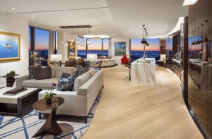
To start the process, they looked up at the large expanses of blank ceiling. They lowered the ten-foot ceilings by six inches, installed ceiling lights, and created coffers. The result encourages the eye to linger instead of breezing past the whole room. “It was designed to create drama,” says Terrat.
The team worked with builder Greg Nicolai of G.L. Nicolai & Company, who had renovated other units in the building. Because he was intimately familiar with the plan, he knew just where to look to maximize space and function. For example, he stole bathtub space from the daughter’s bathroom to add more storage to the kitchen. The homeowner had her heart set on a waterfall countertop for the peninsula, so they used the Calacatta marble topper as an opportunity to increase the peninsula’s size, add an overhang for bar seating, and fit in a trash and recycling area.
Clever furniture and built-ins also maximize living space. The windows have deep marble windowsills, so Terrat and Elms set custom pieces, such as the dining banquette and the daughter’s desk, all the way into the sill to free up floor space. In the master bedroom, the designers eschewed a freestanding bed in favor of a built-in upholstered headboard that protrudes only a couple of inches. A built-in desk and shelves occupy a wall of the media den, allowing the space to do double duty as an office.
Most of the apartment wears a subdued palette of grays and creams, embellished here and there with accents of yellow-gold or cheerful orange. Textured wall coverings from Phillip Jeffries—a soft linen look in the master bedroom, a hint of sparkle in the open living and dining area, and a bold burlap effect in the media den—lend extra interest to the neutral palette. “It just adds something that paint can’t give you,” says Elms. “It’s very multidimensional, warm, and textural.”
“Multidimensional” can also be applied to the home’s other textiles, whether it be the raised pattern in the rugs in the living area and the master bedroom, a sofa’s velvet upholstery, the tufting on the dining banquette, or the nail-head trim on the dining chairs. All combine to keep a sleek, urban space family-friendly and livable.
The design team also kept things interesting by mixing vintage and new furnishings. “We could have gone either new-school high-rise or old-school, like the brownstones,” says Elms. “We wanted to bring both together, and the client really liked that.” A chair and lamps in the living room as well as a master-bedroom chair and the nightstands in the daughter’s bedroom are all vintage finds, lending an evolved look that blends nicely with the historic backdrop the coffered ceilings offer.
As it turns out, the daughter did not go off to boarding school. The family still resides mostly on the North Shore, though they usually spend one weeknight a week in town, as well as many weekends. After getting a taste for the place, the owners look forward to spending more time there in the future. The wife had wondered how she would feel about living near work. “I work at the Hancock, so I can see my office,” she notes. But it doesn’t bother her at all. “It’s kind of an urban oasis,” she says of her new home. “When you go in there, you just relax.” •
Interior architecture and design: Andrew Terrat and Dee Elms, Terrat Elms Interior Design
Builder: Greg Nicolai, G.L. Nicolai & Company
Share
![NEH-Logo_Black[1] NEH-Logo_Black[1]](https://b2915716.smushcdn.com/2915716/wp-content/uploads/2022/08/NEH-Logo_Black1-300x162.jpg?lossy=1&strip=1&webp=1)






You must be logged in to post a comment.