Greg Premru: Three Approaches to Composing Interior Photos
April 19, 2011
When you walk into a room, your brain is flooded with information: colors and textures, furniture, window treatments, lamps, flowers, rugs. Just as when you view artwork, you process the bright things first–objects that are either lighter in shade or bolder in color tend to grab your attention. Your eyes then move around the room section by section, often in a left-to-right direction (the way we read), or through some strong vanishing point or perspective. Having quickly gathered all this information and “seen†the room, your brain’s focus returns to the smaller details that interest you most.
Composing interior photographs works much the same way. The “overall†view takes in broad amounts of space, which can then be broken down into a series of “vignettes†and even further focused into tighter “detail†images of specific objects.
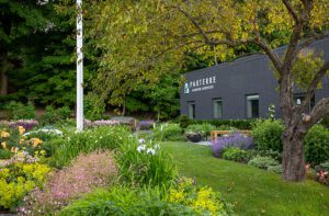
This image of Jim and Susan M-Geough‘s house by interior designer Eliza Tan (with styling by Robert Brown) gives the best possible sense of the space as a whole.

Photos by Greg Premru
But as we divide the space into sections, and tighten our views to create concise and natural-feeling “vignettes,†the viewer gains a greater sense of how the room actually feels when you’re in it. To me, these images portray the space most effectively and compellingly. They also work better visually because they are more focused and graphic. (An interior image needs not only to evoke the space, it also needs to be successful as a photograph.)

Moving in still further, the “detail†image gives the viewer an opportunity to study key objects and collections up close. Just like the vignette, I believe detail images are often more visually interesting than the overall view.

Still, I wouldn’t necessarily exclude overall views from a shoot. Many architects prefer them to vignettes, even if I would argue that multiple concise vignette images tend to be more evocative. Below are an overall and two vignette images of a living room by interior designer Manuel de Santaren. I think you’ll agree that the overall image creates an understanding of the space, but it’s the power of vignettes that tell the story.


I’m hearing from many architects and interior designers that their potential clients favor the vignette-style imagery they see in design magazines, and I agree. Today’s design consumers are sophisticated and savvy–they know what feels right.
[Editor’s note:Â Click here to read more about Jim and Susan M-Geough’s house, which was featured in the November/December 2007 issue of New England Home. To see a different Manuel de Santaren project, also photographed by Greg Premru, check out this link to a story from the November/December 2008 issue.]
–Greg Premru
Greg Premru is a noted architectural and interiors photographer based in the Boston area. His photographs have appeared in New England Home and many other regional and national magazines. He is currently working on a book about New England with author/producer Bruce Irving, due out this fall. See more of his work at www.gregpremru.com
Share


You must be logged in to post a comment.