Friday Favorites 05/24/2013
May 24, 2013
Karin Lidbeck Brent, Contributing Editor
Many years ago, I fell in love with the graceful sea inspired designs of Kim Cully. With summer quickly approaching, my desire to drop everything, grab a book and escape to the sand is stronger than ever. Unfortunately, not all of us can spend our summers beachside. If you don’t have too much spare time to hit the beach, Kim’s nautical decor is a great way to bring the ocean into your home.
I have been following Kim’s creations since she started making these exquisite and intricate shell-bordered mirrors and frames years ago.
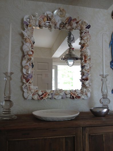
Photos by Karin Lidbeck Brent
Although Kim started by solely designing frames and mirrors, she has successfully expanded her seashell art and now designs lamps, sconces and other decorative objects that are sold in many fashionable stores in the Boston and Cape Cod area. Kim’s designs are custom made, each different and unique.
Last year I commissioned Kim to make this vase, which I used for styling this bouquet of roses.
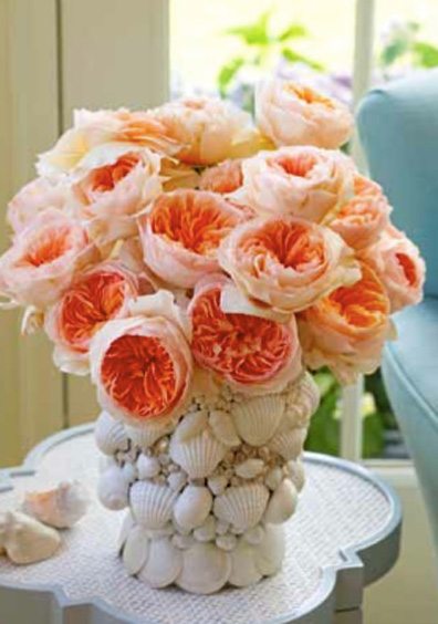
Working with shells in all shapes and sizes from different parts of the world, Kim can make any ordinary household accessory into a breathtaking piece of art.
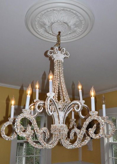
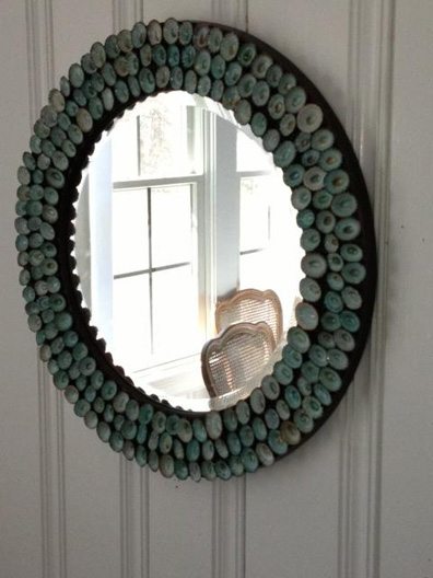
To see more of Kim’s work, you can find her on Facebook at KIM Sea Shells or reach her at kim.cully@gmail.com.
You can purchase Kim’s designs directly at Midsummer Nights in Chatham, Mass., Robins Nest in Hingham, Mass. and Welch Company in Scituate, Mass.
Paula M. Bodah, Senior Editor
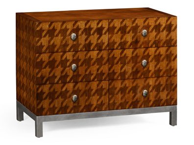
Whether he’s designing clothing or home furnishings, Alexander Julian aims for a classic, casually elegant, distinctly American look. In his collaboration with North Carolina furniture company Jonathan Charles, that translates into furniture that recalls bespoke men’s clothing. A mirror, for instance, is framed with exotic woods hand-inlaid in an argyle pattern. A dresser lacquered the exact color of a gray flannel suit is accented with drawer pulls made of Italian enamel blazer buttons. And my favorite in the collection: a three-drawer chest smartly outfitted in a houndstooth created by hand-inlaying two shades of walnut.
Kyle Hoepner, Editor-in-Chief
One thing I always try to do during late-spring excursions to New York City is drop by the annual Kips Bay Decorator Show House. This year was no exception, and the payoff was big. Installation time was apparently quite limited this year—something on the order of four weeks—and some parts of the house were apparently in dismal shape to start with. But you’d never know now. In fact, overall this year’s house felt to me like one of the more consistent and livable collections of rooms I’ve seen at Kips Bay yet.
Many other people will undoubtedly be doing top-to-bottom reviews, so I’ll just share a few of my favorite bits here, in hopes of tempting you to go see it yourself.
1. Eve Robinson’s top-floor family lounge. A quiet yet tightly composed space, and an introduction to some of the low-value colors—purples, teals, red-oranges—that would crop up repeatedly elsewhere in the house. I love how the ombré curtains mediate gently between the light tonality of the walls and ceiling soffit, and the dark floor.
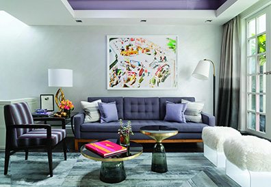
Photo from everobinson.net
2. Just outside, West Chin’s front-terrace bathtub was fun, facing a petite koi pond and fireplace-turned-terrarium—although I’m not sure how thrilled the neighbors would be to see someone using it.
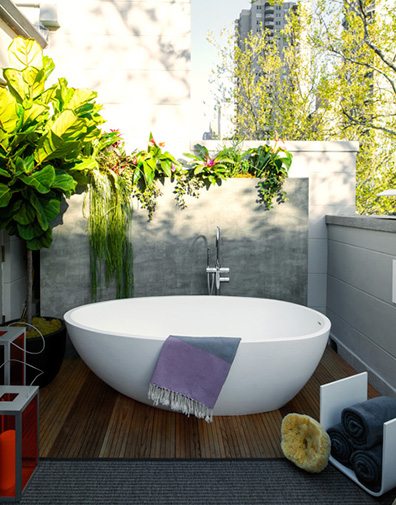
Photo by Trevor Tondro from The New York Times
3. Jack Levy’s fourth-floor sitting room evoked the feeling of a gentleman’s library/wunderkammer, with its dark walls and quirky zoological and botanical references.
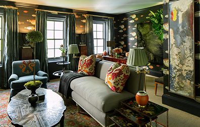
Photo by Trevor Tondro from The New York Times
4. The dining room, by Kristen McGinnis, was in some ways one of those not-entirely-usable stage-set concept rooms that usually annoy me in show houses. Yet this one felt somehow more humane, perhaps because the stately yet delicate simplicity of the table and chairs offset the less-practical art pieces like Vincent Dubourg’s self-destructing double buffet. And who could resist that silver-leaf ceiling and those luscious lacquered, pilastered walls?
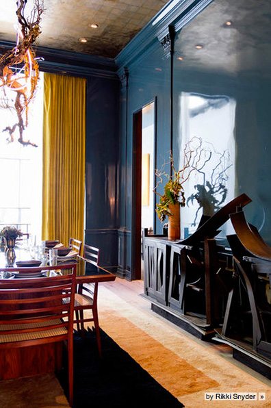
Photo by Rikki Snyder from houzz.com
5. Particularly lovely was the little wine bar and sitting room by Dineen Architecture + Design, tucked in behind the dining room (and, like the dining room, overlooking James Huniford’s downstairs atrium space). I assume they must have coordinated with Kristen McGinnis during planning, since their glossy teal ceiling and related accent colors, carried throughout the room, were a perfect complement to the dining room’s succulent walls. (Also included: a pair of gorgeous Regency convex mirrors fresh from the Carlton Hobbs booth at the Winter Antiques Show, wonderfully overscale for such a narrow room and a perfect foil for the otherwise midcentury vibe.)
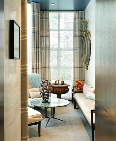
Photos by Peter Rymwid from dineenarchitecture.com
Really, almost all of the rooms had at least something nice going on, so this is a bare-bones sampling. But if you’ll be in the New York City area soon, you can see for yourself. The house is open through Tuesday, June 4, 2013, and proceeds, as always, benefit the Kips Bay Boys & Girls Club.
Share
![NEH-Logo_Black[1] NEH-Logo_Black[1]](https://b2915716.smushcdn.com/2915716/wp-content/uploads/2022/08/NEH-Logo_Black1-300x162.jpg?lossy=1&strip=1&webp=1)
