Four Part Harmony
April 4, 2013
Text by Megan Fulweiler Photography by Tria Giovan

Good relationships, we all know, build over time. With every year that passes, the bonds of friendship and trust strengthen. Case in point? After almost two decades of working together, the owners of this Wilton home are happily in sync with interior designers John Roch and Gary Chase of Fairfield’s Roch & Chase Interiors. The designers were on the scene before their client’s two children, who are long past nursery days, had even arrived.
During this lengthy commitment, the house has evolved from a traditional nineteenth-century home to a stately six-bedroom residence. A grand 4,000-square-foot addition designed by South Norwalk–based architect Bruce Beinfield gives the family the space they need while maintaining the home’s character. “Many New England houses were added on to incrementally as families grew. The way the pieces come together—that wonderful rambling quality—is what makes them charming and that’s what we referenced,” explains Beinfield.
Years back, he contrived a kitchen addition for the owners. This time around, in spite of stringent site constraints, Beinfield and project architect Mark Goodwin devised a gracious two-story east-to-west-facing addition that includes an airy entry, sunroom and family room with the family’s bedrooms above.
Roch and Chase’s affection for their clients shines as they talk about all the steps that brought the place to this handsome pinnacle. They love that the wife grew up with antiques and favors a softer approach, while the husband leans toward clean, crisp lines. And when they point out how well the owners marry old and new—barely giving any credit to themselves—they sound like proud parents. “Our clients are special people. They’ve been totally involved in the whole process and we’ve been with them so long, there’s no need for lots of back and forth when it comes to decisions,” says Roch.
This, of course, is a blessing since the decorating has been an organic procedure, too. The end result, though, is seamlessly stylish and livable. Not one note of discord emerges in the melding of centuries, thanks to the soothing palette and the designers’ clever mixing and matching of furniture eras and styles.
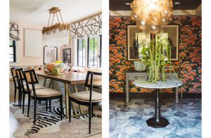
Moreover, by not confining themselves to any single period, the designers have conjured a fresh tone befitting a modern family. Off the hallway with its chic painted floor—the “spine of the old house,” as Chase labels it—sit the dining and sitting rooms. The latter could be interpreted as decidedly traditional with its antique sideboard and mirror, custom chandelier dripping prisms and Hepplewhite-style chairs. And what about the wallcovering? “The Kravet paper is reminiscent of damask but in a contemporary way,” Chase says.
Slip into the lofty sitting room (an earlier tweak involved lifting the ceiling) and further examples abound of Roch and Chase’s talent for blending past and present. Since this space tends to be more about grown-ups, the designers helped the owners forge an inviting conversation area complete with cushioned window seat. Brass side tables and hand-crafted Christopher Spitzmiller ceramic lamps speak to today. So does the generous cocktail table, expansive enough to hold everyone’s drinks. No guest will ever find himself struggling to balance a wine glass in his lap while trying to snatch a canapé. The hospitable setting also holds a pedigreed chest from Woodbury’s Thomas Schwenke. Above it hangs a print—one of a series of four—by the American minimalist artist Robert Mangold. One might think a patterned backdrop would detract from Mangold’s work. On the contrary, the poetic paper, the same used in the dining room, counterbalances the cool art.
Completely in step, the new light-filled family room has its own roster of subtle juxtapositions. Take that streamlined desk tucked behind the sofa, for instance. The desk may be of-the-moment, but the chair parked alongside is antique. A sophisticated, contemporary cocktail table, an African stool and a pair of Louis XIII chairs make perfect, if unexpected, partners. The antique seats and a stash of plump sofa pillows wear a vintage coral-hued Osborne & Little fabric: a perfect age-defying foil to the dark wood. Congenial club chairs boost the symmetrical seating arrangement’s comfort level. And a striped custom-colored Stark carpet—more confirmation (as if any were needed) that this is not your grandmother’s house—pulls it all together.
Well-tailored window treatments appear only where the homeowners need privacy. In general, the designers have taken every opportunity to invite the landscape in. “The property has a park-like ambience,” says Roch. Designed by New Canaan landscape architect L. Wesley Stout, principal of Wesley Stout Associates, the grounds are lush with myriad evergreens offsetting the architecture.
From their bedroom windows, the owners spy green lawn and trees. Their serene retreat is, like the rest of the house, a study of subdued colors. When it came to forging the bath of their dreams, however, the couple decided some glam was in order. Roch and Chase, recruiting architect Richard Campbell to help, turned up the volume with a bounty of marble not only for countertops but also to clad the walls. A lustrous marble mosaic floor doubles the light. The well-organized space is dazzling yet totally refined (think Grace Kelly). A grid of eighteenth-century botanicals blooms above the vanities, and linens are white as driven snow.
The children’s quarters are adorable. Situated above the sun room, the daughter’s room’s hexagonal shape allows for a super-girly let’s-lounge-all-day window seat. Country Swedish beds upholstered in khaki twill will never seem age-inappropriate but instead can grow up with their owner. A simple Parsons table wedded to a Scandinavian chair is ideal for homework and diary writing.
It seems Roch and Chase think of everything in a manner that’s not just immensely creative but also caring. It’s as if when they close their eyes at night, the thoughtful designers need to picture their clients content. In such stylish, comfortable and personal surroundings, no doubt about it, they are.
Interior design: Roch & Chase Interiors
Architecture: Beinfield Architecture
Builder: Koellmer Development
Share
![NEH-Logo_Black[1] NEH-Logo_Black[1]](https://b2915716.smushcdn.com/2915716/wp-content/uploads/2022/08/NEH-Logo_Black1-300x162.jpg?lossy=1&strip=1&webp=1)






You must be logged in to post a comment.