Forever Young
July 26, 2016
A thorough revamping that includes a new addition sends a 1950s New Canaan house into middle age with a fresh new outlook.
Text by Megan Fulweiler Photography by Tria Giovan Produced by Karin Lidbeck Brent

Every owner brings fresh ideas to a house. Walls are demolished, stairs are rerouted, and grand rooms appear where before there were none. Anything is possible, and the possibilities are never-ending. But as marvelous as these revisions can be, they can also leave a nest feeling slightly disjointed and inefficient for the next inhabitants. Everyone, after all, arrives with his or her own vision for how to create a livable, harmonious home.
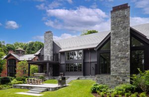
This New Canaan house built in the 1950s is a prime example. Its classic facade is the kind that sparks thoughts of beaming faces gathered around a Thanksgiving table (there were, in fact, forty-two present for last fall’s feast). And, indeed, the ambience couldn’t be more welcoming. To the wife’s great joy, the rooms are flooded with light. In the morning, she explains, “I have coffee on a sunlit window seat. Sunsets occur in the family room’s largest window, which faces west. The whole room is bathed in orange.”
It wasn’t always this way, however: the window seat came with the new kitchen. And the climactic evening shows are a bonus; not too long ago, there was no family room where the parents and their three children could relax. The soaring space sits in the life-enhancing addition that architectural designer Louise Brooks, principal of Brooks & Falotico, devised as part of a major renovation.
Thanks to Brooks’s clever and functional design, the 1,200-square-foot add-on (which also includes mud and laundry rooms as well as an office) looks like it’s been there forever. On the home’s front side, the addition provides a picturesque entry porch with a bluestone floor. Nearby, there’s a pull-off framed with pert cone-shaped boxwood. “It’s a handy spot where the wife parks to unload groceries,” says landscape designer Jennifer Anderson, who collaborated with Brooks to make sure the addition tucks quietly into its surroundings. Travel around the corner of the house and the addition reveals a lower level with a four-bay garage.
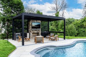
Rather than tackle everything at once, the owners added their stamp in stages. Steady improvements during their tenure have included everything from a pool and pool house (another skillful Brooks and Anderson collaboration) to a handsome master bath. A master suite is in the works now. The latest revamping, however, was the most significant in that other rewards came along with the stellar family room, including a kids’ bath, a media room, a second staircase to ease traffic, a pantry, and, most important, a new kitchen. The last contains dual counters to protect the cook’s workspace no matter how big the crowd (thus, last autumn’s banner holiday turn out).
Interior designer Lynn Morgan’s smart updating of colors, fabrics, and furnishings also plays a big role in today’s congenial vibe. For a family who loves the water, a palette of blue and white evokes salt air. Morgan holds the over-cute seashore look at bay, however, conjuring instead casual elegance. “We didn’t want beachy,” says the wife. “We were thinking of that feeling of being dressed up and walking barefoot on the beach.”
To that point, the family room’s jaw-dropping chandelier from Liza Sherman is posh, but not fussy. The hand-blown cobalt-blue shades stand in sharp relief against the white shiplap ceiling. Clustered about the stone hearth, there’s a bevy of inviting furnishings clad in durable fabrics that three teenagers and pets needn’t worry about. Blue is the thread that links the rooms, but taking a cue from the moody ocean, Morgan smartly varies the hues: the sofas are covered in a strong navy chenille from Duralee, for example, while the dining room chairs wear a soft green/blue Kravet Ultrasuede.
Stools by Palecek in the gleaming kitchen (which occupies basically the same location as the original cooking area) are also dressed in bold navy. Their nailhead trim speaks to the polished nickel pendants above the islands and zinc strapping on the custom hood. The top-notch, navy-lacquered bar sports a zinc countertop. West Elm globes sail aloft in the breakfast area. Even the cabinets dazzle. “That design just seemed right, and I liked the look,” says Brooks modestly of the glass doors with their stylish “X” detail.
These days, if the kids have commandeered the family room for TV, the adults head to the cozy library. Conducive to reading, this “winter room,” as the designer refers to it, is also ideal for entertaining. Morgan elevated the space from vintage to chic by faux-painting the bookshelves to mimic limed oak. “It was an easy fix, but a huge transformation,” she says. Mitchell Gold + Bob Williams sectionals strewn with back-soothing pillows promote conversation, and there’s also a popular billiard table.
Cosmetic touches stepped up the dining room as well. Morgan reshuffled the contents of the owners’ eighteenth-century chinoiserie cabinet and introduced a stash of snowy Crate and Barrel plates to brighten the shelves. Silver trays lend light to the dark table. And for color and a precious bit of history, there’s a framed petit point by the wife’s eighty-year-old grandmother. Incredibly, she worked freehand, copying favorite paintings onto linen. This one—a Matisse, according to a notation on the back—took her 146 hours to complete.
Across the hall, just past the main staircase with its lighthouse-like newel post, is the airy living room. Pale walls, comfortable custom furnishings, and some astute editing further a clean, crisp spirit. Twin X- base benches are covered in a traditional China Seas pattern that has, as the designer says, “an Old World quality.” Yet, there’s nothing Old World about the Lucite coffee table or the stunning art, which hails from New Canaan’s Sorelle Gallery.
In the end, modernized without losing its character, the gracious house has become the perfect sum of its parts. “I love how it all ties together now and feels like one,” the wife agrees happily. •
Architecture: Louise Brooks, Brooks & Falotico Associates
Builder: L & L Builders
Interior Design: Lynn Morgan, Lynn Morgan Design
Landscape Design: Jennifer Anderson, Jennifer Anderson Design & Development
Share
![NEH-Logo_Black[1] NEH-Logo_Black[1]](https://b2915716.smushcdn.com/2915716/wp-content/uploads/2022/08/NEH-Logo_Black1-300x162.jpg?lossy=1&strip=1&webp=1)



You must be logged in to post a comment.