Family-Friendly in Wellesley
May 4, 2020
Text by Maria LaPiana Photography by Read McKendree Produced by Karin Lidbeck Brent
No toile? No problem!
That’s what interior designer Tiffany LeBlanc thought to herself when she was asked to make a new home in Wellesley, Massachusetts—a 6,500-square-foot classic Colonial—feel more like a boutique hotel than, well, a classic Colonial in Wellesley.
The house had good bones and some nice touches, including lovely coffered ceilings. Instinctively, it felt good to the homeowner; the flow from room to room made sense. But she had something more special in mind. And because she and her husband have three children, their “boutique hotel” would have to be family-friendly, too.
“They wanted a sophisticated home, but one that was atypical,” says LeBlanc. “Not overly decorated—she specifically requested no toile—suitable for kids, but not dumbed down.”
They wouldn’t be taking a single stick of furniture from their old home. “We started with all new furnishings because we saw this as our ‘grown-up’ house,” says the homeowner.
A near-blank slate is a designer’s dream, but it can be daunting. “You have to corral your ideas and decide how far you want to go,” says LeBlanc. “Ask yourself what you can live with, and how to get where you need to be.”
A few architectural changes came first, including “peeling back some of the molding and details,” the designer says. For a more modern, linear look in the living room, she replaced the mantel and heavy millwork around the fireplace with a floor-to-ceiling quartzite facade. She kept the sitting room’s traditional trim, but toned it down by removing the upper shelving flanking the fireplace and painting the coffered ceiling a half tone lighter than the walls. Then she chose unexpected pieces for the room, including a purple Wesley Hall sofa and blue leather wing chairs.
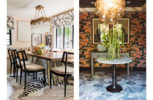
The designer says she “wanted to achieve luxury without trying too hard.” “So we added lots of texture, layers, wallpaper, and wool woven rugs that make rooms feel more intimate.” The artwork is deliberately eclectic.
In the dining room, a metallic ikat wallpaper by Jim Thompson adds depth. Overhead, the designer hung a favorite fixture—the Cloud by Apparatus Studio. “Every designer has a love affair with a piece,” she says. “They tuck it away and know they will use it somewhere. This was mine, and it was time.”
The oversize painting of penguins by an illustrator in the U.K. was selected because “it’s kitschy and makes you smile.”
In the calming master suite, LeBlanc chose a matte wallpaper to contrast with the woven carpet. The enchanting tête-à-tête is a favorite with the children, while the homeowner says she absolutely adores her desk. “I still love writing cards, and it’s the perfect place to be reflective and write notes,” she says.
LeBlanc clearly took care to engage—not obliterate—the home’s classic elements. “Detailing and tailored accents let you know the space is very refined and thoughtful,” she says. “Contemporary nods make it feel more urban, more timeless than traditional.” And there’s not an inch of toile in sight.
Project Team
Architecture: Scott Rogers, Shane Structures
Interior design: Tiffany LeBlanc, LeBlanc Design Interiors
House Builder: Brendon Homes
Remodeling Builder: Dean Behrend, Dean Behrend Luxury Homes
Landscape design: Dan Gordon, Dan Gordon Landscape Architects
[WPSM_COLORBOX id=73546]
Share
![NEH-Logo_Black[1] NEH-Logo_Black[1]](https://b2915716.smushcdn.com/2915716/wp-content/uploads/2022/08/NEH-Logo_Black1-300x162.jpg?lossy=1&strip=1&webp=1)








You must be logged in to post a comment.