Erin Gates and Patrick Ahearn Team Up to Update a Historic Wellesley Home
November 10, 2021
Subtle alterations bring an antique house into the future— without leaving its historical heart behind.
Text by Debra Judge Silber Photography by Michael J. Lee

Having built or remodeled some fifty homes in the Boston suburb of Wellesley Farms, Patrick Ahearn’s architectural firm just might be remaking the leafy enclave one house at a time.
Not that anyone would notice.
“You can’t tell my new houses from my old houses,” says the architect, whose signature style is best described as invisibility. Through adherence to classic proportions and architectural sleight of hand, Ahearn specializes in making older homes easier to live in without stripping them of their timeless character.
“We don’t create a new architecture,” Ahearn explains. “We study the architecture that was there. If you don’t know the past, you really can’t do the future well.”
Inside this particular Wellesley Farms home, the future was already coming into focus. For more than a year, interior designer Erin Gates had been working with the owners to better adapt the 1934 brick colonial to their needs and those of the couple’s three teenagers. “They wanted to respect the history of the home and the style in which it was designed but make it more friendly for a modern family,” she says.
But it soon became clear that a more extensive remodel would be needed for the family to gain the space and comfort they desired. The owners called on Ahearn and Michael Tartamella, Ahearn’s managing principal and project architect, to join Gates on the renovation.
Past additions to the brick portion of the house had added some space, but the rooms remained disjointed. “Our task was to update the existing house and reimagine some of the additions to make them more cohesive,” Tartamella says. The key was to preserve the hierarchy of the original architecture. “It’s all about scale,” he says. “You want to make the additions appear as if they were part of the original massing. That sets the tone for how to add onto the house while maintaining authenticity.”
Using this formula, an unheated porch on one side of the house became a one-and-a-half-story addition, its modest height preventing it from competing with the main brick structure; the new section houses a game room below and a luxurious primary bath above. On the opposite side, an undersized garage was replaced with a larger but otherwise identical replica, faithful down to the gambrel roof that nearly sweeps the ground.
In the back of the house, a small breakfast room bump out was replaced with a much larger addition containing a new kitchen and family room. Positioning this addition behind the house not only preserved the view from the street, but it also created an anchor for an outdoor kitchen, dining patio, and fireplace just steps from the new family room. “They really wanted an amazing outdoor space to integrate with both the interior and the yard,” says Ryan Wampler of Matthew Cunningham Landscape Design.
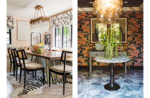
With those strategic additions, “the most useful parts of the home got much more enjoyable, functional, and beautiful,” says Gates, who enhanced these qualities further by intermixing contemporary and traditional furnishings as seamlessly as the architects blended the exterior details. Classic burled wood shape-shifts into modern forms, while occasional pieces incorporating glass, metal, and Lucite crop up throughout rooms anchored by colonial-style moldings. “We really wanted to make sure the materials were rich and felt traditional, with a little bit of a twist,” she says. Just enough of a twist, that is, to make this old house live like new.
Project Team
Architecture: Patrick Ahearn, Michael Tartamella, Patrick Ahearn Architect
Interior design: Erin Gates, Erin Gates Design
Builder: Jack Sullivan, The Chelsea Company
Landscape Design: Ryan Wampler, Matthew Cunningham Landscape Design
Exterior photographs by Taylor Ahearn.
Share
![NEH-Logo_Black[1] NEH-Logo_Black[1]](https://b2915716.smushcdn.com/2915716/wp-content/uploads/2022/08/NEH-Logo_Black1-300x162.jpg?lossy=1&strip=1&webp=1)


You must be logged in to post a comment.