Editor’s Miscellany: Tiny Treasures
January 17, 2013
By Kyle Hoepner
The Rooms We Love department in our January–February 2013 issue (on newsstands now) shows some of the particularly lovely and elegant spaces that were on offer at this past autumn’s 2012 Junior League of Boston Show House at the Potter estate in Newton. But a post by Patrick J. Hamilton about New York’s Holiday House reminded me of something I, too, have noticed over time: frequently it’s the smaller or transitional spaces in a show house—halls, stairways, powder rooms, vestibules, little nooks of many sorts—that can be particularly witty, innovative, delightful, and prove a real test of their designer’s ingenuity.
That was very much true in the JLB house. Although the spaces printed in our magazine are principally the larger, more formal rooms, some of my own fondly remembered moments in the house were the bits in between. So I’d like to acknowledge a scattering of those here.
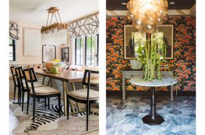
Visitors to the house were welcomed in this foyer, by Dianne Ramponi Interiors and Susan Welsh Design. An introductory space surrounded by high-impact rooms, it proved fully up to the task.
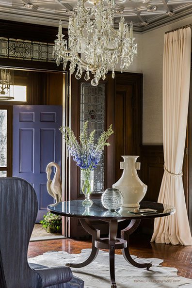 Photo by Michael J. Lee, from stylecarrot.com
Elizabeth Benedict‘s Green Room. Originally an adjunct to the kitchen, complete with walk-in freezer, this homely cul-de-sac was transformed with design details from elsewhere in the house to make a delightfully Lilly-Pulitzer-meets-Million-Dollar-Decorators refuge for the hypothetical mother of the house. (If you want to know more about the changes, see this post on Elizabeth’s blog, which goes into detail.)
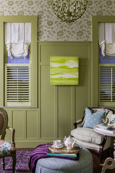 Photo by Michael J. Lee, from spacetograce.blogspot.com
Kris Shaffer‘s “Ladies Room, Gentlemen Welcome†bath: minuscule but fully kitted out in dramatic style (including custom lamp from Lucy Dearborn).
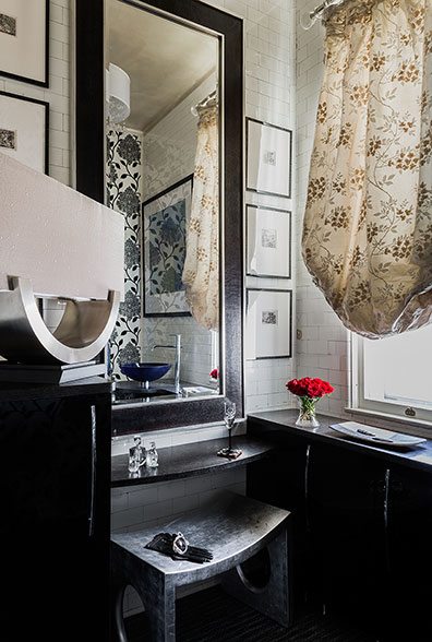 Photo by Michael J. Lee, courtesy of Michael J. Lee
Ana Donohue‘s Bath Retreat turned an under-eaves corner into a tiny tropical spa.
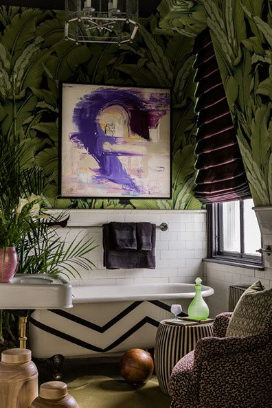 Photo by Michael J. Lee, from stylecarrot.com
Designer Cecilia Walker in her backstairs space (with mural by John Coles in the distance). Cecilia also did a blog post about her design inspirations and process, in case you’re interested in knowing more.
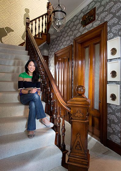 Photo by Eric Roth, from everythingin3s.com
Perhaps my very favorite of these interstitial interludes was this Potter’s Room by Marilyn MacLeod of Lee Design, which turned an unpromising little pass-through into a space of real substance and utility.
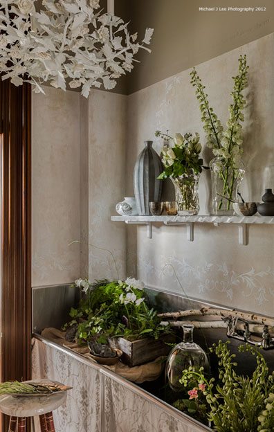 Photo by Michael J. Lee, from stylecarrot.com
To be honest, though, it isn’t just the smallest spaces I regret not being able to show in the magazine. The vast majority of the house’s rooms had superior qualities to them, and hewed to an unusually consistent standard of interest and sophistication. Here are two examples, culled from the house’s many bedrooms.
The Guest Room by Hilary Bovey of Bovey Steers Design Group  (the mural wallpaper is from Susan Harter) .
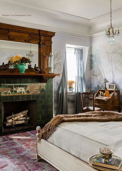 Photo by Michael J. Lee, from stylecarrot.com
The Girl’s Bedroom by designer Mally Skok: cheerful but hardly juvenile.
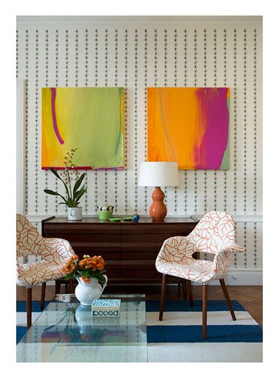 Photo by Eric Roth, from stylecarrot.com
Once more I’m not able to show everything this show house had to offer. But let’s raise a glass to tiny treasures, local designers, and whatever the Junior League of Boston will come up with next time.
For highlights from other show houses in 2012:
Share
![NEH-Logo_Black[1] NEH-Logo_Black[1]](https://b2915716.smushcdn.com/2915716/wp-content/uploads/2022/08/NEH-Logo_Black1-300x162.jpg?lossy=1&strip=1&webp=1)




You must be logged in to post a comment.