Editor’s Miscellany: First Impressions
February 2, 2012
By Kyle Hoepner
My editor’s letter in our January/February 2012 issue talked a bit about the considerations that go into choosing a magazine cover, and I promised to follow up with a blog post showing some of the cover options we considered.
Here’s a candidate that came very, very close to winning the day. It’s the dining room of a serenely white, but still quite gutsy, apartment by the design team Weena & Spook.
In a very different vein is this Berkshires dining room, from a Colonial renovation by architect Kristine Sprague and interior designer Keith Lichtman. This cover would have had a sweet and wonderfully cozy feel, especially during a very cold season–or at least what in a normal year is a very cold season.
Another characterful space from the same house:

Photo by Robert Benson
Meichi Peng was the creative force behind this bedroom in the Residences at W Boston. This image would definitely have made a bold, graphic statement–but, beautiful as it looks inside the magazine, we were concerned it might seem slightly cold as a cover.
Here’s one more possibility we discussed. This media room is in a new house (architecture by Birdseye Design Studio; interiors by Fleur-de-lis Interior Design) located on a parcel of historic farmland in Vermont. Once more a very dramatic photo, but perhaps a tad too busy to make a really focused cover, and at first glance it might be mistaken for a commercial interior.
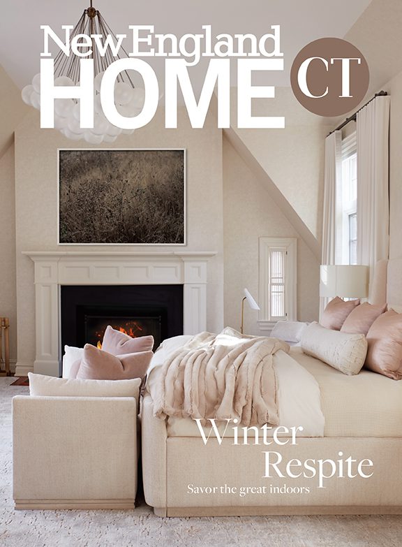
So, after much deliberation, the following is the cover we ran. It’s a shot of the great room of the Vermont house, with a fortunate conjunction of desirable aspects:
1. It’s contemporary. Since we are sometimes typecast–I have no idea why–as only showing traditional design, we love the opportunity to put a modern house on our cover.
2. It shows a nice blend of architectural and interiors elements.
3. Who can resist a fire?
4. The clincher–a killer, and seasonal, view of Lake Champlain.

The actual January/February 2012 cover of New England Home; photo by Michael Partenio
There are many good things to be said for all of these potential covers, of course, which is one reason making a final selection is so difficult. Did we do the right thing? We’d love to see your comments. Which one would you be most likely to pick up at a newsstand?
Share
![NEH-Logo_Black[1] NEH-Logo_Black[1]](https://b2915716.smushcdn.com/2915716/wp-content/uploads/2022/08/NEH-Logo_Black1-300x162.jpg?lossy=1&strip=1&webp=1)


You must be logged in to post a comment.