Editor’s Miscellany: A Post on Posters
May 12, 2011
By Kyle Hoepner
This past weekend some friends and I checked out the FAST Light festival of luminous, kinetic, and interactive art at the Massachusetts Institute of Technology in Cambridge. A pleasant spring evening spent quartering the campus and nearby Charles River in search of glowing, morphing, flickering forms–very of-the-moment and technologically based–got me thinking about the close relationships between different kinds of design–whether pursued as interior design, graphic design, or “fine†art–and the surprisingly lengthy and deep tradition of aesthetic engagement at MIT.
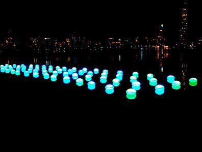
Blue and green pods float on the Charles River opposite Boston’s Back Bay: my own bad phone pic of “Light Drift†by Meejin Yoon.
The twentieth century saw a number of pretty well-known figures associated with the school: photographer Harold Edgerton, painter György Kepes, documentary filmmaker Richard Leacock, environmental sculptor Otto Piene, to name a few.
Less well known, I suspect, at least to the general public, were a few people associated with MIT’s Office of Publications. Founded by the noted graphic designer Muriel Cooper, the office was an enthusiastic hotbed of the “Swiss style,†a movement in graphic design that flourished in mid-century and stressed simplicity, cleanness, and readability in printed material. The publications group at MIT pushed these ideas well beyond just typography, marrying them with the kind of hard-edged, abstract geometric images that were brewing in the art world around the same time.
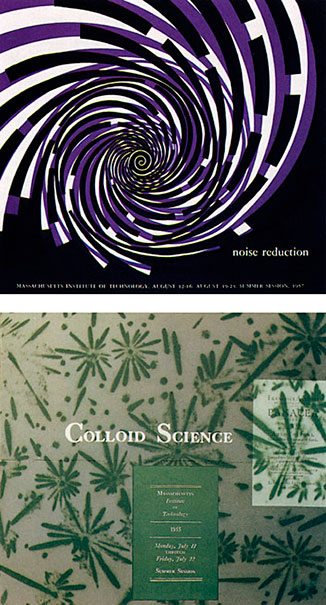
1958 MIT Summer Session announcements designed by Muriel Cooper. Image from aiga.org
Two other member of the Office of Publications team who also have followings in the graphic-design world: Jacqueline S. Casey and Ralph Coburn.
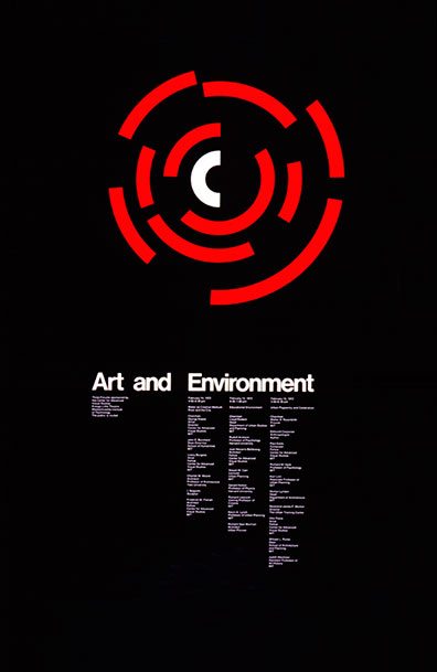
1972 poster for three forums sponsored by MIT’s Center for Advanced Visual Studies, by Jacqueline S. Casey. Image from the 1992 MIT Museum booklet, “Posters: Jacqueline S. Casey–30 Years of Design at MITâ€
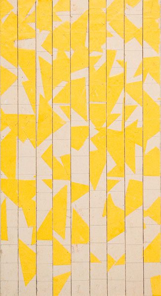
Ralph Coburn, Graduation Eve ’65 announcement. Image from aiga.org
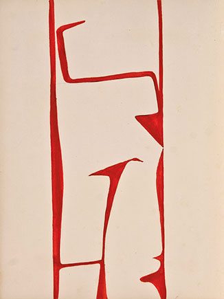
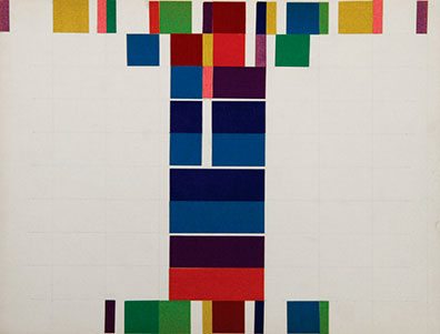
Ralph Coburn, actually, was the subject of a recent exhibition at David Hall Fine Art in Wellesley, Mass., called “Ralph Coburn–France | Works on Paper 1949–1956.â€â€¨In the show you could watch Coburn’s sensibility developing during the years between his time studying architecture at MIT and when he later returned to do publications work there. (Unfortunately the show closed on April 22, but there are still plenty of samples of Coburn’s work viewable on the gallery’s Web site, and I’m sure they’ll be happy to show you some of the real articles if you want to stop by.)
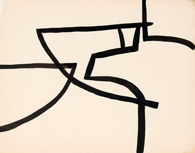

- Ralph Coburn, Landscape, Paris, c. 1951,
oil on paper. Photo courtesy of David Hall Fine Art.

- Ralph Coburn, Collage, Arranged by Choice, c. 1950,
paper on paperboard. Photo courtesy of David Hall Fine Art.

- Ralph Coburn, Collage Drawing, 1950–56,
paper. Photo courtesy of David Hall Fine Art.
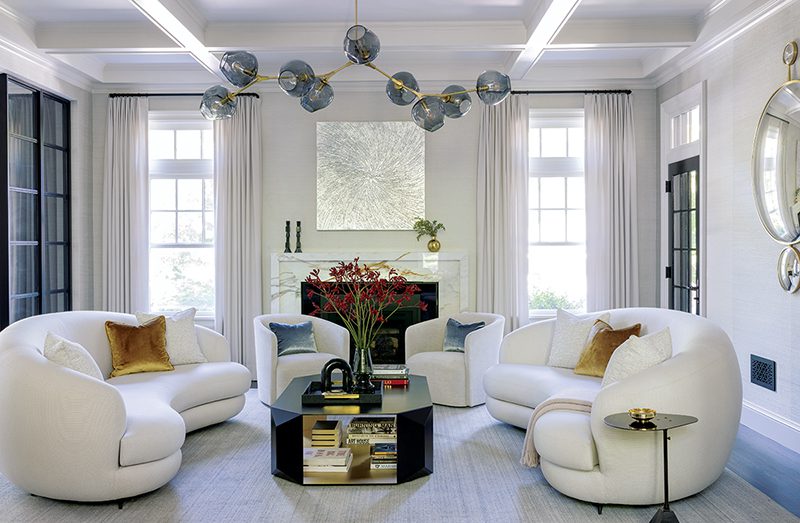
Forgive me for leading you today on a journey that has veered far from sconces and upholstery fabrics. Yet these artists, in only two dimensions and in quite spare and stripped down form, are still juggling the same issues of scale, visual weight, balance, and color harmony that go into making a beautiful room (and, even more, a beautiful photograph of a beautiful room)–just witness this Rhode Island guest house by architect Greg Snider and interior designer Meryl Santopietro, shot by photographer Nat Rea with stylist Robert Brown:
So how can I treasure one thing and not appreciate the other?
Share
![NEH-Logo_Black[1] NEH-Logo_Black[1]](https://b2915716.smushcdn.com/2915716/wp-content/uploads/2022/08/NEH-Logo_Black1-300x162.jpg?lossy=1&strip=1&webp=1)




You must be logged in to post a comment.