Dramatic Effect
March 26, 2015
Dynamic, soaring roof projections lend a theatrical note to a sleek contemporary house tucked into a Vermont hillside.
Text by Lisa E. Harrison Photography by Jim Westphalen Produced by Karin Lidbeck Brent

The couple’s original plan was to renovate their Richmond, Vermont, house. “We both have very contemporary tastes,” the wife says, “and our house was very colonial.”
They reached out to architect Brian Mac at Birdseye Design, an architecture and building company, for guidance. But before Mac had so much as put pen to paper, the couple decided to scrap the renovation in favor of a fresh start, purchasing property a street and a half away.
Mac set to work. The design phase went smoothly, and with nearly a year logged on the project, the construction plans were complete and it was time to break ground.
That’s when a (welcome) wrench got tossed in the works: a breathtaking, ten-acre piece of land came up for sale on the tip of Shelburne Point. The view. The privacy. The access to Lake Champlain. It was too perfect to pass up.
Mac once again set to work. A year’s worth of collaboration had given him a good sense of what his clients wanted, and he incorporated his vision into a chipboard architectural model. “I took one look at it,” remembers the wife, “started crying, and said, ‘That’s our house.’”
In fact, the actual 6,500-square-foot dwelling would stray little from that initial mock-up. In keeping with the owners’ modern aesthetic, Mac crafted a dramatic, contemporary house that makes a strong architectural statement, yet syncs seamlessly with the natural surroundings.
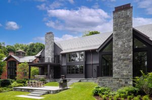
The drama begins at the top, where the roof juts out eight feet beyond the exterior walls. Mac gave that striking design element a further touch of the theatrical by adding twenty-eight-foot cantilevered roof forms on both the main house and the garage wing. The two forms pack a visual punch and act as a sort of picture frame for the views of the shoreline and north up the lake to Burlington, Vermont. “Whether you’re inside the house or in the courtyard,” notes Mac, “you always feel the presence of the architecture in the landscape.”
The stretched roofline also helps the house to read horizontally, preventing it from competing vertically with the landscape. A ten-foot elevation change in the landscape further inspired the elongated design. “The slope was a blessing,” says Mac. “We didn’t force the house onto the landscape, we built it into the landscape.”
Unfinished western red cedar trim and siding, Corten metal panels, and repurposed corral board give the structure an organic look that blends with its natural setting. “You sit in one part of the house and look out a window and see another part of the house—and it’s beautiful,” notes the wife. “It never occurred to me that the exterior of a house could be so beautiful.”
Bonus? Not only are the materials handsome, but they age well and require zero maintenance.
This easy, natural aesthetic extends to the plantings as well, which were masterminded by Burlington-based landscape architect Keith Wagner. “There’s a richness to the materials that Brian used,” he explains, “so our landscape had to have a richness in texture.” Wagner relied primarily on large sweeps of native species—ornamental grasses, ferns, river birch, and red maples—and used them in what he calls a “painterly way” to create a calming effect that stands up to the architecture but doesn’t overpower it.
Inside, Mac conceived an open layout that harmonizes with both the architecture and the surroundings. He devised what he calls an entry link that subtly connects the two sections of the house. Head left for the garage, mudroom, office, and a bathroom with pool access. A right turn leads to the main living quarters, including the living and dining rooms, kitchen, guest bath, and master suite. A stairwell descends to three additional bedrooms (all with sliders that open to the outdoors), three baths, a family room, and a kitchenette. This lower level serves as a gathering spot for the couple’s four children, now young adults.
Family and entertaining factored into the overall design of the house. “An open floor plan was important to us,” says the wife. “Our lifestyle revolves around the kitchen, so why segregate it from the rest of the house?” The oft-used, user-friendly kitchen holds an island where four stools invite visitors to keep the cook company.
The kitchen opens to the dining area, where the table—a stunning high-gloss, black-stained bamboo number with blackened steel accents and legs—is surrounded by chairs in an eye-catching turquoise hue. A glass half-wall and a two-step decline delineate the dining and living areas, enabling the conversation to flow freely from one space to the next.
The couple did most of the interior design work themselves, choosing everything from fixtures and furniture to rugs and kitchen appliances, gleaning input from Mac along the way. “I like contemporary style, but I didn’t want it to be cold and sparse,” says the wife. “We definitely wanted a little bit warmer feel.” This ethos plays out beautifully in the living room, an area defined by a soothing neutral palette, modern furnishings, and a wood-burning fireplace to ensure literal warmth.
The profusion of windows throughout the house limits the available wall space for artwork; instead, the couple relies on nature to supply colorful, ever-changing scenery.
Birdseye’s in-house woodworking and metal-fabrication crews created all the statement-making built-ins, beds, cabinetry, staircase banisters, and exterior ironwork. The custom work lends a streamlined, minimalist appeal to the design as well as an overall cohesion from room to room. “They’re really craftsmen,” says the husband about the Birdseye team. “Their attention to detail is amazing.”
The home’s many amazing details continue to delight the couple. “Brian really understood what we liked, our style; he nailed it,” says the wife. “There’s a lot of our personality in this house.”
It turns out the third try really is the charm. •
Architecture: Brian Mac, Birdseye Design
Builder: Birdseye Building Company
Landscape design: H. Keith Wagner, Wagner Hodgson Landscape Architecture
Share
![NEH-Logo_Black[1] NEH-Logo_Black[1]](https://b2915716.smushcdn.com/2915716/wp-content/uploads/2022/08/NEH-Logo_Black1-300x162.jpg?lossy=1&strip=1&webp=1)



You must be logged in to post a comment.