Down East Meets Downtown
September 27, 2011
Text by Nathaniel Reade Photography by Eric Roth Produced by Kyle Hoepner
When the subcontractors walked in they mostly thought this job was crazy, recalls Brian Sleeper. “What the heck is this?” they grumbled. “It’ll never work.” They asked him, “Do you like this, Brian?”
Sleeper had been hired by two businessmen from Manhattan to make changes to the house they’d bought, a 6,000-square-foot turn-of-the-twentieth-century classic just seventy-five feet from the shoreline in York Harbor, Maine. Built in 1910, it blended the Shingle style then popular in posh summer enclaves with a more conservative, Federal-style form. Sleeper’s regular plumbers, electricians and finish carpenters were accustomed to seeing maybe a few modern touches in new construction, or to restoring historic houses to some approximation of their original look. These clients, however, wanted sheets of quartz in the bathrooms, custom-made mahogany washstands hung from century-old walls and, perhaps most startling of all to Sleeper’s crew, a staircase made of paneled glass.
What did Sleeper think? “I told ’em,” he says in his mellifluous Maine accent, “ ‘I’m waitin’ to see how it looks when it’s all done.’ I was just goin’ with it.”
The couple had been summering in the Ogunquit area for a decade, and fell in love with York Harbor’s ocean views and its sense of history. Because it had once been a summer destination for the privileged on a par with Bar Harbor and Newport, it had many stately homes. They also liked the sense of culture and arts they found there—Winslow Homer and Edward Hopper, after all, had once painted in these parts. When they saw the Captain’s Walk, a bluff that runs along the water, they decided, “That’s where we want to live,” one of the men recalls. Homes in the area rarely change hands, so when this house came on the market, the men snapped it up.
When Sleeper, known for his skill with older homes, walked in the door in December of 2007, his first thought, he admits, was, “This is gonna be a really good job.” A century of proximity to high winds and saltwater had given the house a good beating. He noticed sagging floors, stuck doors, cracked horsehair plaster, windows you couldn’t open. The kitchen had metal counters from the 1950s, and some ceilings were covered with four-by-eight-foot sheets of paneling. It needed a lot of work.
The clients initially thought they just wanted the kitchen and a couple of bathrooms renovated. Then Paul G. Gosselin of Salmon Falls Architecture took a look at the sun porch, a later add-on supported by dubious posts, and told them that if they had a party in there for twenty people, he wouldn’t dare come. After a closer look, the homeowners decided to replace all the windows in the house, enlarging them on the ocean sides to bring in the views. They also decided to run air-conditioning ducts, which meant the old knob-and-tube wiring had to go. Within a month, everyone agreed it would be best to blow out the interior, right down to the studs. Said one of the clients, “It’s like when you pull on a thread, and it just keeps unraveling.”
Once the canvas was bare, Boston-based designer Dennis Duffy had to decide what to put on it. He was pleased to discover that the clients had strong design sense, which they communicated well. Duffy says they all “respected the history of the house, which has great bones.”
The original floor plan and the look of the house inside and out were retained. Duffy and his clients kept the hardwood floors, albeit staining them dark, and salvaged all the original hardware. They kept original moldings and coffered ceilings. The new kitchen cabinet doors were crafted to match the original doors.
After seeing their New York apartment, however, Duffy knew that a traditional interior wouldn’t work for his clients: no “pastels and wicker,” no heavy antiques with traditional dark reds and greens. The designer says he wanted to preserve the old house, “but also liberate it.”
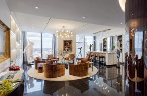
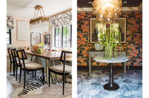
So he employed a mid-twentieth-century modernist style, something he and the clients both love, the kind of design we tend to associate with Prairie-style ranch houses and such designers as Marcel Breuer or Paul Frankl. Duffy designed custom pieces of furniture, including bedroom dressers and the dining-room table and cabinets, and kept to a light palette throughout the house. For the furniture they mixed modern designs with traditional textiles and traditional designs with modern textiles. They wanted visitors’ eyes to go to the ocean, not their design choices, but they also wanted to create a bit of surprise.
It was those surprises that started the subcontractors grumbling—in particular the staircase. Duffy and his clients had considered something traditional there, dark and wooden, but the stairs stood between rooms on the shore side and the windows onto the ocean. After much discussion they hit on clear panels with the softened quality of beach glass, supported in part by naval-inspired cables.
These modernist ingredients posed a technical challenge. A century-old house settles; the floors, walls and ceilings are rarely perfectly straight or square. If you stick to historic moldings and fixtures, Sleeper says, it’s fairly easy to make it look good; inconsistencies can be passed off as character. Modernist lines, however, require right angles and precision. He recalls installing one-foot-by-two-foot quartz tiles in the bathroom. You run them up the wall square and level, but when you get to the funky old ceiling, then what do you do? Sleeper says, “We worked it out.”
When it was all done, Sleeper’s subcontractors ate their words, he says. There’s enough history in the original hardware and trim to keep the look balanced, and enough of a modernist flair to make it feel new. Take, for instance, that staircase. As Sleeper explains, you can stand outside the house on the wall farthest from the water, look in the near windows, through the staircase and out the far windows to the ocean. And isn’t that the point of an oceanfront house? To see the ocean?
Says Sleeper: “It works.”
Architecture: Paul G. Gosselin, Salmon Falls Architecture
Interior design: Dennis Duffy, Duffy Design Group
Builder: Brian Sleeper, Period Design Restoration
Landscape design: Jacquelyn Nooney Landscape
Share
![NEH-Logo_Black[1] NEH-Logo_Black[1]](https://b2915716.smushcdn.com/2915716/wp-content/uploads/2022/08/NEH-Logo_Black1-300x162.jpg?lossy=1&strip=1&webp=1)




You must be logged in to post a comment.