Designer Snapshot: Transformations
October 23, 2013
By Paula M. Bodah
For Christina Sullivan Roughan, the whole process of design is fun, from the first concepts to the shopping for the perfect fabrics, furnishings, and accessories to the final result. “I always say that my favorite part of the job is the installation, when everything comes together and we bring a home to life,” she says. “But then my other favorite part is seeing the big smile on the client’s face when they see it for the first time. That is one of the happiest moments.”
Taking a look at the before-and-after shots of a Greenwich, Connecticut, home she redesigned recently makes it clear why her clients have such big smiles.
The client, a woman with a young son, envisioned a tailored look for her living room. “She wanted to get away from white walls, and put the focus on the room’s architecture,” Christina says. The designer covered the walls with grasscloth from Holly Hunt, then played up the moldings and fireplace mantel with white paint. Oscar de la Renta fabric and Ralph Lauren hardware outfit the windows, while contemporary furniture pieces with a dash of steel and Lucite add a touch of glamour while keeping the tailored look the client wanted.
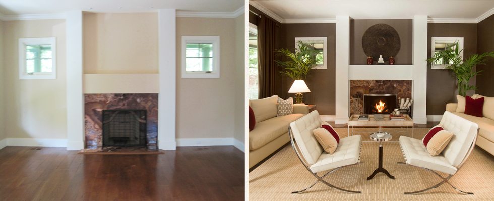
“After” photo by Neil Landino
The homeowner wanted to turn a third-floor room into a quiet place for reading, reflection, and meditation. Christina obliged by creating an oasis with a peaceful, spa-like feeling. An oriental rug in quiet blue and cream covers the wood floor, and a palette of navy tempered by off-white and lit softly by parchment-shaded lights turns the large, open space into a serene and cozy retreat. A Buddha statue placed before the round window speaks to the client’s Asian background and adds the final meditative touch.
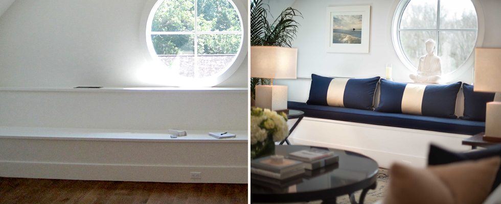
“After” photo by Neil Landino
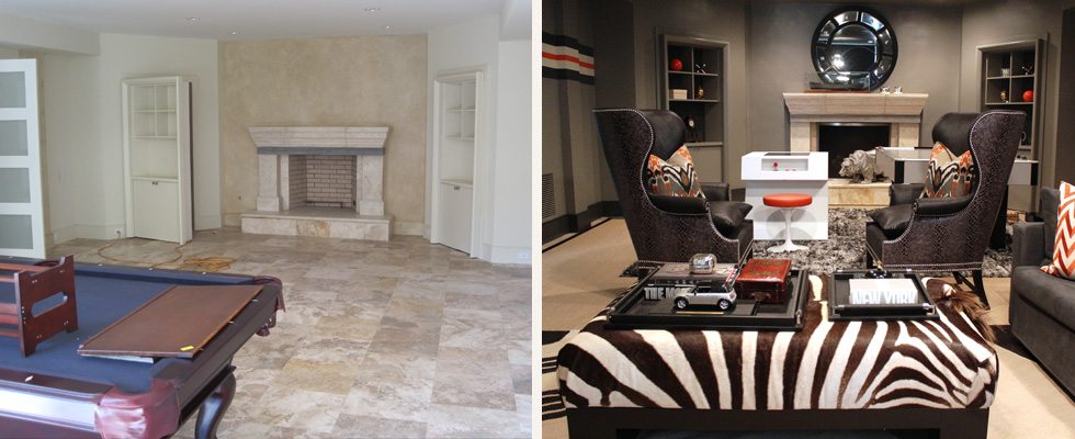
The homeowner’s son may be only middle-school aged, but, Christina says, he’s well-traveled and sophisticated. The basement media and game room, where he and his friends can gather, needed to be fun and masculine, but not little-boyish. His favorite colors are gray and orange, so Christina started there, painting the walls gray and embellishing them with a horizontal-striped detail that’s graphic and playful. The cold marble floor was covered with an indoor/outdoor carpet that’s both quietly sophisticated and durable. A hockey table and a 1980s game board offer fun, while roomy wing chairs make cozy spots for curling up with a good book. In a signature move, Christina painted the interior of the fireplace black. “I always like to make the brick disappear if I can,” she says. The result is a space that will suit tomorrow’s home-from-college student as perfectly as it does today’s twelve-year-old.
Share
![NEH-Logo_Black[1] NEH-Logo_Black[1]](https://b2915716.smushcdn.com/2915716/wp-content/uploads/2022/08/NEH-Logo_Black1-300x162.jpg?lossy=1&strip=1&webp=1)
