Designer Snapshot: Model Behavior
June 18, 2013
By Paula M. Bodah
I was perfectly happy with the sand, putty and deep yellow-gold paint I chose for my living room a decade and a half ago. The colors seemed to wrap the space in warmth and made me feel safe and secure. Lately, though, I find that those same hues make me feel closed in rather than safe and sap my energy rather than renew it. It’s time for a change. Naturally, I look to the designers I see on the pages of New England Home—and specifically, to some of the spaces designers and I have blogged about together over the past few years—for inspiration. I can see that some of the living rooms I’ve liked best have a few things in common. Perhaps a second look at a few of them will point me in the right direction.
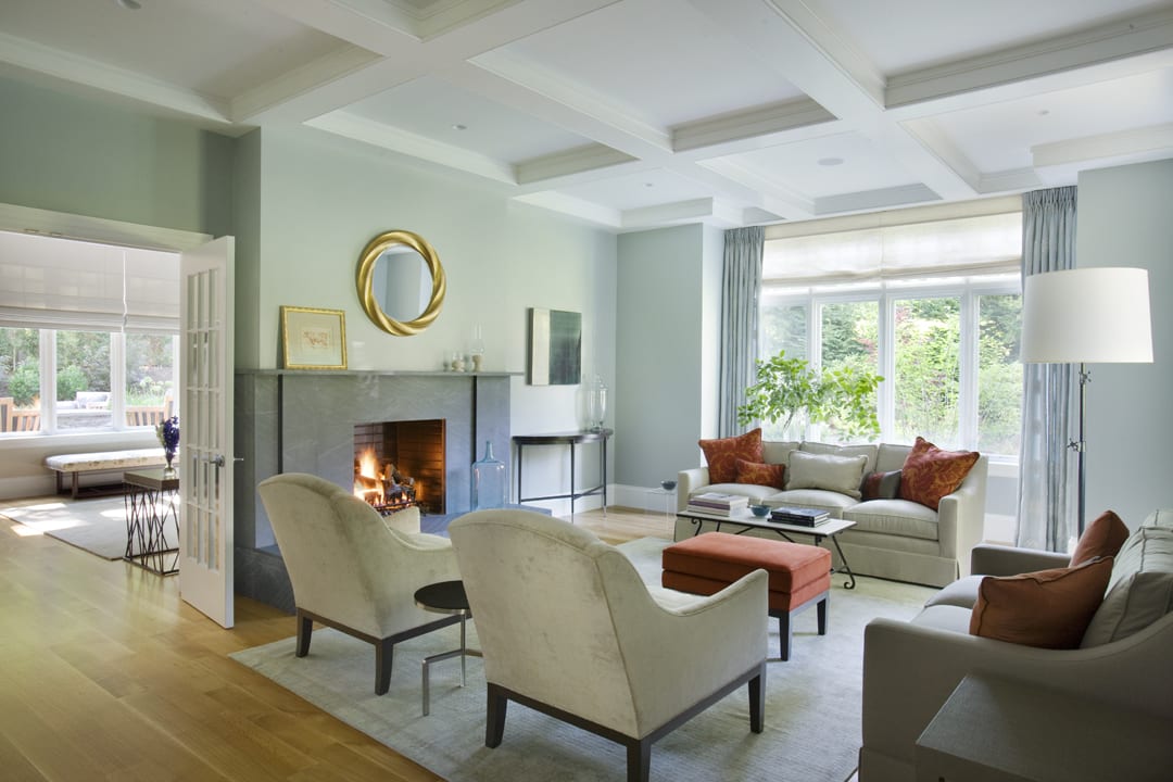
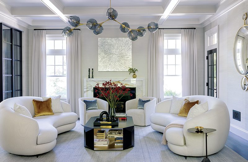
Photo by Eric Roth
I find the pastel walls in this living room designed by Christine Tuttle for a house in Wellesley Hills so appealing and soothing. I’d swap out my dark furniture for pieces like these with their soft neutrals. I love a good shot of color though, as well as a touch of something darker to bring all that airy paleness down to earth, so the cinnamon hues in the little bench and the toss pillows seem like a good addition. It’s a lovely, tranquil room. I wonder, though…is it a tad more placid than I want right now?
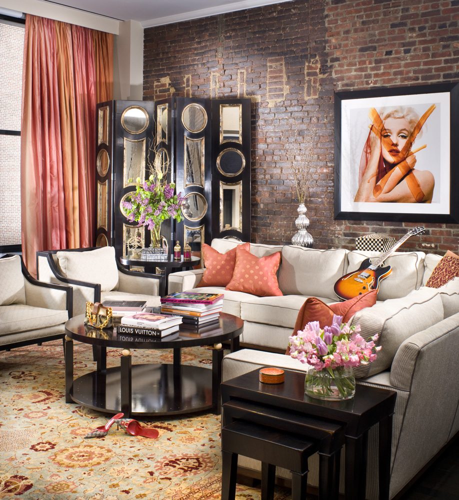
Photo by Mike Rixon, Rixon Photography, courtesy of Cebula Design
Michael Cebula designed this space for a Manhattan loft. Coral—or any orangey shade—is big on my list of favorite colors lately, and with the Asian influences and the contrast between the dark and light pieces of furniture, this living room has a drama that suits my current mood, too. I’m not about to install a brick wall, but I could paint one wall a brick color. It’s certainly going in a different direction from the room above, but I can imagine being happy here. On the other hand, maybe it’s a bit too dramatic for a suburban Rhode Island home.
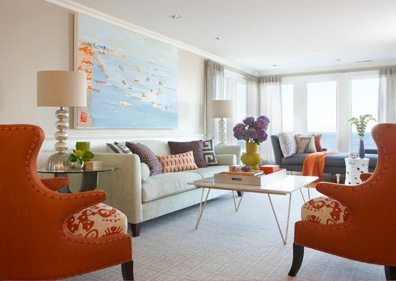
Photo by Michael Partenio
When I blogged with Rachel Reider back in January, here’s what she said about this photo. “I’m constantly looking for unusual color combinations and this Cohasset, Massachusetts, living room designed in shades of blue, purple and orange is one of my favorites. The blues and purples are soft and soothing, while the pops of orange bring a freshness to the space.”
Soothing and fresh, yes. I also love the way Rachel grounded the space in solids then added zest with a mix of patterns. I think I’ve found the space to model my own surroundings after. A room like this would strike the perfect balance, letting me relax—and recharge.
Share
![NEH-Logo_Black[1] NEH-Logo_Black[1]](https://b2915716.smushcdn.com/2915716/wp-content/uploads/2022/08/NEH-Logo_Black1-300x162.jpg?lossy=1&strip=1&webp=1)
