Designer Snapshot: Makeover Magic
February 15, 2012
By Paula M. Bodah
Williston, Vermont–based designer Lindsay Jaccom enjoys the challenge of taking a space that lacks character and focus and imbuing it with personality and style. Lindsay, whose favorite pieces for a master bedroom were featured in Perspectives in our January/February issue, sent in these before-and-after photos of a bedroom and living room she recently redesigned., taking them from dull to distinctive.
Lindsay’s clients wanted their master bedroom to have the feel of a high-end hotel.  She started by installing cherry hardwood floors and painting the walls a gold-toned neutral inspired by the palette of the rest of the house, giving the room the warmth it lacked. “I kept the clients’ end tables but brought in a ‘statement’ bed,†she says. “The upholstered headboard and matching bench add luxury.†A chandelier with crystal accents is a touch of the glamour her clients like. The warm walls and floor find a cool counterpoint in the light-blue accents. “I highlighted the massive window with blue-patterned curtain panels and sheers that diffuse the light beautifully into the space,†Lindsay says. Two blue gourd-shaped table lamps anchor the sides of the bed, and a custom-designed bolster pillow brings all the room’s colors together. “The end result,†says Lindsay, “is a chic, warm, hotel-like master bedroom.â€
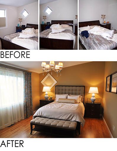
Photos courtesy of Lindsay Jay Designs
“This living room needed a major facelift,†Lindsay says, noting that, “there was no focal point or color story happening in the space, and the room was eclectic in a bad way.†The clients loved animal prints, so Lindsay introduced them in what she calls a “controlled manner,†in the rug and the two wing chairs. “To give the space dimension I used three different paint colors: one for the bottom part of the wall, one for the trim and one for the upper walls and ceiling,†the designer explains. The white brick fireplace was repainted to coordinate with the room’s new palette, and grasscloth applied to the middle panels adds texture. Sleek-lined furniture in soothing neutrals replaced overstuffed, floral pieces. Now, Lindsay says, the space has a warm, luxurious and pulled-together look and feel.
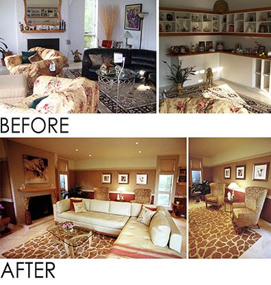
Photos courtesy of Lindsay Jay DesignsÂ
Share
![NEH-Logo_Black[1] NEH-Logo_Black[1]](https://b2915716.smushcdn.com/2915716/wp-content/uploads/2022/08/NEH-Logo_Black1-300x162.jpg?lossy=1&strip=1&webp=1)



You must be logged in to post a comment.