Designer Snapshot: In Living Color
May 8, 2013
By Paula M. Bodah
I’ve been struck by the vitality of the spaces designed by Jocelyn Chiappone of the North Kingstown, Rhode Island-based Digs Design Company. Even rooms outfitted in neutrals and pastels seem to pulse with energy, and classic pieces like a lovely old four-poster bed take on a new freshness, thanks to the fabrics, colors and textures she chooses as companions. Jocelyn, who was a featured designer for Perspectives in our May-June issue gives us a few tips about how she makes uses of color in her work.

Photo by Nat Rea
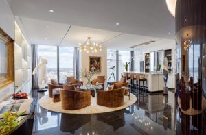
“Color doesn’t necessarily have to be on the walls,” says Jocelyn. “For this room, I chose to use it in the area rug and on the high-gloss ceiling. The neutral grasscoth wall is the perfect backdrop for the color palette. It is important to remember the role of finishes too. Here, the brass detailing on the lamps, artwork, sideboard, chandelier and mirror help give the room a cohesive feel. I did the horseshoe dining chairs in a chocolate color to make them pop.”

Photo by Nat Rea
“Don’t be afraid of using a saturated color in a small space. This room is long but not too wide. I like doing my upholstery in the same color as the walls. It blends nicely and does not overwhelm the room. The stripe carpet adds a bit of playfulness and the Lucite trunk is so perfect!”

Photo by Nat Rea
“If you want to use a number of different patterns, I think it’s smart to limit the number of colors. Here, I used several prints to make it fun and lively, but kept to a quiet palette of green and blue to keep it sane. Too many patterns with too many colors can be a disaster. The little pop of orange goes a long way. “

Photo by Nat Rea
“I like to take inspiration from the architecture and the surroundings. This window is the perfect backdrop for the gorgeous chandelier. The curve of the window gets repeated in the custom window seat, the scoop of the chairs and the print on the chairs. I let the chair fabric take center stage by doing the wall color and case goods in soft whites.”

Photograph courtesy of InStyle
Inspiration for design can come from anywhere, Jocelyn says. “I came across this photo of Julianne Moore and her husband at the Emmy Awards. I love the color, the classic form, the pop of red. I started thinking, if this were a room….”
…it might look like this:

“I’d showcase the gorgeous yellow in the Osborne & Little drapery fabric, and pair it with a fabulous Verellen sofa from Hudson and Mary MacDonald carpet, both in neutrals. With such a bold color, I’d keep the design elements classic in feel. The Vintage 1950s mirrors from 1stdibs and the demilunes from Oomph keep things sophisticated. The glass chandelier from Vaughan is the needed bling. I’d top it off with the Greek-key-themed red coffee table from Somerset Bay.”
Share


