Designer Snapshot: Hues You Can Use
January 29, 2014
By Paula M. Bodah
By now we’ve all heard that the Pantone color for 2014 is Radiant Orchid.
Not to worry, though, if you don’t love the idea of surrounding yourself with this particular shade of pinkish-purple. The key word here is radiant. Even before Pantone announced its winning color, designers like Elizabeth Swartz were blogging about the vivid, saturated hues that were trending as favorites for the new year.
Elizabeth blogged earlier this week about the virtues of orchid in the home. But, recognizing that not all of us will cotton to the color, and even fewer of us are inclined to redo our houses every year to follow a trend, she also offers some ideas for integrating 2014’s brilliant colors without a total home makeover.
“Add a fun rug to the foyer,” says Elizabeth. “This one, from Kravet, with its vivid waves of fuchsia and orange, would offer a dynamic greeting to visitors.”
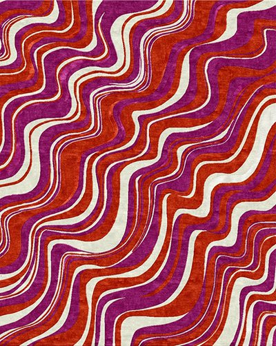
Kravet Renegade rug in fucsia
“Custom drapery in a bold, bright, favorite fabric can breathe new life into any room regardless of the surrounding decor,” Elizabeth advises. “In this room I used a bright wall color, but even with a neutral-toned wall, this floral fabric from Osborne & Little, or a similar one, could add the desired punch.”
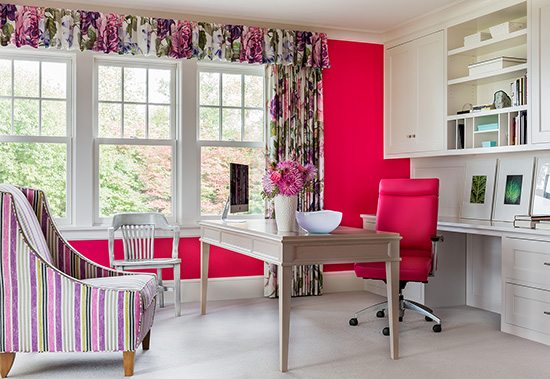
Photo by Michael J. Lee
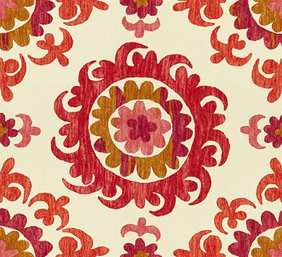
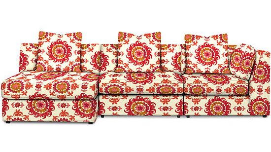
Spice up a neutral palette—and make a bold statement—by reupholstering a sofa in a fun fabric like Pekan, from Kravet’s Jaipur collection, shown here on Kravet’s Derring sectional sofa.
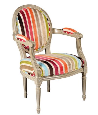
If understatement is more your style, add a small but colorful piece of furniture, like this Louis XVI medallion armchair from Grange, to a room.
Repaint part of a room in a vibrant color, like the brilliant geranium Elizabeth used for the ceiling of a mostly white bathroom. “Adding color to even a small part of a room will make a big statement,” Elizabeth says. “There are many bold, fun colors that are on trend for 2014. No matter which color you choose, it is sure to freshen up your home!”
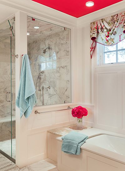
Photo by Michael J. Lee
Share
![NEH-Logo_Black[1] NEH-Logo_Black[1]](https://b2915716.smushcdn.com/2915716/wp-content/uploads/2022/08/NEH-Logo_Black1-300x162.jpg?lossy=1&strip=1&webp=1)
