Designer Snapshot: Grounded in the Classics
July 31, 2013
By Paula M. Bodah
Meredith Bohn credits her years of traveling in Europe for the classical approach to design that forms the basis of her practice. The Hollis, New Hampshire–based designer doesn’t stick with an Old World sensibility however. She incorporates the best of contemporary design to create spaces with a timeless sense of style. Meredith, whose selections of beautiful things for the home in all the colors of summer were featured in Perspectives in our July-August issue, shows us some of her recent projects that combine classic and contemporary with beautiful results.
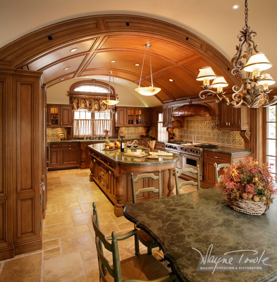
Photo by Greg West Photography
“I think this project is a good illustration of fresh, classic design. It makes creative reuse of architectural elements and found objects, such as the column arch and stained-glass panel and the incorporation of a vintage cabinet into the new kitchen cabinets and layout, in an unexpected way,” Meredith explains. “I chose classic elements, such as the porcelain tile laid out in a modified Versailles pattern, and honed soapstone and marble counters. The house is a late 1970s contemporary ‘rustic chalet’ style with cathedral ceilings and some rustic ceiling beams that shout ‘dated.’ I incorporated those details, while creating fresh, open and unexpected spaces. The contemporary industrial chandelier from Restoration Hardware is the perfect illustration of a classic with clean simple lines echoing some of the architecture. This takes the look beyond ‘trend’ and into ‘timeless.’ ”
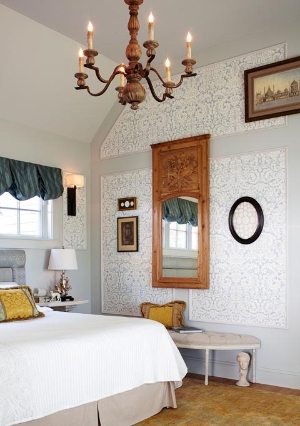
Photo by Greg West Photography
“This bedroom is an example of another contemporary space designed using classic elements,” says Meredith. “The use of paneling and wallpaper to create better proportion and scale is a time-honored technique. I used a combination of antique furniture with modern comforts (a king-size bed and upholstered headboard) to create a serene, restful retreat. This space is in Harmon House, the 2012 York Historical Society Designer Show House. The room had four doors and three windows (all different) and nothing was symmetrical or balanced. Proportion and balance create a room that is more comfortable and timeless. I transformed the space by adding the paneling and diminishing the impact of the moldings around all the openings with subtle paint color choices. The furniture is quite minimal, but each piece was chosen for patina, classical style and clean lines to enhance the modern sense of the space.”
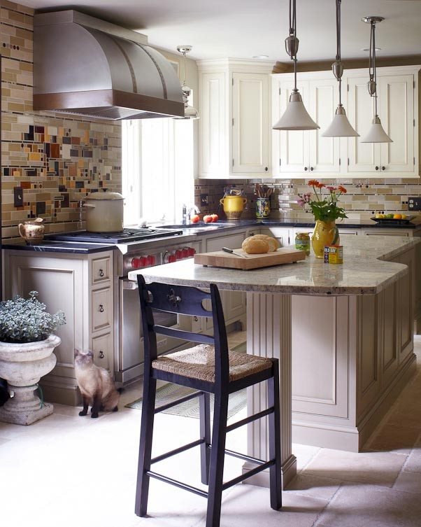
Photo by Greg West Photography
“Here’s another kitchen that also shows a fresh take on ‘timeless’ with some bold choices that reflect personality and yet will never feel dated. Absolutely traditional cabinets that are detailed, yet simple will stand the test of time much better than ornate moldings and heavy details. A mix of honed counter surfaces is functional and adds interest. I like incorporating unexpected color choices, so the backsplash is bold, yet the color palette is essentially neutral. The window is totally contemporary and is juxtaposed with classic cabinets and stove hood. The tumbled limestone floor is done in a timeless, random paving pattern and softens many of the hard-edged aspects a kitchen tends to have. As always, vintage touches add the patina of age and natural textures soften the stainless steel elements.”
Share
![NEH-Logo_Black[1] NEH-Logo_Black[1]](https://b2915716.smushcdn.com/2915716/wp-content/uploads/2022/08/NEH-Logo_Black1-300x162.jpg?lossy=1&strip=1&webp=1)
