Designer Snapshot: Behind the Magic
January 16, 2013
By Paula M. Bodah
The Potter Estate in Newton, Massachusetts, wowed everyone who stopped in to see the beautiful work done by the area’s top designers who transformed the 1862 house for the 2012 Junior League of Boston Show House. The team of Kate and Paula McCusker, partners in the Boston design firm Theodore & Company, created the living room, a lovely space that blended classic and modern in a serene palette of blue and cream. I thought it would be fun to get a glimpse of what it took to turn a bare space into the kind of welcoming room Kate and Paula imagined.
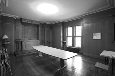
The space was originally a chapel, complete with an altar and stained-glass windows.
 Photos by Eric Roth
“It was a huge task to disassemble the chapel and then remove all the paneling and moldings,†says Kate. “It was even more of a monumental task to then put the room physically back together again.â€
Here, the walls have been ripped to the studs, revealing a space behind the altar. Kate and Paula saw the beautiful possibility of an alcove. “We removed the molding surrounding the bay windows so we could create an alcove with two 90-degree angles. We extended the walls to the left and right of the opening to create a more intimate alcove,†Kate explains. “The entire space had to be boarded and plastered. We then had to install new baseboard moldings and moldings around all the doors and windows. Once the alcove was created we ran into the problem that the original plaster molding at the ceiling of the window bay was removed or damaged behind the altar. In order for the new walls to match with the existing, we had to have a plaster mold made of the original molding.”
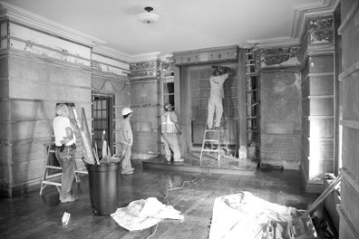 The existing walls in the room had to come down.
Kate and Paula disguised the stained-glass windows with a custom-colored wooden blind to allow light to come through, a cream cashmere Roman shade and long cashmere draperies. The hardware by the Bradley Collection was chosen for its beautiful finish as well as for the design. “The hardware was installed ‘wall to wall’ at the top of the alcove, as there are pipes running up the side walls of the alcove!†Kate says. “This was a bit of a design challenge.â€
For extra light, the designers added custom-designed malachite eglomise mirrors on the two new walls at either side of the desk bay to reflect and allow light to pass around the space.
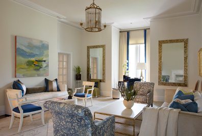 The finished product.
“French doors led into the living room from the sitting room and foyer,” Kate says. “As you can see in the photo, there was not a single anchor wall. Each wall was interrupted with an alcove, a bump-out or doors. It was a challenge to create a sense of balance and symmetry in the space.â€
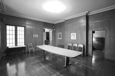 A lack of anchor walls was an initial challenge.
The furniture Theodore & Company designed for the living room, including the backless sofa scaled to fit the wall space, creates a harmony in the irregular physical space. “The painting above the backless sofa, by the late abstract expressionist Luc Leestemaker from the Galerie D’Orsay in Boston, captures the living room’s tranquil color scheme accented with bursts of deep color and then expands upon it,†Kate says. “The large scale of the painting also works fantastically with the long, wide ceilings.â€
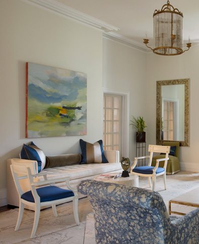 Theodore & Company designed the backless sofa pictured here along the wall.
Share
![NEH-Logo_Black[1] NEH-Logo_Black[1]](https://b2915716.smushcdn.com/2915716/wp-content/uploads/2022/08/NEH-Logo_Black1-300x162.jpg?lossy=1&strip=1&webp=1)

You must be logged in to post a comment.