Designer Snapshot: A Star with Stripes
November 6, 2013
By Paula M. Bodah
Eric Roseff loves stripes. Those of us who aren’t designers by training might feel intimidated at the idea of introducing so bold a concept to our decor—let alone mixing the stripes with other patterns. Eric goes boldly where the rest of us might fear to tread. “Stripes are classic and timeless,” he says. “They can add visual height and depth to a space. They also mix and match well with other patterns like dots, checks, and plaids.” The Boston designer, who showed us some of his favorite things with bling for the home in our November-December issue, doesn’t confine his passion for stripes to his work. “I love to mix stripes with other patterns in my wardrobe as well,” he says.
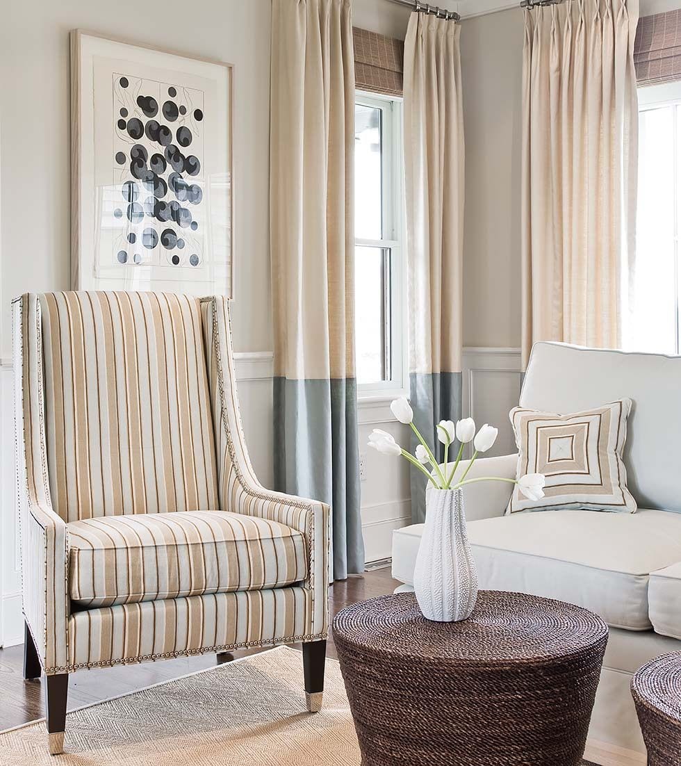
Photo by Michael J. Lee Photography
Stripes can be classic and classy, as this space in a Nantucket home proves. “I wanted to carry the stripes throughout in different incarnations and scales,” Eric explains. “I used the stripes on the chair, then used the same fabric for the pillows, but cut and mitered for a different effect. The color blocking in the drapes creates another scale of stripes. “
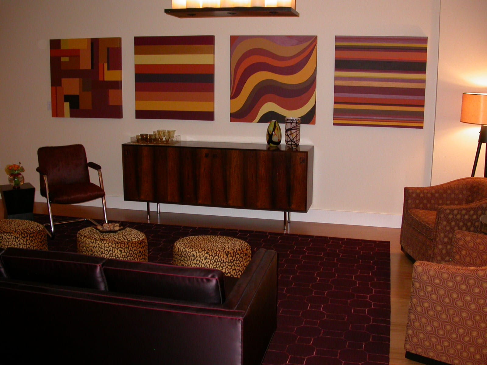
Photo by Desroches Photography
For this urban space in Boston’s South End, Eric pulled out his paintbrush and executed the graphic art on the walls. “I like all of the different striped patterns mixed together, using the same palette in each,” he says. “I also like how the patterns play against the fretwork pattern in the Stark carpet. There’s a lot of life and motion in the space.”
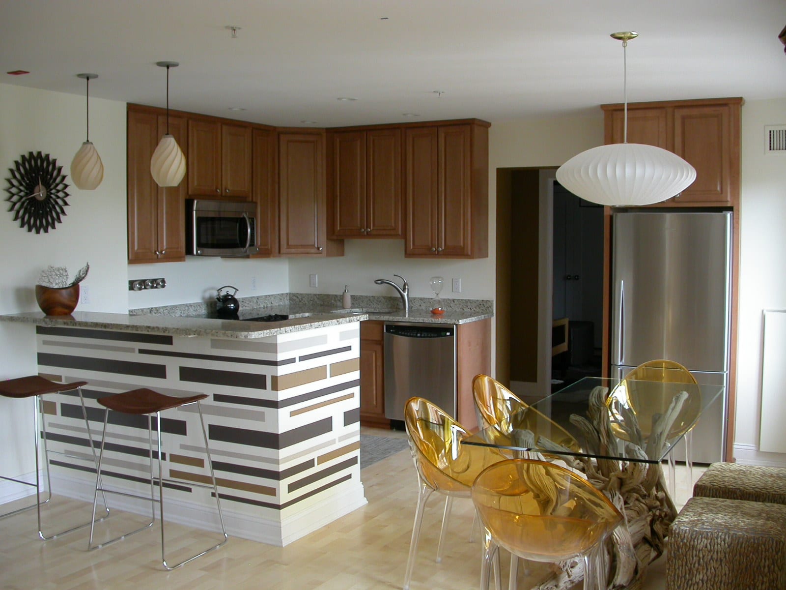
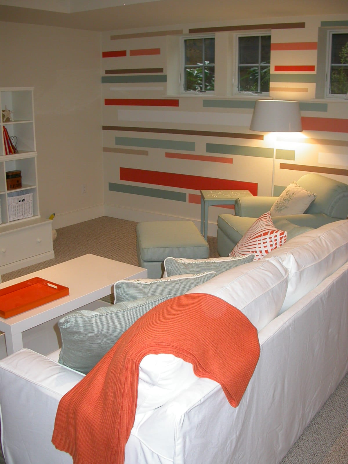
The kitchen is in an apartment in an older, renovated building in Brookline, Massachusetts, while the vivid children’s playroom sits in a Nantucket home. “In both spaces, the pattern really punches things up and adds some life and whimsy to the rooms. In the kitchen, I liked the way the pattern in the peninsula worked with the lines of the wood floor.”
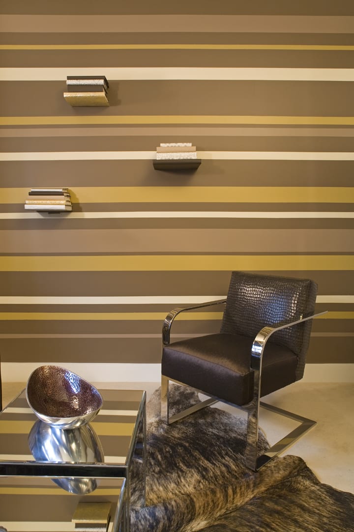
Photo by Desroches Photography
“In this space the horizontal stripes really open the space. The stack books ‘floating’ on the wall create another horizontal line pattern, made even more interesting by the different bindings.”
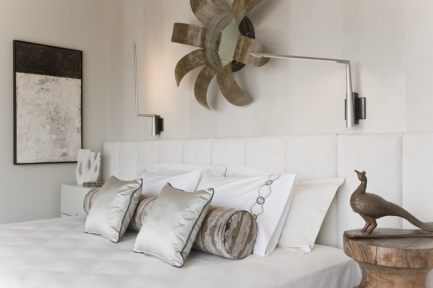
Photo by Michael J. Lee
Stripes can be subtle, too. “These stripes, done in Venetian plaster, go up the wall and onto the ceiling, creating a canopy effect,” Eric explains. “The lines of the channeled headboard line up perfectly with lines of wall stripes. This really helps to visually increase the ceiling height in this space.”
Share
![NEH-Logo_Black[1] NEH-Logo_Black[1]](https://b2915716.smushcdn.com/2915716/wp-content/uploads/2022/08/NEH-Logo_Black1-300x162.jpg?lossy=1&strip=1&webp=1)
