Design in Depth: The Gripe with Green
January 23, 2013
By Stacy Kunstel
Of the dozen “official†colors of 2013 Emerald Green (determined by Pantone) is my least favorite. Sure it can be done right, like in this image I saw in Elle Décor, and in the examples Kaitlin Madden posted here recently, but for me, the lack of warmth has seeped into my bones now and I long for something meatier.
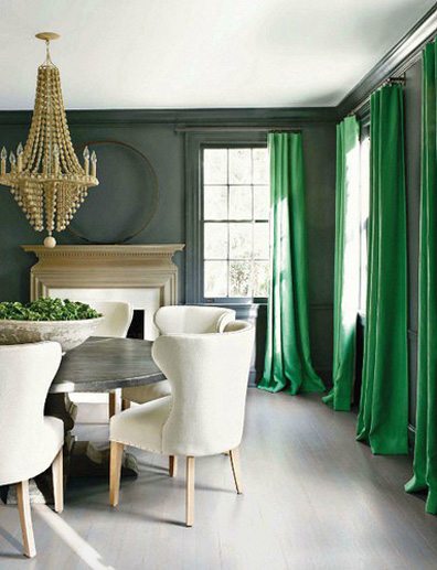 Photo via Elle Decor
I’m not sure when we started having all these different colors of the year, but it’s getting to be a bit much. Benjamin Moore has determined Lemon Sorbet as it’s star while if you were worried about Pantone’s color of the year not being your favorite it has also released a spring color of the year called Monaco Blue.
 Photo courtesy of Pantone
But back to green. Did Pantone really think that designers would drop their white paint rollers and start painting walls as green as an unblemished lime? Who looks good in that color anyway?
 Photo courtesy of Yahoo
Oh, my bad. The Duchess of Cambridge looks stunning in that color. Well, those of us who lack those lustrous brown locks and are burdened with blonde look more like a cadaver under fluorescent lights in a green room.
I can’t even think of positive words to associate with green—wheatgrass, frogs, snakes, itchy grass, mold, gangrene, eco-friendly, allergies, the Amazon—I’m tapped out.
So when I saw this photo I was nearly pushed over the edge. A green kitchen. I could lose a lettuce leaf in there and starve to death looking for it.
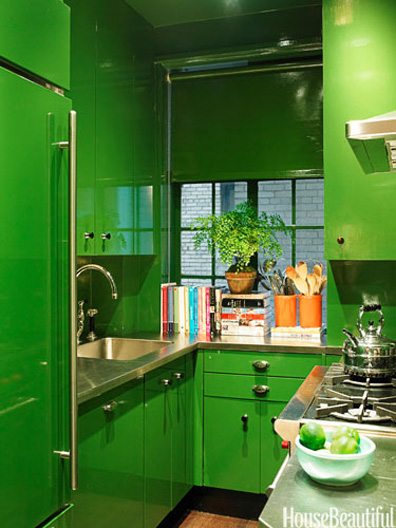 Photo courtesy of House Beautiful
But perhaps just a touch of green—just enough to hide germs and the creatures that live on the hands and under the fingernails of 8-year-olds might be okay. Until I see one of our New England designers use it successfully though I’m sticking to less lively colors.
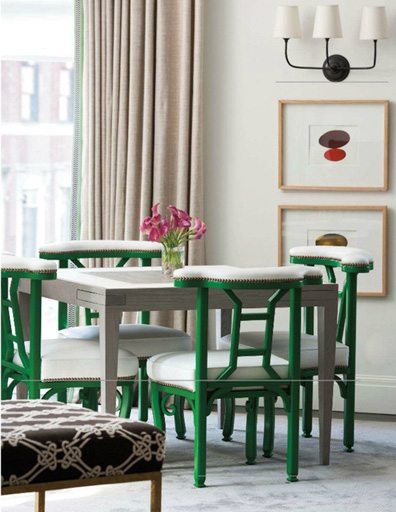 Photo courtesy of Traditional Home, via Pinterest
Share
![NEH-Logo_Black[1] NEH-Logo_Black[1]](https://b2915716.smushcdn.com/2915716/wp-content/uploads/2022/08/NEH-Logo_Black1-300x162.jpg?lossy=1&strip=1&webp=1)





You must be logged in to post a comment.