Design in Depth: Bed Post
July 13, 2011
By Stacy Kunstel
True confessions time. I hate making beds. Making a bed look good in a photo shoot is an absolute nightmare. It’s like trying to make a 27-ingredient recipe when you’re short on time. Think about it–you’ve got wrinkly cotton fabric all over the bed, a bedskirt, multiple pillows. Further complicating matters is that many beds in master suites are king size, which means the bed looks like the size of an aircraft carrier in the photo.
Still, I do have a few memorable beds to share with you. Take them as inspiration next time you make yours.
Tip #1
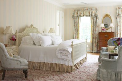
When photographing a bed, it helps if you can back far away from it and you don’t see much of the sheets in case they are wrinkled or put an amazing coverlet over the end of it. This gorgeous bedroom is by Claire Maestroni of Mis en Scene in Greenwich.
Tip #2
Press your sheets for hours until they look perfect, like in this bedroom by Karen Kaali-Nagy. A true bed stylist (there are people who do that for a living) would start by washing the sheets, drying them and pressing them.
Tip #3
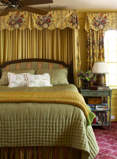
Multiple-colored fabrics will prevent you from spending hours ironing your sheets. I loved that when I walked into this Nancy Serafini-designed master suite that it only needed flowers. No steamer, no fuss.
Tip #4
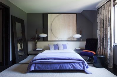
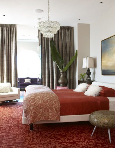
If you have trouble making a bed, go modern with a platform bed to make neat bed making easier. That was how interior designer Jeanne Duval handled this particular room.
Tip #5
When in doubt, just give people so many things to look at that they don’t know where to look to find the creases! I adore Carolyne Roehm and her gorgeous bedroom!
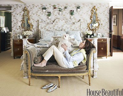
Photo courtesy of House Beautiful
Share
![NEH-Logo_Black[1] NEH-Logo_Black[1]](https://b2915716.smushcdn.com/2915716/wp-content/uploads/2022/08/NEH-Logo_Black1-300x162.jpg?lossy=1&strip=1&webp=1)








You must be logged in to post a comment.