Crossover Hit
October 15, 2013
Text by Stacy Kunstel Photography by Nat Rea Produced by Stacy Kunstel
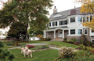
The water is rushing this autumn morning, whooshing against the mossy sides of a stone creek bed and under an arced wooded bridge. On the clipped front lawn of the four-acre property, hydrangea trees cling to their last blossoms. The backyard pond lies calm—except for the fountain sending up its dazzling rainbow spray—and dotted with the first fallen leaves. The bucolic setting, complete with bird calls, would lead you to believe you were on an old Litchfield County estate rather than smack dab in the middle of Darien.
The house, originally a 1950s ranch, had already been reimagined as a classic Shingle-style structure by builder Kent Eppley in concert with Norwalk architect Robert Cardello. He lived here with his family for four years, until the children started getting older and it was time to take on something smaller than the roughly 8,000-square-foot home. The new owners, a family with three young girls, loved the traditional exterior of the house but had much different ideas for the interior. They turned to Fairfield architect Martina Burin to convert the core into a more contemporary living space, and brought in interior designers Kathleen Manchester and Catherine Holleman Branch, of Pawtucket, Rhode Island, to impart an appropriately modern tone to the decor. Eppley graciously stayed on as builder, transforming the house once again for the new owners.
The building’s proximity to the pond meant the footprint couldn’t change, but inside and in the air above anything could happen. “Our goal was to respectfully work with a traditional home, but with a super-clean interior plan,” says Burin.
That meant opening the house to the outdoors whenever possible and bringing in as much natural light as was feasible. To make way for the sweeping interior changes, most of the house was gutted, and some rooms were rearranged and realigned.
Manchester and Holleman Branch strove to straddle the traditional-meets-contemporary mix in terms of furnishings, art, and accessories. “The transition, from outside to in, couldn’t be shocking or disconcerting,” says Manchester. “The clients wanted the interiors to be warm.”
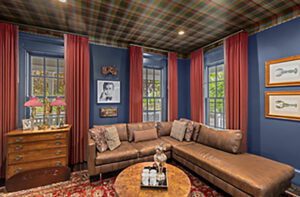
Up the stone steps, past the shingled porch, and into the foyer the transition is subtle. Paneled walls with barely-there crown and base moldings signal a break from the past. Through the foyer to the right lies an open, formal living room that flows into the dining room and beyond to a leather-paneled billiards room and the husband’s office, with its hunting motif.
From the front door, visitors spy a sliver of the water view that lies beyond the vast family room and deck. “In terms of detailing, we tried to keep things as simple as possible,” says Burin. “It’s all about leading you to the water view. You get a sense of one space flowing into the next. I wanted the foyer to be a portal, not a destination.”
The flow fits the family’s love of entertaining. While the narrow living room’s loose arrangement feels designed for cocktails and small bites, the adjacent dining room with its upholstered chairs invites lingering. Flanking the room’s commanding mantel is a pair of 1950s gilded chests holding sleek ceramics and a sculpture. On the opposite wall, two cages of iron and glass hold the couple’s wine collection. “The clients had seen Jennifer Aniston’s grotto wine cellar in a magazine and loved the idea of having a wine room in the dining room,” says Manchester. “A stone grotto would’ve looked crazy, so we did the cages with the metal grid.”
“It keeps the room from being overly formal,” says Holleman Branch. “The room wouldn’t be as dynamic without it, and I think shows the adventurousness of the client.”
Doors that open to the terrace help the room embrace the outdoor vistas. “My goal was to reference every space back to the wonderful view,” says Burin.
Nowhere is that view on bigger, better display than in the large family room. Here Burin removed a roof gable, dropped the vaulted ceiling, and installed knotty alder beams, creating extra space for the new master bedroom that wraps over the top of the house. In contrast to the traditional look of the ceiling, the fireplace takes a contemporary tone, with its hearth made up of a single slab of bluestone balanced on eight-inch steel balls. A modern coffee table pairs with more-traditional, rounded-arm sofas and chairs, while the wool rug and grasscloth blinds keep the look casual. The designers kept the palette quiet, letting texture, rather than color, provide visual interest and a sense of warmth.
In the kitchen, which sits off the family room, it’s hard to tell where the walls end and the cabinetry begins. One line flows into the other through a combination of open, glass-front and simple paneled cabinets that provide plenty of space for both storage and display. Here, as in the rest of the first-floor rooms, a mixture of wood, rough stone, and sleek metal creates a sophisticated feel. In the center of the room, a T-shaped island with large raw-wood Xs on each end provides an informal dining area that supplements the breakfast table and chairs nearby. The natural wood of the island and the ceiling “sort of knits the space together,” says Burin.
The remodeling included building an addition above the family room to create a master bedroom and bath overlooking the pond. Pale walls, white ceilings, and large windows give the whole suite a sense of lightness, but the master bath seems almost to hover on some otherworldly plane. Burin designed a shower that looks like a floating glass box, while a legless vanity and high-gloss white finishes add to the room’s airy feel.
The space is a serene getaway for the new homeowners, especially this time of year when they can look out over that tranquil pond with its backdrop of trees ablaze in the colors of autumn. And, like most every other spot in the house, it’s also one more area that makes the most of a property worth marveling at no matter the season. •
Architecture: Martina Burin, Vicente-Burin Architects
Interior design: Kathleen Manchester and Catherine Holleman Branch, Hollester Interiors
Builder: Kent Eppley, ERI Building & Design
Share
![NEH-Logo_Black[1] NEH-Logo_Black[1]](https://b2915716.smushcdn.com/2915716/wp-content/uploads/2022/08/NEH-Logo_Black1-300x162.jpg?lossy=1&strip=1&webp=1)



You must be logged in to post a comment.