Contemporary on the Maine Coast
August 24, 2020
Text by Paula M. Bodah Photography by Trent Bell
How did the owners of this home know it was the right place for them? By the way their heart rates slowed as they walked the property. “We’d walk around it and just exhale,” says the wife.
Like so many houses on the Maine coast, this one, perched above the bank of the Damariscotta River in Boothbay, was blessed with striking vistas. Still, the couple felt a pull that went beyond the postcard-worthy sight of lobster boats on summer mornings and the more distant views of Inner Heron Island and the ocean beyond.
“A lot of the properties on the Maine coast are rocky and elevated,” the wife says. “This one was just a little more gentle. It had the dramatic views, the typical Maine beauty, but it felt more approachable.”
The house, on the other hand, lacked the same welcoming spirit. Three imposing garage bays dominated the front elevation, and a split-level guest wing on the south end blocked light into the main living areas. Even the eastern views to the river were compromised by small windows and low ceilings. “It had a lot of square footage they didn’t need, and additions had taken away from the original home,” says Jessie Carroll of Whitten Architects. “The story for us was really one of reduction.”
Carroll and her clients decided to demolish the guest-wing addition entirely, letting the southern light flow freely into the rest of the house. To make room for visitors, the three garages were reconfigured and integrated with the house to become guest suites that flank the entry hall.
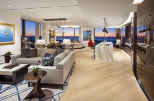
As the trio assessed the main living area, the plan to renovate morphed into a total gutting to create an open plan with lofty ceilings (“My husband is six-four,” says the homeowner. “The windows were so low, he couldn’t see out of them.”). The space is now a light-filled expanse that begins with the sleek, clean kitchen, moves through a dining room grounded by a graphic wool rug and a custom-crafted walnut dining table, and then on to a living room populated with sofas outfitted in oatmeal-hued linen slipcovers and cashmere pillows for a kick-your-feet-up vibe.
“We wanted a place where you’d kick off your shoes,” the homeowner says, “not because you’re worried about messing up the house but because you feel comfortable enough to do that.”
The stucco-clad, double-sided fireplace that separates sitting and dining areas adds a cozy note and brings down the scale of the high ceilings. Tall sliders in the dining room open to an oft-used screened porch—really a three-season living room complete with wood-burning fireplace.
Designer Krista Stokes’s palette consists of grays, off-whites, and subtle blues. A quiet interior keeps the focus on the outdoors, she notes. “We used wool, cashmere, linen—soft, natural, tactile materials—layered in for comfort and interest without distracting from the landscape.” The screened porch breaks out a bit, sporting sofa and chair cushions in zippy red and white.
Landscape architect Todd Richardson’s plan has an understated simplicity that couldn’t be a more perfect complement to the house. “We took our cues from how nature might do things,” he says. That meant using native plants such as ferns, huckleberry, and bayberry accented with natural granite slabs and boulders. “The beauty is in the subtleties,” Richardson says. “It’s a quieter landscape, a humble outdoor space that works well with the home and with the clients.”
Quiet, unassuming, and welcoming is exactly what the couple wanted. At this getaway house, shoes are definitely optional.
Architecture: Jessie Carroll, Whitten Architects
Interior design: Krista Stokes, Krista Stokes Design
Builder: Marden Builders
Landscape design: Todd Richardson, Richardson & Associates
[WPSM_COLORBOX id=73546]
Share
![NEH-Logo_Black[1] NEH-Logo_Black[1]](https://b2915716.smushcdn.com/2915716/wp-content/uploads/2022/08/NEH-Logo_Black1-300x162.jpg?lossy=1&strip=1&webp=1)




You must be logged in to post a comment.