Tour a Contemporary Home in Brookline
November 29, 2018
For all its abstract, sculptural looks, a Brookline, Massachusetts, house is skillfully attuned to its venerable neighborhood.
Text by Bob Curley Photography by Richard Mandelkorn Produced by Kyle Hoepner
Fundamentally, most traditional home designs aren’t terribly different from a child’s drawing of what a house is supposed to look like, full of familiar features like eaves, gables, and windows bracketed by shutters.
Designing a contemporary home, on the other hand, “dispenses with all those things and works with abstract forms”—essentially rectangles and squares—says architect Marcus Gleysteen. The challenge in a project like this striking home in Brookline, Massachusetts, he says, is balancing the size of the house to its shape. “It’s difficult to make a two-story modern home look like a house, rather than a small museum or high-school science building,” he says.
The owners envisioned a house full of natural light, for example, but Gleysteen also needed to scale windows to be “house sized.” A floating canopy over the entry and a brise-soleil running the length of the house helped break up the blockiness of the design and reduce the sense of height, bringing the home down to human scale. “It’s abstract and sculptural, but also completely accessible,” Gleysteen says, with every square foot tailored to meet the everyday needs of an active family with a busy social and entertaining schedule.
Beds of carefully tended ornamentals, tall groomed evergreens, and planters flanking the steps to the front door, installed by landscape architect Michael Coutu, also help connect the home to its environment and soften some of the sharp edges of the design. “The planters provide seasonal color as well as dress up the entrance,” Coutu explains.
None of this means that the home lacks drama, however. Entering it is like stepping into an art gallery. The staircase, a geometric marvel in metal and glass, is reflected in a wall-sized slab of wood polished to a mirror-like sheen. Designed by Gleysteen and interior designer Manuel de Santaren, the panel was inspired by the work of prominent minimalist sculptors such as Sol Lewitt, Donald Judd, and John McCracken. “The wood panel helps to warm up a large volume of space,” de Santaren says. “We knew we had some great vertical real estate, so there were times where we wanted to make a visual impact with art,” which largely came from the owners’ collection of concretist works by South American artists of the 1960s and 1970s.
“This one space brings the whole house together,” says Gleysteen of the glass-walled entry hall, which he likens to the overture to the symphony of the rest of the home. “All of the upstairs bedrooms are grouped around this staircase that brings you down to the living room and dining room.”
Hanging above the stairs is a literal greeting to guests—a crystal chandelier forming the pattern of a voiceprint of the word “welcome.”
Even more dramatic is the monumental slab of marble hung above the living room fireplace, another reflective surface that embellishes an otherwise bright, white room. With its natural striations and whorls, the marble panel is “almost an abstract painting,” says de Santaren. The durable piece also works well for a spot where heat from the fireplace might damage other more fragile works of art.
The panel makes a nice backdrop when the family settles into the living room couches to watch TV. An AV system installed by Maverick Integration simultaneously lowers a movie screen in front of the hearth, drops a projector from the ceiling, and shades the windows in the room. That’s a good illustration of how the home is, in Gleysteen’s words, “fully programmed.”
The custom furnishings that fill the rooms come from what de Santaren describes as “the great contemporary workrooms,” including J. Robert Scott, John Boone, and Holly Hunt. The design is understated, but deliciously tactile, thanks to de Santaren’s use of varied textures and warm materials like leather. A cerused oak bar topped with Egyptian onyx stands as an example of the designer finding opportunities to layer textures to keep things from feeling too austere.
“We wanted a very quiet environment, he says, “because we didn’t want to distract from the landscaping and the old-growth trees on the property. The house is clean and sleek, but not clinical.”
Brookline may seem an unlikely setting for such a bold design. “This house is an object in the landscape, rather than pretending it’s not there,” Gleysteen says. The Boston suburb isn’t the design monoculture one might expect, however, with some modernistic homes dating back to the 1930s sprinkled in among the colonials.
“Typically, we expect the client to want a more traditional home, and we have to talk them into doing something more contemporary,” says Gleysteen. “In this case, the owners wanted a modern home, but they didn’t think they could do it in that part of Brookline.”
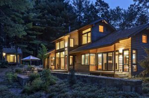
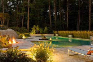
Coutu’s carefully considered landscaping helps to integrate the home into its rare two-acre lot as well as the surrounding neighborhood. Evergreens planted along the perimeter screen the home from neighbors, while a low wall at the back of the yard helps define the property.
A tennis court was sunk about five feet into the ground to minimize its visual impact, and a series of long limestone steps softens the elevation change from the back of the house to the pool and creates continuity between the home and the outdoor spaces.
“The steps give the sense that the living room and dining room flow right into the back lawn,” says Coutu. A bold abstract sculpture by Venezuelan artist Lugufelo, centered on the pathway, draws the eye across the pool and patio with its shaded loungers and sheltered pool cabana.
Effortless in execution, the house is of a piece with those neighbors who had the foresight to embrace the twentieth and twenty-first centuries even when surrounded by homes from the eighteenth and nineteenth. And like its neighbors, no matter what century they represent, “It’s designed in a way that it will be just as nice fifty years from now as it is today,” says Gleysteen.
Project Team
Architecture: Marcus Gleysteen, Marcus Gleysteen Architects
Interior design: Manuel de Santaren
Builder: Kenneth Vona, KVC Builders
Landscape design: Michael Coutu, Sudbury Design Group
Share
![NEH-Logo_Black[1] NEH-Logo_Black[1]](https://b2915716.smushcdn.com/2915716/wp-content/uploads/2022/08/NEH-Logo_Black1-300x162.jpg?lossy=1&strip=1&webp=1)




You must be logged in to post a comment.