Contemporary and Minimal in Maine
February 19, 2023
Grounded in the forest while simultaneously soaring above the sea, this modern marvel in Maine is rooted in the now.
Text by Erika Ayn Finch Photography by Paul Warchol


Frank Sinatra once said being modern isn’t about the future; it’s about the present. And the team that designed this 5,500-square-foot, two-story, orthogonal home in mid-coast Maine went to great lengths to make sure nothing distracts their client from being present. Save for a thoughtfully curated art collection, the immediacy of the landscape—and the occasionally dramatic coastal weather—is in the pilot’s seat.
“Design like this fosters an uncluttered mind and sense of calm,” says interior designer Tracy Davis.
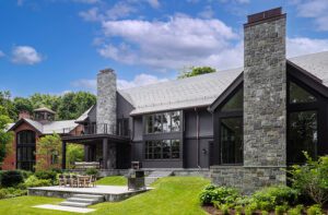
Nature drove most of the design decisions, explains project architect JT Loomis, in both subtle and obvious ways. There are the expanses of glass, of course, that frame are-you-kidding-me views of the ocean. In one of several nods to the trees on the three-and-a-half-acre parcel of land, builder Ken Hough used hemlock planks to achieve the right texture for the board-formed concrete that clads the lower level. Loomis points to the galvanized-steel columns that support the upper level. “Some are angled, and some are plumb,” he explains. “Not only does that reinforce the structure’s lightness, it also relates to the landscape. Trees don’t always grow straight; the scale and geometry of the columns relate to the trunks in the forest.”
Speaking of the upper level, airy phenolic panels contribute to the sense that it’s ready to take flight. “We wanted to contrast the two volumes,” says Loomis. “The bottom feels grounded, while the upper almost seems to float.”
That floating sensation continues inside where an Escher-esque glass-and-steel staircase with wood treads cantilevers above the dining area. Floating walnut-veneer kitchen cabinetry opens pneumatically; a stand-alone section that houses appliances on the kitchen side boasts a drop kiosk and coat-closet storage on the opposite entry side. Rather than use walls to distinguish the kitchen from other living spaces, a configuration of seventy pendant lights acts as a divider while bringing a sense of scale to fourteen-foot-tall ceilings.
In the living room, Davis custom designed a freestanding quartz-and-metal alcohol-burning fire element to break up that expanse. And upstairs, the homeowner’s office seems to flow out into the surrounding trees. A glass desk and linear lighting all but disappear, while a custom credenza hides every last cord, printer, and sheet of paper. “We did not want the furniture to steal from the show,” Davis says.
Indeed, indoors and out, the home blends and recedes into the surrounding environment, at once both rooted and ready for liftoff. “With a project like this, you start with a concept then set up a framework of rules and make decisions that reinforce an expression of that concept,” says Loomis. “But at a certain point, the project takes on a life of its own. When it’s done well, the decisions are made for themselves.”
Project Team
Architecture: Elliott Architects
Interior design: Urban Dwellings
Builder: Warren Construction Group
Landscape design: Michael Boucher Landscape Architecture
Share
![NEH-Logo_Black[1] NEH-Logo_Black[1]](https://b2915716.smushcdn.com/2915716/wp-content/uploads/2022/08/NEH-Logo_Black1-300x162.jpg?lossy=1&strip=1&webp=1)



You must be logged in to post a comment.