Tour a Colorful Family-Friendly Condo
March 14, 2017
High-rise living suits a young Boston Family, thanks to a design plan that emphasized light, color, and kid-friendly materials.
Text by Lisa H. Speidel Photography by Michael Partenio Produced by Stacy Kunstel
The luxury condo development, built in 2004, certainly had a lot going for it: all the modern amenities one could desire, a convenient Back Bay address with an easy walk to great shopping and dining, and pretty views of the Boston Common and the city skyline from the floor-to-ceiling windows.
The young family of four was sold, purchasing a three-bedroom unit they would renovate and make their own. Before enlisting Boston-based designer Rachel Reider and FBN Construction, they chose to live in the space for a while to prioritize their punch list.
By the time they sat down with Reider, their goals were clear. First on the list was lighting. To brighten dark common spaces, they needed to add a layer of light. As Tim Nylander, FBN Construction’s project manager, notes, this is no easy task in a high-rise with its concrete ceilings. “You can’t use a jackhammer to install a recessed light,” he jokes. “A lot of our city work is figuring out solutions. You have to work within a confined area—you can’t just knock a wall down or raise a roof.”
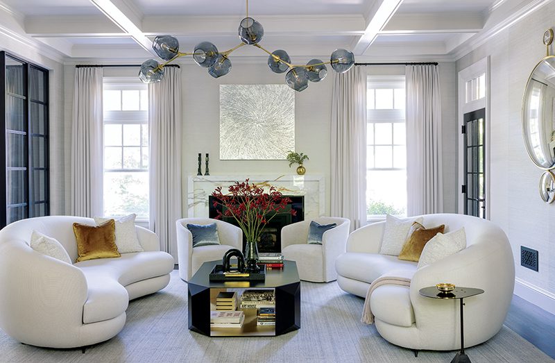
Here, the answer was to create coffered ceilings that accommodate directional recessed cans and introduce a nice architectural detail. “The goal was to make it look like it’s always been there,” he says.
Also high on the owners’ list was ensuring that the 3,000 square feet of living space be child friendly. ‘They’re a young, active family,” says Reider. “We wanted it functional for everyday wear and tear, but aesthetically pleasing for entertaining.”
Fortunately, the floor plan was intuitive and didn’t need tinkering. Guests enter through the foyer, bear right for the living/dining room, head straight to the kitchen and playroom, or turn left to the sleeping quarters and study.
Since no walls needed come down, the designer focused on furnishings and fabrics. In the living/dining room, her goal was to “keep the concept of open living but make it functional.” Cognizant of not obscuring urban vistas, she chose a buffet unit that subtly separates cocktail hour from mealtime. In the same vein, the striking glass chandelier that hangs above the dining table helps to delineate spaces, delivers a visual punch, and doesn’t obstruct views.
When it came to the general aesthetic, Reider wanted to “create a space that’s in keeping with the modern architecture of a high-rise building, but that feels warm and comfortable and inviting.” Given that a high-rise is inherently rectilinear, she sought to soften the space with carefully chosen fabrics and furnishings. Sheer drapes in the living/dining room add a layer of warmth, while the curved lamp next to the sofa tempers the room’s architecture. A durable marble-topped table (a nod to the owners’ preference for midcentury modern-inspired furniture) introduces another round element.
When it came to the color scheme, the homeowners favored neutrals. Reider layered in jewel tones—deep eggplant, teal, tourmaline—to add richness. “The foundation is timeless,” she notes. “But it’s easy to change the color palette in a couple of years.”
Reider also redesigned the bathrooms. “I think bathrooms are a place you can do something unexpected,” she says. “You don’t spend a lot of time in there, and the door is usually closed, so it’s a great place to experiment.”
In the case of the powder room off the foyer, she layered textures and materials, incorporating metal fixtures, pendant lighting at varying heights, and grasscloth wallcovering. Built-in macassar ebony cabinetry provides plenty of storage and affirms the modern, urban vibe.
The kids’ rooms also got special treatment. For the daughter, a fan of pinks and purples, Reider chose a colorful Jim Thompson butterfly wallpaper. “It’s sophisticated enough to take her to the teenage years,” the designer says. “I try to create spaces that feel age appropriate but can grow with the kids.”
The boy’s room is bathed in navy and turquoise with pops of burnt orange for contrast. Blu Dot bedside tables in walnut are a refined touch, and the graphic Shibori wallpaper by Scion treads the line between chic and youthful. Trundle beds for both kids make sleepovers a cinch.
And the parents’ room? They wanted the exact opposite: a soft, serene color palette that signals relaxation. And that’s exactly what they got. In fact, thanks to Reider’s deft hand, everyone got what they wanted: a comfortable, family friendly home, perched in the Boston sky, that’s as handsome as it is functional. •
Share
![NEH-Logo_Black[1] NEH-Logo_Black[1]](https://b2915716.smushcdn.com/2915716/wp-content/uploads/2022/08/NEH-Logo_Black1-300x162.jpg?lossy=1&strip=1&webp=1)





You must be logged in to post a comment.