Classic By Design
October 15, 2012
Text by Maria LaPiana Photography by Laura Moss Produced by Karin Lidbeck Brent
The estate gates part slowly, like curtains on a stage, to reveal a class act: a courtyard and neatly manicured lawn framing a classic New England colonial, complete with porte cochère and double mahogany doors sheltered by a columned portico.
The opening scene was thoughtfully directed by Linda Ruderman, an interior designer known for furnishing exquisite traditional homes on Connecticut’s Gold Coast. She built this, her own home, in keeping with the vernacular style for which her Greenwich neighborhood is known. “Of course I would build a backcountry, center-hall colonial,” Ruderman says with a laugh. “It is Round Hill Road, after all.”
The home’s facade reliably foreshadows the drama that unfolds within—beginning with an elegant foyer in the round, with an inlaid compass rose and handcrafted brass sconces. A coffered ceiling opens to a second-story landing with an ornamental balustrade, creating an interior “skylight” that bathes the space in a golden glow. Beyond the foyer, a grand piano sits in front of wide windows that offer a view of lush lawns (and on a clear day, Long Island Sound).
Ruderman hardly skimped on architectural detail, but she says she deliberately kept the house “clean, with a simple background that appeals even to those who may prefer a more transitional style. It doesn’t have heavy dentil moldings or a winding staircase.”
As elegant—even grand—as the house is, its simplicity keeps it from feeling stiff or ostentatious. “I think that even though it’s large, it doesn’t feel that way,” the designer says.
What her home does have is a polished, pulled-together quality, like a smart outfit assembled by someone who knows how to wear clothes. Nothing was left to chance, and a long time was spent curating the furnishings that fill its rooms; in some instances, Ruderman designed spaces around her collections of fine antiques and treasured accessories.
The more formal spaces house first-rate antiques; the music room, for example, is minimally furnished with just a few knockout pieces: a George III settee, a striking rosewood table from Florian Papp and that stunner of a Steinway piano. The living room, whose focal point is an English antique fireplace mantel, features eighteenth-century gilded-frame chairs, a Pembroke table from Gary Sergeant Antiques, striking sconces from Remains Lighting and, for good measure, a gorgeous pair of new custom chairs designed by Ruderman, from her LR Home collection.
The generously scaled dining room makes an ideal backdrop for the designer’s circa-1850 English table (set with silver candelabras) and chairs. A Stark carpet grounds the room. Mirror-image niches showcase two substantial console tables simply adorned with antique knife boxes. The walls wear wide, faux-painted stripes and sport sconces designed by Ruderman and fabricated in France.
A bright sunroom, yet another elegantly appointed space, has an informality that appeals to the designer’s casual side. A cheerful crewel by Nancy Corzine covers the scallop-back overstuffed sofa. A series of framed African orchids lends interest to the wall behind the sofa. A Holly Hunt coffee table keeps company with an iron table Ruderman discovered in a shop on Paris’s Left Bank. This sweet room is Ruderman’s true haven. “It’s so quiet and peaceful,” she says. “It’s where I keep my books…my art books, garden books, reflective books. It’s where I go to think.”
Although decidedly genteel, the home has a family feel, which is no surprise since Ruderman brought up five boys here. Down the hall from the formal entry, to the left through pocket doors, the casual family rooms are furnished with kick-back style. A half-wall divides the TV and breakfast rooms; a well-planned, working kitchen stands just beyond.
While aesthetics always inspire her work, the designer says she places a premium on “circulation, flow and functionality.”
Her kitchen is a prime example. Not as grand as some Greenwich kitchens, this is a serious cook’s space, with a smart, usable island, commercial range, twin fridges, sinks large enough to work in and—most important—ample seating for family and friends. It feels more spacious when it’s open to the breakfast room, of course, but it can be closed off to hide prep work or cleanup.
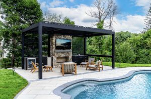
The flow of these spaces is proof that Ruderman loves to entertain. A door from the breakfast room opens onto the veranda, and a few steps down, to the outdoor kitchen and pizza oven, which she says she uses “all the time, for everything.” The veranda overlooks the pool, bocce court and crisp, lovingly tended gardens that meander down to the Sound.
“I’d say that all of my outdoor spaces really reflect who I am as a designer,” says Ruderman. “I love to cook, garden and entertain, and those spaces are set up for me to do that, all in a gracious way.”
So, how did such an accomplished designer arrive at all the right decisions when it came to planning her own home? It wasn’t easy. Ruderman allows that it can be possible to know too much. “They say you’re your own worst client,” she says with a laugh. “I’m so busy that I didn’t always have the time I needed to work on my home. You would think it was easy—I have so much access and information. But that made it hard, too, because if I couldn’t find the right fabric I wanted, I’d say, ‘Well, I’ll just wait for the fall or the spring line to come out.’ To be honest, it’s still evolving.”
On the bright side, she says, “I know what I like. And I didn’t have to convince anyone. When I work with clients, I want to make sure they understand everything. I go to bed thinking, ‘Did I do this or tell them that?’ I’m always thinking.”
In business for thirty years, Ruderman says she’s now seeing a style shift among many of her clients, especially younger couples with children. “They’re telling me they don’t want to live in their parents’ houses,” she says. “It’s not that they don’t appreciate traditional, but they want something with a twist, a contemporary surprise.”
Now an empty nester, Ruderman says she’s having a stylistic change of heart herself. In fact, she thinks her next house will be a complete surprise to those who know her. “I’m thinking it will have cleaner lines and focus on simplicity,” she says. “I imagine it will be…more modern.” •
Interior design: Linda Ruderman
strong>Architect: Jose Ramirez, JL Ramirez Architect
Builder: Todd Smith, American Carpentry
Landscape Architect: Diane Devore, Devore Associates
Share
![NEH-Logo_Black[1] NEH-Logo_Black[1]](https://nehomemag.com/wp-content/uploads/2022/08/NEH-Logo_Black1-300x162.jpg)


You must be logged in to post a comment.