Chance of a Lifetime
November 13, 2011
Text by Paula M. Bodah Photography by Tria Giovan (interior) and Jonathan Wallen (exterior)
Everyone knows about the benefits of exercise. But who’d have thought a husband’s passion for weekend bicycle rides would yield the lifelong payback of the perfect home for him and his young family?
“We’d been in New Canaan for a couple of years, but we knew our house wasn’t our forever house,” his wife says. “My husband loves to bike, and he rode every street in town. One day he came home and said, ‘I found our house.’ We went back to look at it that afternoon. We got halfway up the driveway and said, ‘This is it.’ It was destiny.”
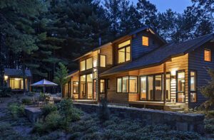
From the outside, the 1910 Elizabethan-style house had everything the couple wanted. Its four acres included big swathes of lawn in front and back—perfect for the pair’s energetic ten-year-old twins. The landscaping was pretty, if a bit overgrown, and included many ornamental trees and bushes. And the house itself was as solidly built as it was enchanting. “It’s built like a fortress, with concrete and steel construction,” says the homeowner.
Inside, some decorative updating was in order. “There was white shag wall-to-wall carpeting on every inch of the floors, even the bathrooms,” the wife says. “And the beautiful old woodwork had been pickled a tannish-green color.”
Beyond the cosmetic renewal, the couple knew some architectural change would be necessary. The old kitchen with its butler’s pantry and the floor plan of separate, somewhat formal rooms didn’t quite meet a modern family’s needs. “It was a true old-style house,” the homeowner says. “We wanted to keep the history and the architecture, but make it a house for the way people live today.”
Before going ahead with the purchase, the couple asked New Canaan–based architect Dinyar Wadia whether the changes they imagined were possible. “Mr. Wadia was very excited,” the homeowner says. “He could envision the house, keeping it the way it should be, historically, but working with us to make it work for our living style. It was a good match from the beginning.”
Wadia and project architect Rob Lominski forged a new design based on respect for the original architecture. “The key,” says Wadia, “is integrating the changes with the existing design. It has its roots in history. You don’t want to put your own imprint on it; it just wouldn’t be right.”
The architects bumped out the back of the house to add a family room and a porch and to enlarge the kitchen. “As in most houses today, there’s a connection between the kitchen, breakfast room and family room,” Wadia explains. “It’s a nice, pleasant place to begin and end your day.”
A new master bedroom was added above the family room, and on the first floor, a small addition next to the living room holds a new study.
Existing parts of the house were returned to a more era-appropriate look: walls were re-plastered, the old oak woodwork was stripped and restored to its former beauty, and the steel window casings were removed, cleaned and put back in place. “We used as many of the existing doors and windows as possible,” Wadia says.
It’s impossible to distinguish the old parts of the house from the new. Outside, the addition follows the original rooflines of the house. Inside, tray ceilings, half columns and other architectural elements bring old and new together seamlessly.
Interior designer George Snead, who had worked with the couple on their previous house, joined the process early on. When his client called, Snead says, “She said it’s never too early for the designer. She wanted help with stain colors and paint and slate for the roof and a lot of those details. We probably spent two weeks driving all over Fairfield County looking at slate roofs!”
Snead custom-blended interior paint colors in an array of browns—from mushroom to caramel to taupe—to suit the homeowner’s longstanding penchant for earthy neutrals. The palette is similar to that of her previous house, Snead notes. “Back when she chose this palette people were more into jewel tones. It served her well because it’s still very current.”
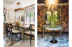
The similar palette also meant pieces from the old house could make themselves right at home in their new environment. “We used almost everything from the old house,” Snead says. Among the notable exceptions, Snead persuaded his client to buy new dining chairs to go with her double-pedestal table. Now the traditional table is surrounded by a collection of more transitional pieces from Hickory Chair. “It’s just a cleaner, slightly edgier look,” Snead says. The seats are upholstered in a khaki-and-taupe mini-geometric fabric that’s just a shade darker than the tone-on-tone Tibetan rug that made the move from the living room of the previous house. Wanting to highlight and soften the large windows without obscuring them or the view, Snead devised narrow panels of cut raised velvet on wool that hang to either side.
For the living room, Snead set his clients’ well-loved furniture against mushroom-colored walls and atop a new diamond-pattern rug of wool and silk from Nepal. Shades of blue in the velvet sofa, toss pillows and a pair of Louis XVI–style chairs add a soft punch of color.
Snead took the new family room in a slightly more transitional direction, matching a spindle-legged coffee table brought from the old house with clean-lined sofas and chairs. Walls painted a warm caramel color and then given a frottage treatment with a darker tobacco hue bring texture to the space, and accents of brick red add warmth.
The same mix of warmth and elegance continues in the breakfast room, with its arts-and-crafts–style rug (a rectangle Snead had cut into an octagon to better fit the shape of the room and the natural traffic pattern), simple table and chairs and a slightly overscale reproduction chandelier that looks like antique hand-forged metal.
The remodeling, a two-year-long task, was daunting, but well worth it. “It was the project of a lifetime,” the wife says. “People ask when I’m going to do the next one and I say never. This is our forever home.” •
Interior Design: George Snead
Architecture: Dinyar Wadia and Rob Lominski, Wadia Associates
Landscape design: Doyle Herman Design Associates
Share
![NEH-Logo_Black[1] NEH-Logo_Black[1]](https://b2915716.smushcdn.com/2915716/wp-content/uploads/2022/08/NEH-Logo_Black1-300x162.jpg?lossy=1&strip=1&webp=1)







You must be logged in to post a comment.