Be My Guest
November 13, 2011
Text by Dan Shaw Photography by Michael Partenio
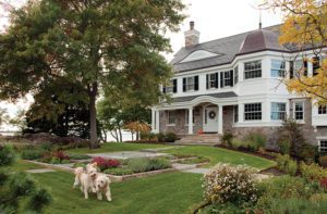
When this stone-and-stucco carriage house was built in 1905 at the foot of the driveway leading to a waterfront mansion on Long Island Sound, it was designed to be charming on the outside and utilitarian on the inside. “It originally had cement floors with drains so they could wash off the horses,” says Stamford-based interior designer Victoria Vandamm. “It had been renovated many years ago in the most rustic way so it could be rented out as an apartment. My client wanted to transform it into a guesthouse where friends and relatives would feel comfortable, perhaps pampered.”
The homeowner, an accomplished artist with a keen color sense, had started the project on her own by purchasing two floral armchairs, chosen because they evoked the blowsy pink roses that envelop the Fairfield County cottage in the summer. But when her life suddenly got too hectic, she called on Vandamm to take over the job. “It would have been easier for Victoria to start from scratch,” says the owner, “but I liked the chairs and I never imagined that we’d make so many changes. The original plan was just to spruce the place up.”
As they talked about redecorating the living room, the women quickly recognized that a full-scale renovation of the open kitchen would be necessary. “It became obvious that the kitchen had to have cabinetry that looked like real furniture because it is part of the living room after all,” says the owner. “It dictated everything we would do.”
After visiting several kitchen showrooms, Vandamm concluded that she would have to design custom cabinetry to get the effect—and efficiency—they wanted. The centerpiece would be an island and dining bar that would bridge the two spaces, emerging organically from the new floors made from planks of reclaimed wood. “The kitchen became a labor of love,” says Vandamm, explaining how she created an appropriately Old World aura by choosing soapstone counters, crackled glass for the cabinet doors and a farmhouse sink the color of a worn penny. Vandamm hired decorative painter Suzanne Bellehumeur, who stained the island an antique brown and gave the cabinets a French country patina by using multiple layers of paint in two shades, aging them with strategic sanding and topping them with a layer of tinted wax to minimize wear and tear.
Making the most of a galley kitchen is second nature to Vandamm, who tucked refrigerator drawers into the island, stashed the microwave into a cabinet and camouflaged the washer/dryer with a rough-hewn door that creates the illusion that there’s another room beyond. “My husband is a yacht broker and we sail,” she says. “That’s why I am so organized and make sure to use every nook and cranny when I design a kitchen.”
Once the kitchen was figured out, she could focus on the living room. The pink flowers on the club chairs could not be ignored. “But we didn’t want a pink and green room!” says Vandamm, laughing at the preppy connotation those colors have in this coastal corner of the state. Nevertheless, the room is a tone poem in nuanced shades of pink and green.
“I am very careful how colors must be worked out, so I went in the direction of rose and rust in the curtains by Jim Thompson,” says Vandamm, who upholstered the sofa in a primarily pink Lee Jofa fabric based on an old tapestry that’s more gutsy than girly. “We painted the walls a buffed-out celery that doesn’t hit you in the eye as a color but plays wonderfully with the green outside in the spring and summer.”
Then she doubled back to the kitchen, setting zippy barstools upholstered in leafy green leather at the island between the kitchen and living space, and installing pink Moroccan glass tiles for the stovetop’s backsplash. “It’s a rose-based theme that doesn’t hit you as pink,” she says.
The master bedroom is equally enchanting. “This is my love—what I am most proud of,” confesses Vandamm as she looks up at the peaked ceiling that follows the lines of the roof. “None of these beams were here. I immediately pictured a Cotswold cottage with antique beams and wallpaper on the ceiling, which is so cozy. I am lucky to have a magician of a wallpaper guy, because at one point the roof leaked and he had to patch the paper, which is not so easy when you have all these beams at crazy angles.”
While other decorators might have felt that enveloping the room in Osborne & Little’s Scroll wallpaper made a bold enough statement, Vandamm decided to push the European country look with Lambourne Sage curtains from Lee Jofa that feature birds perched on tree branches (which is exactly what you might see out the window). “If you used a solid fabric, you would feel like you’d hit a wall,” she says, noting that the simply dressed four-poster bed the client moved from her main house offers a nice counterpoint to the cacophony of patterns. “I like that the room is jazzy and that it’s both English and French,” says the owner. “I don’t like things to be too theme-parky.”
Vandamm was confident that the patterned carpet and reading chair upholstered in another bird fabric from Sanderson would harmonize in a way that feels calming, not chaotic. “When I work, it’s a layering of patterns and textures, and I look at them all together until I find the ones that can play together and shake hands,” she says. “I wanted you to be able to pull the curtains closed and feel really cozy,” she adds, noting that the windows were slightly crooked so “it was quite a balancing act to hang the shades and curtains to get a sense that everything was straight, because, in fact, nothing lines up perfectly. But that’s the wonderful feel of an old house.”
The client says she’s overjoyed that the guest cottage is now as romantic on the inside as it is on the outside. “We think of it as a place for couples to stay without their kids,” she says. “Now, we call it the ‘honeymoon cottage.’ ” •
Interior Design: Victoria Vandamm
Architect: Michiel A. Boender, Edgewater Group Architects
Builder: Andy Moore, Ram Construction
Share
![NEH-Logo_Black[1] NEH-Logo_Black[1]](https://b2915716.smushcdn.com/2915716/wp-content/uploads/2022/08/NEH-Logo_Black1-300x162.jpg?lossy=1&strip=1&webp=1)



You must be logged in to post a comment.