Special Focus: Kitchens & Baths from the 2017 Summer Issue of New England Home Connecticut
July 20, 2017
Connecticut kitchens and baths that are a beautiful union of style and utility.
Text by Paula M. Bodah
A Dash of Panache
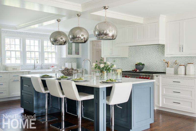
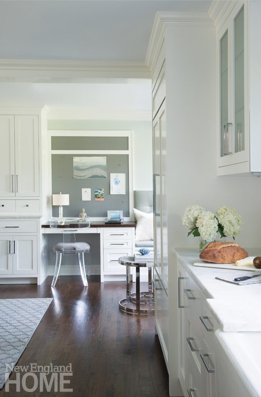
Dalia Canora is the first to admit that, as appealingly timeless as white can be, an all-white kitchen runs the risk of being boring. The expansive kitchen she designed for a young Darien family, however, is anything but dull. Yes, the large (about 865 square feet) space is predominantly white. But judicious use of color, as in the warm gray-blue of the island and the blend of blues and whites in the mosaic backsplash, adds a welcome spark. So, too, do touches like the big, bold, pierced-metal pendants that illuminate the island. The streamlined faux-leather stools are hydraulic, so even the littlest kid can belly up to the island with no fuss. The area also holds a dining table that seats ten, a nook with a sofa and a piano, a bar where the husband stores his wine collection, a den for TV watching, a built-in banquette for impromptu napping, and a built-in desk. The wall above the desk sports a magnetic Pollack wallpaper that stands in for corkboard, helping the family keep track of activities and appointments. “The room satisfies so many functions,” Canora says, “but it’s still spacious and uncluttered.” All that, and beautiful, too.
Architectural design: Glenn Smith, Residential Engineering + Design
Interior design: Dalia Canora, Dalia Canora Design
Builder: Danny and Eamonn Fay
Photography: Jane Beiles
The Family That Cooks Together
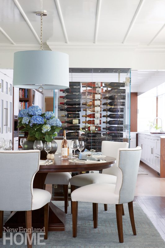
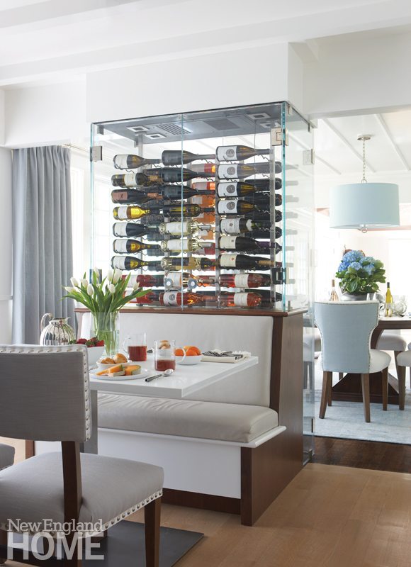
A shared passion for cooking was at the heart of the renovation of this Darien kitchen. “We cook a lot, and it’s a gift we hope to share with our sons,” the wife says. “We wanted a real cook’s kitchen where we can work together.” Architect Chris Pagliaro bumped out the rear wall eighteen inches, creating room for an island and additional counter and storage space. Above the sink and a long expanse of glossy white countertop, the new wall holds a run of windows that ushers in light and visually extends the kitchen into the backyard. The island, with its own sink, means the couple can work together without bumping into each other. Clean, modern, white cabinets get a boost of warmth from walnut trim. Pagliaro eliminated walls between the kitchen and dining room and between the dining and family rooms to create a sense of openness, then introduced elements to delineate the spaces. A temperature-controlled glass wine cabinet that separates the dining room from the breakfast area is “a fun, playful element that keeps communication open but breaks up the railroading of the rooms,” he explains. Designer Lynn Morgan’s palette of pale blues and fabrics in a variety of textures strike the perfect tone of contemporary glamour.
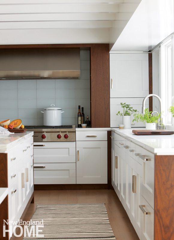
Architecture: Pagliaro Bartels Sajda Architects
Interior design: Lynn Morgan, Lynn Morgan Design
Builder: Shore Point Builders
Photography: Michael Partenio
Producer: Stacy Kunstel
Let There Be Light
Keri Levitt is not a dark person. The kitchen in her Westport home, however, was altogether gloomy with its heavy cabinetry, midnight-brown granite counters, and walls painted deep blue. “My whole vibe is sort of modern, eclectic bohemian,” Levitt says. Her kitchen, she felt, should—like the rest of her home—reflect that feeling. She ripped out the upper cabinets, instantly bringing a sense of openness to the space. Then she dressed the walls in shiny white subway tile that reflects the light spilling in through the windows above a new farmer’s sink. She gave the existing lower cabinets a coat of black paint and topped them with white Caesarstone. Stainless-steel appliances blend in nicely, supporting the room’s smart, snappy look. Her brother-in-law Jeremy Levitt, co-owner of the New York City–based design firm Parts and Labor, created the oversize mirror that hangs above a new desk in the kitchen’s office area, pulling light from outdoors into the space. “The kitchen is the nervous system, the main hub, 100 percent the heartbeat of my home,” Levitt says. “I wanted it to have personality and spirit. It exudes my personal style.”
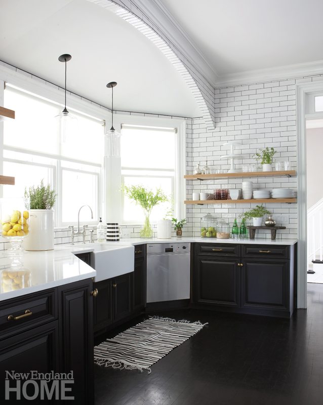
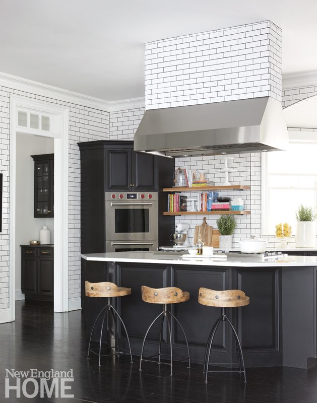
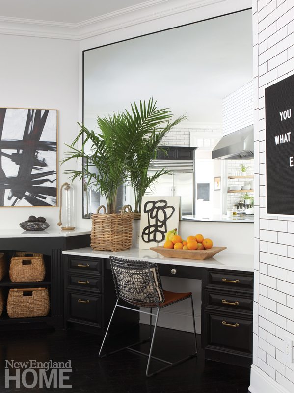
Interior design: Keri Levitt
Photography: Michael Partenio
Producer: Stacy Kunstel
Family-Friendly Flair
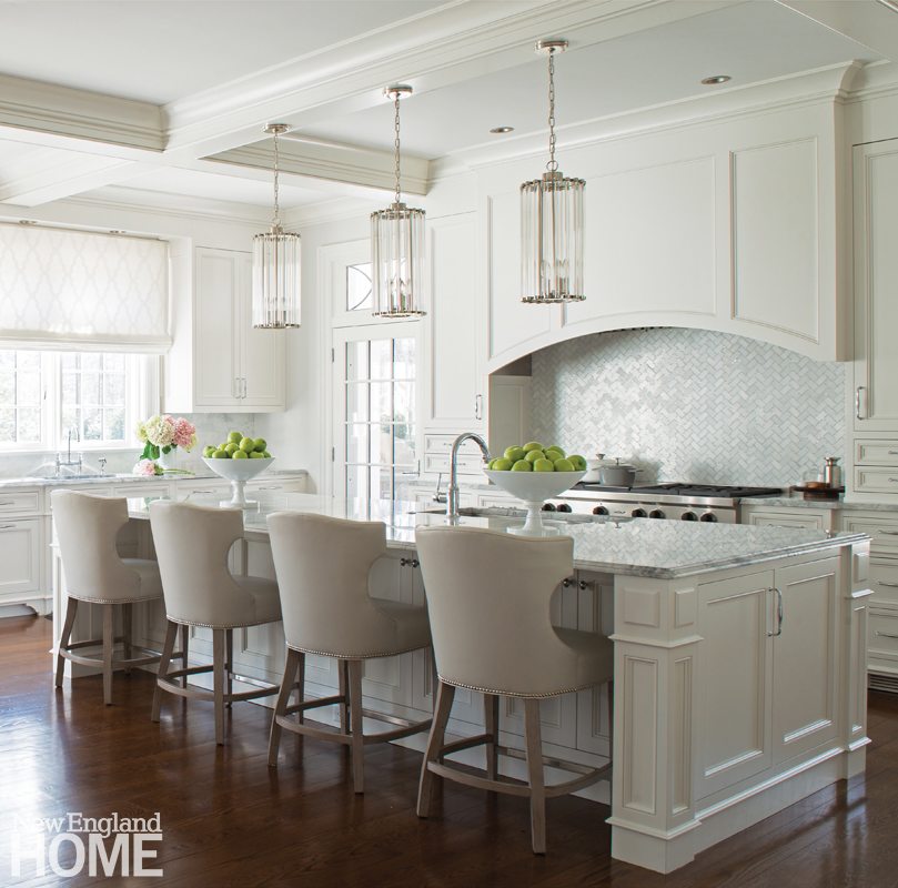
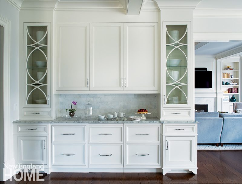
The attractive architectural details in this new Shingle-style house in Greenwich provided plenty of inspiration for Michelle Morgan -Harrison for designing the stylish kitchen. Clean, simple cabinetry molding echoes the ceiling coffers, for instance, while the pretty curves in a transom window are reinforced in the arched cabinetry above the stove, the round-backed island chairs, and the glass-front cupboards that flank the breakfast bar. Morgan Harrison has taken a fresh approach to the classic all-white kitchen, painting the woodwork with a fifty-fifty blend of white and Benjamin Moore’s Silver Satin—a color she calls “a pale greige”—to warm things up. Crystal light fixtures add an elegant touch. Chic as it all looks, this is a hard-working kitchen for a young family. Refrigerator drawers in the breakfast bar let kids grab their own drinks and snacks. The good-looking counters are strong, durable quartzite. The chairs wear vinyl upholstery for quick cleanup. Even the cabinetry’s hardware balances style and function; Morgan Harrison opted for polished chrome for its shine. “And,” she says, “unlike nickel, it’s easy to maintain.”
Architecture: Jones Byrne Margeotes Partners
Interior design: Michelle Morgan Harrison, Morgan Harrison Home
Builder: Pecora Brothers
Photography: Jane Beiles
Country Comfort
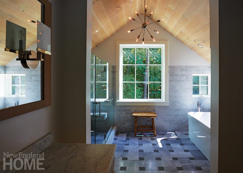
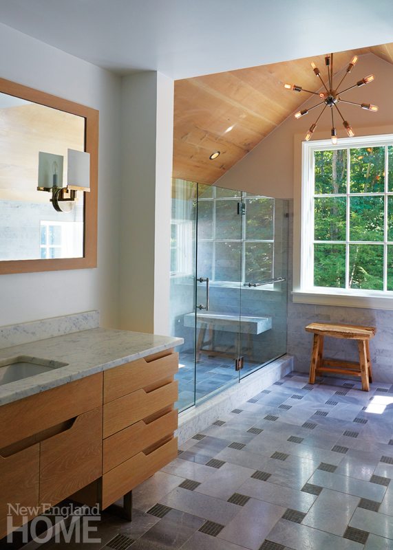
In designing the addition for a 1950s colonial-style Westport home, architect Paulo Vicente says, “We wanted to keep the home’s simplicity and purity, but make it feel more contemporary and open. And because it’s in the country, we wanted a bit of rustic charm.” The second-floor master bath illustrates his success. There is a pleasing unfussiness in the walls painted Benjamin Moore’s Decorator’s White and in the sleek, marble-topped, oak vanity with stainless-steel legs and cutout pulls. A vaulted ceiling of oak spanning the space between the tub and the glassed-in shower provides a rustic note. There’s a comforting familiarity—albeit with an update—in the large-format basket-weave tile floor (the dark squares are actually mosaic). A trio of windows of different sizes bring in the pastoral surroundings as a design element of their own. The Sputnik chandelier is a midcentury-modern addition that ties it all together. “The character of the space emulates what we did in the rest of the house,” Vicente says. We call it a perfect blend of old and new.
Architecture and interior design: Paulo Vicente, Vicente-Burin Architects
Builder: Keith J. Manca Building Company
Photography: Tim Williams
A Room of Her Own
The bathroom in this Greenwich home is a spacious twenty-one feet long, but it’s barely more than seven feet wide—proportions that posed a challenge for designer Rebecca Reynolds. The first order of business was to rip out the cedar sauna that dominated one end, the dated fixtures, and—definitely—the 1980s Laura Ashley tile that covered the walls from floor to ceiling. The new homeowner had in mind a spa-like space, sleek and spare, but elegant, too. Reynolds obliged with a feminine palette of lavender and white with Lucite accents that add a hint of glamour. The tub and shower occupy opposite ends of the room. Reynolds made clever use of mirrors—a pair set into the wall at the back of the tub, and another pair in the walls that flank the shower door—to reflect the ends of the room back to each other, minimizing the long feel of the space. Mirrors float within the twin windows above the vanity, too, maximizing the room’s width without blocking too much light. Texture, in the grasscloth wallpaper and the white-on-white raised design of the large-format tile, soften any severity, and the reclaimed-wood look of the floor tile adds warmth.
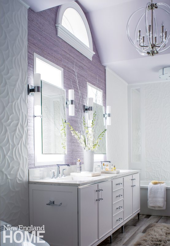
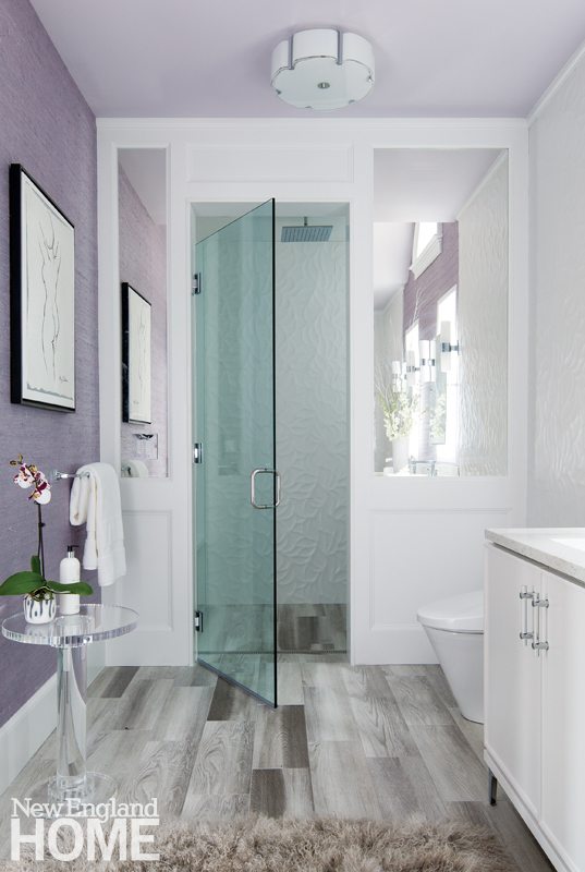
Interior design: Rebecca Reynolds, Rebecca Reynolds Design
Builder: Seri Bueti, Bueti Construction
Photography: John Gould Bessler
Producer: Karin Lidbeck Brent
Share
![NEH-Logo_Black[1] NEH-Logo_Black[1]](https://b2915716.smushcdn.com/2915716/wp-content/uploads/2022/08/NEH-Logo_Black1-300x162.jpg?lossy=1&strip=1&webp=1)




You must be logged in to post a comment.