Made to Order
November 23, 2015
A designer plays off his clients’ label-defying style to create a home that is a little bit traditional, a little bit contemporary, completely stylish, and totally personal.
Text by Lisa E. Harrison Photography by Michael J. Lee Produced by Kyle Hoepner


Having parted with most of their furniture when they moved from Atlanta, they were in search of a designer who was up to the large (literally) challenge of filling some 7,500 square feet. In her search, Desi came across Tony Cappoli. “Tony’s work spoke to me,” she remembers. “I looked at his website and he had this friendly face. A personal rapport is very important to me.”
Then she read an interview in a local magazine, where he mentioned his affinity for basil-lime gimlets. Desi had one thought: “I’ve got to get to know him.”
Desi’s gut feeling was right: she and Cappoli hit it off immediately, both professionally and personally—an asset from a design perspective, since Cappoli’s mantra is that a home should reflect the people who live in it.
So how does Desi see herself? “One day I’m a hippie, then the next day I’m in Ralph Lauren,” she says, “I really vacillate, depending on my mood.”
Cappoli set out to design a house that—like his clients—defies easy labels. It skews traditional New England, especially curbside, with its exterior of brick and white clapboard, but there are many contemporary touches throughout. “There’s a sense of casualness,” he says, “but there’s also something very sharp, a sense of couture about it.”
Despite the fact that Cappoli would leave his mark on “every square inch” of the space, the layout would remain intact. “The house has great energy. The rooms flow well into each other,” he says.
The kitchen and baths would be gutted, French doors added, a new deck built, and rooms repurposed, but no walls would need to go up or come down.
Desi admits they weren’t necessarily looking for a house this large, but she was drawn to the location, the layout, and the light. “What I loved about the house was that every room was its own room,” she says. “Many times when you’re dealing with smaller square footage, rooms are extended into each other to create a more open space. This house has that unobstructed feeling without all the rooms being open to each other. The kitchen is the kitchen. The family room is the family room.”
The Wakehams are restaurateurs, so it’s not surprising that entertaining (and, by proxy, cooking) would factor in to the overall design scheme. The 1,200-square-foot family room, which occupies the white clapboard section of the house (a five-car garage sits below, while the master bedroom perches above), is great for entertaining, but the couple also wanted it to feel cozy when just the family of five gathers. Cappoli created a comfortable scale by setting up two distinct sitting areas. A three-stool bar, complete with wine fridge, icemaker, microwave, dishwasher, and a hammered copper sink, brings convenience and a congenial vibe.
While the family room has a casual warmth to it, reinforced by the stacked-stone fireplace, the library exudes polished sophistication. “Desi loves cream and taupe, monochromatic color schemes,” notes Cappoli, so that informed the design. The two were on a buying trip in Manhattan when they came across the antelope-patterned carpet and the velvet Knole sofa with gold-leaf finials—two pieces around which they would build the rest of the room. A show-stopping chandelier hangs from the cathedral ceiling; the bronze drum has a frosted milk-glass diffuser that reflects a soft light onto the dangling brass rings.
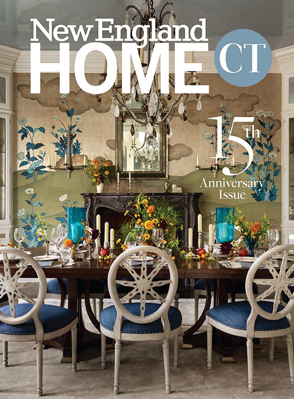
Just off the library sits the dining room, a space also inspired by a trip the designer and his client made to New York, this time for a dinner at Daniel Boulud’s four-star restaurant, Daniel. They loved the lightness of the restaurant and its splashes of color. To loosely mimic the look, Cappoli chose a beautiful, rich, creamy-white paint as a backdrop. To get that pop of color, he mounted a De Gournay wallpaper with a modern plum-blossom pattern on an eighteen-foot screen. Cappoli designed the dining table, fabricated from English burl wood with rosewood inlay. Classic Greek klismos-style chairs get a modern makeover thanks to the Asian-inspired Fret fabric that covers the backs. Every detail matters: the fabric’s cloud pattern is a symbol of good fortune. In keeping with the traditional-meets-modern aesthetic, Cappoli took old-fashioned crystal chandeliers and gave them a transitional update by adding sheer drums.
Every beautiful dining room needs a great kitchen. The key here was function, though form certainly didn’t take a backseat. The centerpiece is a six-burner black La Cornue range. Cappoli designed the high-gloss black island with polished brass knobs to match. Two Asian-inspired lanterns above give off an elegant light at night. He mixed silver and brass throughout, as well as contemporary touches (note the faucet and pot filler) with traditional ones (the kitchen cabinets in a timeless linen white). He chose a hand-painted and -embroidered fabric by Boston-based designer Seema Krish to cover the swivel stools and complement the granite counter on the island. “The fabric is absolutely delicious,” says Cappoli. “It should be in a kitchen.”
Off the kitchen, the Wakehams repurposed the original dining room into a keeping room. Four club chairs fluffed with monogrammed pillows, a fireplace, and chocolate-brown walls (Benjamin Moore’s Midsummer Night) make it a cozy spot to take your morning coffee, which is exactly what the homeowners do.
Despite the grand scale of the four-bedroom house, there’s no wasted space, notes Desi. Every room is functional and, because of Cappoli’s deft hand, personal. He was able to achieve the latter thanks to a great working relationship (and eventual friendship) with the Wakehams. “They have a really good sense of style, and we filled the house with things they love,” he says.
Sounds like a straightforward and successful design approach—one to which we can all raise a basil-lime gimlet. •
Project Team
Interior design and architecture: Tony Cappoli Interiors
Builder: Sleeping Dog Properties
Share
![NEH-Logo_Black[1] NEH-Logo_Black[1]](https://b2915716.smushcdn.com/2915716/wp-content/uploads/2022/08/NEH-Logo_Black1-300x162.jpg?lossy=1&strip=1&webp=1)


You must be logged in to post a comment.