Fresh Air
May 29, 2014
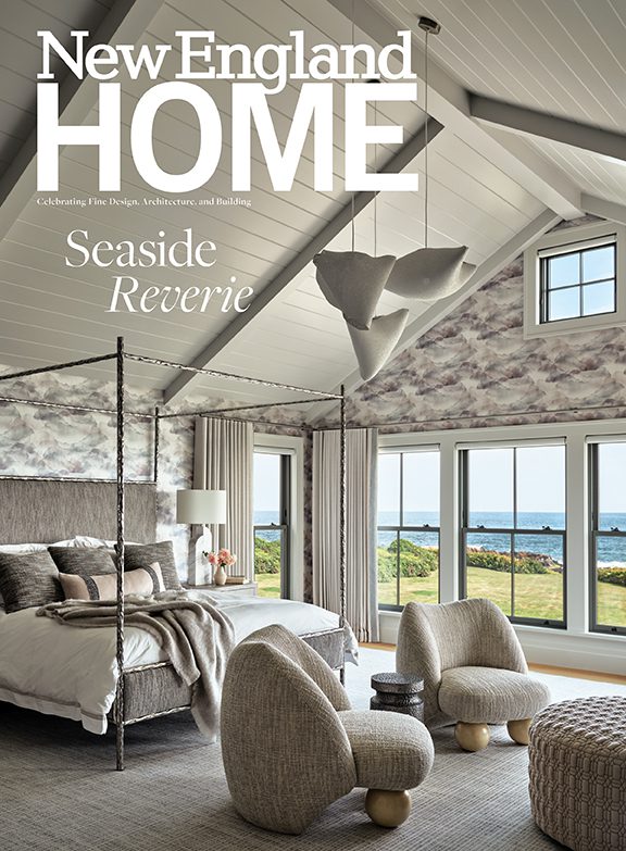
Outside, this Nantucket house has the classic good looks of its older neighbors. Inside, it adopts a breezy attitude that suits its role as a young summer family’s getaway.
Text by Jaci Conry Photography by Michael Partenio Produced by Stacy Kunstel
Buildable lots rarely become available in Nantucket’s Brant Point, the idyllic, highly sought-after area known for the historic lighthouse that welcomes ferry travelers to the island. So the owners of this new house considered themselves quite lucky when they happened upon this precious parcel just a stroll from both beach and town and blessed with views of Nantucket Sound.
The couple, who have summered on Nantucket for years, had definite ideas for their retreat. They craved a home that was spacious but efficient, with a clean, open plan, says Kathleen Hay, their interior designer. “There are four young children in the family. Everyone needed to be comfortable and have their own space,” says Hay. “But they didn’t want a huge, cavernous house.”
In deference to the island’s iconic building style, the couple also insisted that their home fit within the local architectural vocabulary. Architect Chip Webster strove to design a residence that, as he says, “struck a happy medium between contemporary style and traditional Nantucket.”
Several site constraints called for clever design decisions. The home’s proximity to the ocean required the first level to be raised, while height restrictions dictated that the structure could be only one-and-a-half stories tall. Webster put the kitchen, living, and dining areas, as well as two bedroom suites, on the second level. The lower level is devoted to children’s bedrooms and a central family room. “Since the family does most of its living upstairs, we needed to create a fully usable second story,” says Webster. “It’s a challenge to design big, open, light-filled spaces that conform to traditional vocabulary. One way of doing that is to play with scale.”
To maximize light and headroom on the second floor, Webster made dormers and windows larger than is typical. “But they are in scale with the exterior of the house so they don’t feel overwhelming,” the architect explains. Inside, the larger windows and dormers, paired with fourteen-foot cathedral ceilings and arranged around the open layout, give the space an airy feel.
With its gracious front porch, cedar shingles, and white-trimmed six-over-six windows, the 3,700-square-foot home exudes a timeless appeal. Inside, Webster collaborated with Hay to offer contemporary interpretations of traditional treatments that give the home a clean, modern flow.
Some walls are sheathed with horizontal shiplap paneling, a detail that harkens back to Nantucket’s early residences. “In the first houses the Quakers built on the island, they would typically put their energy and resources into paneling one focal point, like the fireplace,” says Webster. Here, the gas fireplace in the living room has a decidedly contemporary feel, with its stainless-steel surround. The fireplace sits within a floating mass clad with shiplap paneling that extends to the ceiling. “The rest of the walls are plaster, but the fireplace stands out as a modern interpretation of the storied design element,” Webster notes.
The kitchen’s cabinets were inspired by the Shaker style used on the island during the eighteenth and nineteenth centuries, but paired with the room’s modern detailing—Caesarstone counters, frosted-glass backsplash, and pendants of polished nickel and milk glass—they take on a contemporary feel.
The ceiling is sheathed with flat wood panels that relate to the cabinet design and give the space distinction. “It was important that the kitchen be open and prominent, yet it needed to feel like its own space,” says Webster. “The different ceiling treatment reinforces that.”
Intent on using space in the most efficient way possible, Hay and Webster conceived several built-ins around the house. When challenged to accommodate a king-size bed in a modest second-floor bedroom, the duo sought inspiration from the tight quarters of a ship. The sole piece of furniture in the closetless room, the bed has a built-in base fitted with drawers. The continuous piece connects with tiny nightstands on either side that adjoin cabinets that offer space for hanging clothes. “The room is small, but it’s also tall, so it feels larger,” says Hay, who made the room cohesive and cozy by sheathing the contours of the ceiling with the same Phillip Jeffries grasscloth covering that adorns the walls. In the family room, a daybed is surrounded by built-in cabinets, drawers, and bookshelves that conceal the home’s mechanicals.
A subtle, predominantly neutral color palette prevails. Floors are pickled white oak with a bleached finish, and walls are painted bright white. Dark wood finishes and jolts of color, such as the deep-red, patterned seat cushions in the dining room and the orange herringbone bolsters in the family room, add energy.
Hay’s design scheme suits both kids and adults. “We made durable selections with family and guests in mind, but things are also sophisticated,” she explains. In the living room, for instance, she installed a generous sectional upholstered in a kid-friendly woven cotton-viscose blend. Lounge chairs, ottomans, the rug, and decorative accents all wear hues in the beige family, but Hay introduced a variety of textures to keep things interesting. Subtle patterns—twin throws with a Greek key pattern, chair cushions upholstered in a Bansuri ikat design, and toss pillows with a bolder ikat pattern—add a layer of elegance. The decor isn’t overly beachy, but refined nautical references abound, including an arresting trove of rare sea treasures and several coastal landscape paintings by Provincetown artist Anne Packard.
The homeowners had fallen in love with a bunk room Hay designed for another home and asked that she create a similar one for their children. Hay and Webster envisioned four generous bunks, white wood-paneled walls, and a ceiling painted a deep navy hue. With stainless-steel rails, mahogany ladders, and nifty open portholes, the room conveys a sense of fun that the children find delightful.
“The house is fresh and youthful but still sophisticated and contemporary,” says Hay. “It suits the whole family.”
Project Team
Architecture: Chip Webster, Chip Webster Architecture
Interior design: Kathleen Hay, Kathleen Hay Designs
Builder: O’Connor Custom Builders
Landscape design: Ernst Land Design
Share
![NEH-Logo_Black[1] NEH-Logo_Black[1]](https://b2915716.smushcdn.com/2915716/wp-content/uploads/2022/08/NEH-Logo_Black1-300x162.jpg?lossy=1&strip=1&webp=1)


You must be logged in to post a comment.