And the Livin’ is Easy
June 2, 2015
It’s all about summer at this quintessential Edgartown house updated with a relaxed, beachy vibe.
Text by Stacy Kunstel Photography by Michael Partenio Produced by Stacy Kunstel
A good decorator knows his clients. An excellent one will do all he can to put himself in their shoes to conjure a space they can call their own. Interior designer Parker Rogers drew upon his own years of summering on Martha’s Vineyard as he was designing Hilary and Damien Breier’s house. “They are a young, hip family,” says Rogers. “It needed to be as chic as possible and filled with big books and novels you can just pick up on a rainy day. There needed to be TVs in the rooms and a Sonos sound system throughout the house and all the bells and whistles. These are people who like to entertain and enjoy every moment.”
It also had to be practical, meaning it could handle the wear and tear of two kids, dogs, houseguests, dinner parties, sand, and the occasional wet towel slung over the furniture.
“Everything in the house has a super practicality to it,” says Rogers.
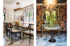
Although he has been coming to the island since he was a child, this was the first time he had an opportunity to work there. Not that this house needed much work. Besides its perfect waterfront location, it had been beautifully cared for. A major renovation, done twenty-some years ago by the Boston-area architectural firm Stirling/Brown and on-island builder Gerret Conover of Conover Restorations, still looks as fresh as it did when it was completed for a previous owner. Whimsical architectural details and accents stand as a perfect complement to the house and its location. Rogers just needed to bring it into the present with a few minor changes. “I wanted it to be a fun, fresh, summertime place for them,” says Rogers. “A zebra-print rug in the living room—why not?”
In bringing the house into this decade, bathrooms were the first consideration. With help from Hilary’s brother, Kristian Strom, who acted as an unofficial general contractor, full baths on the first and second floors were redone with new showers, marble, tile, counters, sinks, and fixtures.
There was a bit of discussion about whether closets should be added to the bedrooms, but Rogers was adamant about keeping the spaces open. “I will tell you right now: no one needs a closet,” says Rogers. “You’re on vacation.”
In the kitchen, Rogers added a pair of refrigerator drawers with cabinetry above them for additional counter space and storage, and installed a new built-in refrigerator.
Some of the doors throughout the house were treated to new framing, and an elevator a previous owner had installed was removed. On the first floor, the onetime elevator space was transformed into a perfectly placed wet bar between the kitchen and water-facing porch. On the second floor, the shaft created space for a linen closet.
The rooms in the 3,000-square-foot house are small, but laid out in a plan that takes advantage of the view from every space. Even from the kitchen, a glimpse of boats churning the water in the harbor can be seen through the breakfast area and dining room. “The kitchen was in nice condition,” says Rogers, but its attractive architectural details were lost in a sea of white. “It needed a pop of color to highlight the vaulted ceiling and beams overhead,” the designer explains. Paint the color of rich milk chocolate provided the contrast that lets the details shine.
Rogers gave the dining room a dose of drama with bold blue-and-white wallpaper and dining chairs that wear a glossy navy lacquer. “The walls are paneled three-quarters of the way to the ceiling,” Rogers explains. “I didn’t want to do a flat color there. This paper is happy and beachy, but with a bit of formality. I didn’t want it to be a full-on beach house, because the architectural design of the house is somewhat formal.”
The sophisticated look continues in the living room, where white sofas, rattan chairs, and a zebra-print rug layered on sisal are relaxed counterpoints to the beadboard walls and the fireplace with its classic molding and blue-and-white tiles.
“I like to do high-low,” says Rogers. “I love to do really great fabrics even if it’s on an inexpensive piece of furniture. I love doing sea grass on the floors of houses. The sisals are inexpensive, and family- and dog-friendly, too.”
The daughter’s room is the only bedroom on the first floor, and Rogers gave it the lavender treatment with an Osborne & Little wallpaper hung horizontally on the wall behind the bed. “I started with the wallpaper,” he says. “Then I found the vertical-striped fabric with lavender for the draperies, and then I painted the walls lavender.”
After twelve years of renting houses on the island, the Breiers now call this their summer home. “We had always vacationed in Edgartown,” Hilary says. “We considered buying somewhere else on the island, but Edgartown has something special.”
Oriented to the east and sitting above Edgartown Harbor, the house catches the first light of dawn as it spreads across the water and over the stiff masts of bobbing sailboats. Perched high enough to command a view of Chappaquiddick Island and a spit of beach where boats seem to move in a constant waltz of activity, it is the opposite of looking at an endless horizon of uninterrupted water. “The harbor is just so much more entertaining,” says Hilary. “From our deck we can see friends at their house on Chappy watching the sunset at the end of the day. We can give a little wave.”
At this summer retreat, life is about stress-free days and happy nights, relaxed time with the family and convivial times with friends. “Everyone who comes into the house says it’s such a happy house,” says Hilary.
“It has a good vibe and a really good energy,” adds Rogers, “like a lot of people have had a really good time here.”
No doubt, there are plenty of good times ahead, too. •
Interior Design: Parker Rogers, Parker & Company
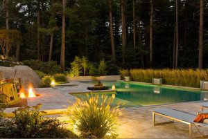
Landscape Design: Carly Look, Carly Look Design
Share
![NEH-Logo_Black[1] NEH-Logo_Black[1]](https://b2915716.smushcdn.com/2915716/wp-content/uploads/2022/08/NEH-Logo_Black1-300x162.jpg?lossy=1&strip=1&webp=1)





You must be logged in to post a comment.