American Idyll
May 21, 2010
Text by Stacy Kunstel Photography by Eric Roth
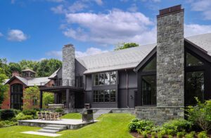
Rambling stone walls, a rolling meadow and a wetlands view are pleasures rarely afforded homeowners sitting on just a few acres. But despite its suburban setting, the feeling in this new 6,000-square-foot home is purely rural in character.
Tucked behind a bevy of staid colonials with massive front lawns in Weston, Massachusetts, it recalls the area’s historic predecessors—in this case barns and the outlying buildings that support the functions of farm life. Divided into three forms, each with gabled rooflines, the house is reminiscent of a collection of connected barns, albeit ones executed in wood, stone and glass.
“We wanted the spaces to be broken up,” says the husband who, with his wife, had purchased the property a few years before deciding to build. “We didn’t want a tall or imposing house.”
“We loved the idea of multiple outbuildings, like we see when driving through Vermont,” adds the wife.
The couple, who have two young children, turned to architect Mark Hutker of Hutker Architects in Falmouth and Martha’s Vineyard, Massachusetts, for this project after working with him on the renovation of a home on the Cape. Known mostly for his work on Cape Cod and the islands over the past twenty-five years, Hutker approached this home as an opportunity to practice his philosophy of new regional vernacular architecture away from the water’s edge. “This is us continuing to define new regional vernacular or the language of place,” he says. “In our approach, we looked at the history of the community. It’s those agrarian buildings that are often overlooked as part of the rural landscape. They have this ability, though, to create really interesting architecture.”
It was a look the homeowners, one of whom grew up among the horse barns and stone walls around Lexington, Kentucky, could easily embrace.
From the stone-pillared entrance, only pieces of the house are visible. Following the stone wall (a feature that continues through the interior of the house), the eye is drawn to the front facade where a walkway and wooden pergola reach out to lead visitors toward the entry.
Inside, the house reveals itself gradually. The foyer appears as a long hallway with a stained wooden wall standing between it and the living area. The wall is actually three separate floor-to-ceiling standing cabinets, each with a particular function that corresponds to the seating areas on the other side. One holds a wet bar to serve the cocktail table near the bronze-covered fireplace at one end, another hides a large flat-screen television across from a plush sofa and chairs, and a third holds a coat closet that opens on the foyer side. “We talked a lot with Mark about the function of the spaces and storage,” the wife says. “We are very organized people and didn’t want a lot of clutter.”
If stone walls, barn-like forms and a standing seam roof carried the vestiges of Kentucky life on the exteriors, then it was the state’s heritage of bourbon-making that influenced the colors in the interior.
The open room, a sea of bourbon-hued furnishings, is made more airy by the exposed trusses on the ceiling and the band of clerestory windows around the top of the structure. Pavilion-like in feel, it offers green views to the outdoors in almost every direction.
Interior designer Susanne Csongor of SLC Interiors in South Hamilton, Massachusetts, started with a custom-cut and -colored rug to anchor the three sitting areas and unify the room. A leather-topped coffee table in front of the L-shaped sofa plays off the dark bronze fireplace surround and bronze-framed windows. Blocks of color, whether on the walls and ceiling or in the rug and furnishings, eschew pattern. “The homeowners have a very clean, sophisticated idea of what they want to live with,” says Csongor. “They have a predisposition to transitional furnishings without a lot of fuss or pattern in the composition. We avoided masses of color so you can focus on texture.”
Opposite the seating areas, project architect Matt Schiffer’s interior detailing on the dining room wall continues a theme of simple raised paneling that focuses on clean lines and a graphic pattern. Above the table hangs an oversized drum shade, a more modern shape than the expected chandelier. A door built into the paneling, which is invisible unless ajar, leads to a smaller family room—also equipped with a television and fireplace—that is open to the kitchen.
“We didn’t want spaces we wouldn’t really use,” the wife says. “We love the idea of a great room for entertaining, but as a family we love to be in this space of the kitchen and family room.”
The family room, separated from the kitchen by a dark-stained breakfast table, takes on lighter colors, but with the same clean lines seen in the living room. Wood on the walls and ceiling are painted similar colors, recalling Shaker detailing. “The fabrics and furnishings we chose here are more durable and casual,” says Csongor. “The coffee and breakfast tables are both made from found wood and have natural, organic and irregular qualities to them that give the room a more eclectic feel. It’s a great way to create the atmosphere of a family-driven space.”
In laying out the house, the couple also wanted to be near their children’s rooms. In the two-story bedroom wing, Hutker and Schiffer kept the stairwell open with a balcony so the parents have a visual connection between their space and the area outside the kids’ bedrooms, which does triple duty as a homework and computer space as well as a library.
The second floor master suite is organized with the homeowners’ lives in mind. An office area for the husband connects directly to a dressing room and the master bath, meaning he doesn’t have to disturb his wife when he comes home late from a business trip or meeting.
Wraparound windows in the master bath maximize both light and view. Schiffer designed the spa-like setting, choosing to float the mirrors on steel rods in the windows above the vanities. “It’s a wonderful feeling having natural light illuminate your face,” he says.
The view, with its southern exposure, rolls toward old-growth trees and an open meadow. It’s hard to place your exact location in such a bucolic setting. It could be Kentucky or the Connecticut River Valley, but it just happens to be an in-town idyll.
Architecture: Mark Hutker and Matt Schiffer, Hutker Architects
Interior Design: Susanne Csongor, SLC Interiors
Builder: ECO Structures
Share
![NEH-Logo_Black[1] NEH-Logo_Black[1]](https://b2915716.smushcdn.com/2915716/wp-content/uploads/2022/08/NEH-Logo_Black1-300x162.jpg?lossy=1&strip=1&webp=1)



You must be logged in to post a comment.