A Young Family Finds Their Perfect Home in Newton
March 1, 2019
Text by Fred Albert Photography by Laura Moss Produced by Kyle Hoepner

When a Boston couple decided to have children, they figured it was time to trade their triplex condo for something a little more family-friendly. They set their sights on a modest apartment in the city, with fewer stairs and a patch of grass out back for their kids to play on.
After months of searching without success, the men agreed to see a home that they had admired online—but quickly dismissed. With more than 9,000 square feet of living space and nearly an acre of land, the house in suburban Newton was the polar opposite of everything they’d been looking at. Naturally, it was love at first sight.
“This place just felt like it had the potential to be a really great home for us,” says one of the owners, a stay-at-home dad. Although he and his husband, an Internet executive, were understandably daunted by the scope of the project they were about to undertake, there was no turning back: the couple’s surrogate was due to deliver their first child in six months.
The pair wasted no time enlisting the services of architectural designer Thomas Henry Egan III and interior designer Josh Linder, partners in Boston’s Evolve Residential. The designers had collaborated with the owners on two previous residences, developing a level of trust that stood them in good stead during this home’s abbreviated renovation and decoration.
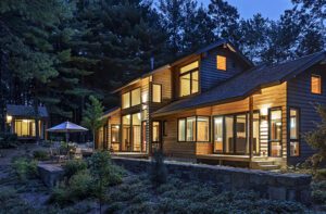
The couple wanted to update the 1908 house without obscuring the period charm that initially attracted them. But first, they had to address the home’s biggest shortcoming: an expansive 2002 addition that didn’t match the rest of the Shingle-style house and was only accessible through a narrow opening in the kitchen. “It was like two houses that had nothing to do with each other,” says Egan.
The architectural designer opened up the wall between the family room and kitchen, creating a pair of passageways that enhanced the flow of traffic between the rooms and made the two parts feel whole. The kitchen was then treated to an eye-soothing assemblage of slate-gray cabinets surrounding a snowy white island capped with matching quartz. In lieu of conventional pulls, the cabinets were fitted with supple leather handles, giving the room the bespoke elegance of a gentleman’s dressing room. “It allows a bit of softness, and it is a little playful,” notes Linder, who was assisted on the project by Joanna McNulty.
While the house was blessed with an abundance of natural wood, the species changed from room to room, lending a sense of dissonance to the interiors. “The living room was oak, the dining room was mahogany, and the family room was cherry with maple floors,” notes Egan. “It sounds great, but when you got in it, it was just overwhelming. So we did something that everyone told us you can’t do. We painted it.”
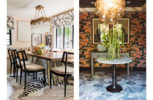
The living room’s muscular beams and trim were treated with a soothing gray-green stain that softens the wood’s appearance but allows the original grain to show through. Pale gray paint brightens the family room, while the dining room woodwork got a coat of dark charcoal and was paired with grasscloth in a similar hue, shrouding the room in a veil of dusky drama.
Painting the wood was a scary move, the owner concedes. “It kind of freaked us out,” he says. “But I’m glad they made us do it. I think the neutral colors make everything more contemporary, but make it feel homey, too.”
Abetting that perception are the furnishings: a largely modern mix that mitigates the home’s historicism, so it doesn’t feel as imposing, and introduces a levity that counteracts the cool color palette. The blend also helps bridge the original 1908 spaces with the more contemporary addition, so the two flow together better.
Furnishings from the couple’s two prior homes fit easily into the Newton house, except in the living room, whose yawning proportions demanded a suitably Brobdingnagian sense of scale. A curvaceous twelve-foot sofa anchors one side of the room, while the other side finds a velvet sofa sidling up to a pair of contemporary wing chairs framed in transparent acrylic. “It’s a playful nod to what may have been in this room originally,” says Linder. A sisal rug—so large it took eight men to carry it inside—unites the two seating groups, which flank a colossal ottoman planted in front of the stone-encrusted fireplace.
When the men bought the house, the architectural embellishments adorning the first floor were completely absent from the floor above. “The rooms were very plain,” recalls Egan. “They had no detail whatsoever. It almost made it feel like a hotel.”
To rectify the situation, he whittled down the five bedrooms to three (the owners have since had a second daughter) and gave each a private bath and a cozy sleeping niche. “We wanted each room to have its own personality,” says Linder, who covered the master bedroom’s niche with a wallcovering so lacy it makes you feel like you’re sleeping inside a doily.
Confining those structural changes to the second floor proved challenging for contractor Joe Holland. “We were gutting the second floor and updating that, but we had to preserve a good portion of the first floor,” he explains. “That’s always difficult, because you don’t want to do any damage.”
One thing that didn’t require much change was the garden, which was designed for the previous occupants by landscape architect Gregory Lombardi. “There are lots of hydrangeas and peonies, and every New England perennial you can imagine,” says the homeowner. “Even in winter, with all the holly and pine trees, we cut stuff and bring it in.”
In moving from the city to the suburbs, the couple traded weekends in Provincetown for play dates and plant sales. But when they see their little girls cavorting in their pink and lavender bedrooms or bounding past beds of billowing white hydrangeas, there’s no doubt they made the right decision.
Project Team
Architectural designer: Thomas Henry Egan III, Evolve Residential
Interior design: Josh Linder, Evolve Residential
Builder: Joe Holland, Holland Construction
Landscape design: Gregory Lombardi, Gregory Lombardi Design
Share
![NEH-Logo_Black[1] NEH-Logo_Black[1]](https://b2915716.smushcdn.com/2915716/wp-content/uploads/2022/08/NEH-Logo_Black1-300x162.jpg?lossy=1&strip=1&webp=1)







You must be logged in to post a comment.