A Suburban Estate with French Influence
April 24, 2024
A couple and their design team breathe new life into a storied estate.
Text by Fred Albert Photography by Tamara Flanagan
The suburban Boston estate had seen better days. An Italianate mansion that once dominated the site was long gone, replaced by a 1950s ranch house. The formal gardens designed by the Olmsted Brothers nearly a century earlier were in a state of ruin. But for the man who grew up next door, the place still held a magical allure.
Learning the property was for sale, the gentleman and his wife purchased it twenty-five years ago, hoping to replace the ranch with a new house befitting the estate’s storied past. But that would have to wait until the couple’s finances caught up with their dreams.
In need of space after the arrival of their fourth child, the pair augmented the shingled ranch with two stucco wings designed in the French country style they envisioned for their future home. The marriage of Pasadena and Provence was not an auspicious one. “It was very funny looking,” concedes architectural designer Todd Paratore (formerly of TJP Design Group, now with Vance Stein Architecture|Interiors), who assisted architect John Margolis on the design. Seventeen years after moving in, the family demolished the ranch and started building a new two-story house designed by Paratore, which builder David Malmquist skillfully merged with the existing wings.
Blessed with creamy stucco walls, stout masonry trim, and ebony French doors that open to the front and rear gardens, the new home’s glamorous visage carries through to the interior, where paneled walls and passageways conspire with French oak floors and generous expanses of stone to give the house a venerable old-world appearance. “The clients wanted the house to feel like it was always there,” says Paratore. At the same time, he adds, “they didn’t want the house to be grandiose.”
The wife concurs. “We wanted it to fit our style of living, which is very casual,” she says.
To help bridge the formality of the architecture and the family’s easygoing lifestyle, interior designer Nina Seed stuck to a serene, neutral palette that was light on pattern but not visual interest. “Layering and texture is everything in these neutral spaces—it’s not about the color and patina,” says Seed, who managed the assignment using the couple’s existing furnishings.
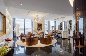
Color does come into play in some secondary spaces, as well as the library, whose dusty green walls and ceiling offer cozy contrast to the airy living room next door. An understated archway is all that separates the latter from the kitchen, which pairs cool painted cabinets with warm paneled oak and forgoes upper cabinets for open shelves to keep dishes and cookware in easy reach. A second island doubles as a serving station for the window-wrapped breakfast bay, which surrounds diners in greenery and views of the garden relics out back.
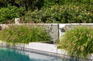
“We tried to take our cues from the landscape elements that were left,” says the wife, who tasked landscape architect Dan Gordon with knitting the new house into the old gardens. Emerald shrubs and groundcovers (bereft of all but white flowers) embrace the front auto court, where guests arrive after ascending a long sweeping driveway. “When you drive up there now,” Malmquist muses, “you think the house has been there for quite a long time.”
Project Team
Architectural design: TJP Design Group
Interior design: Nina Seed Interiors
Builder: Malmquist Builders
Landscape design: Dan Gordon Landscape Architects
Share
![NEH-Logo_Black[1] NEH-Logo_Black[1]](https://b2915716.smushcdn.com/2915716/wp-content/uploads/2022/08/NEH-Logo_Black1-300x162.jpg?lossy=1&strip=1&webp=1)



You must be logged in to post a comment.