A Stately Swampscott Renovation
April 15, 2020
Sponsored Content
Text by Maria LaPiana Photography by Michael J. Lee
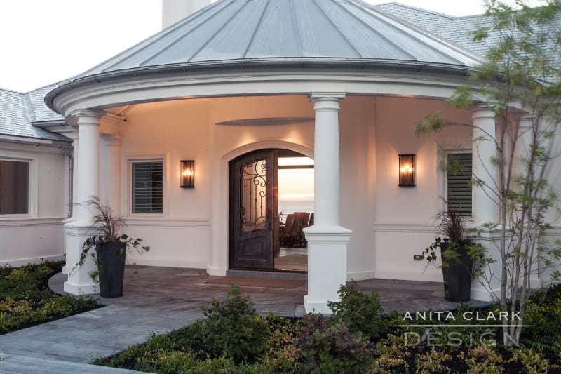
The front door of a Swampscott home renovated by Anita Clark Design.
It’s not overstating it to say that recent events have forever changed the way we view and experience our homes. Living in close quarters will do that to you. Suddenly we’re rethinking everything—from the way we use common rooms to the functionality of our pantries. We’re putting nooks and crannies to work, and we have a renewed appreciation for the world outside our walls.
This is the kind of mindset that informed a gut renovation of a large, formal home in Swampscott a few years back. In many ways, it was a classic before-and-after story; but more than that, it was an opportunity to see an older home through a modern lens. It was an opportunity designer Anita Clark embraced.
“The 40-year-old home had timeless character and an understated elegance,” says Clark, whose firm is based on Boston’s North Shore. “Its location on a point with spectacular ocean views made it impossible to resist. It was state of the art for its time, but it hadn’t aged well,” she says. Her clients wanted a home “large enough to accommodate family gatherings, but intimate enough for two people.” Her charge was to take a house that was grand back in the day—and make it over for the way its homeowners live today.
First up: enhancing the views. The house sits on a rolling acre at the ocean’s edge, some fifteen miles up the coast from Boston. The property has unsurpassed views of the Atlantic Ocean from Marblehead to the South Shore of Boston. So for starters, a tall, narrow, multi-pane bay window wall was replaced with wider panes to better frame those views. It was important, says Clark, that “light and its reflection on the water play an integral part in the design.”
GOOD BONES MADE BETTER
The home was sturdy and well constructed, but preservation measures were in order—especially on the exterior. To better withstand the salt air and harsh ocean climate, the brick structure was covered with a durable stucco material, and the wood trim replaced with an Azek composite product. The new windows were rated to resist serious Nor’easters, and heat loss was mitigated with glazing and multiple electronic sunscreen shades.
The 9,000-square-foot Swampscott renovation has four bedrooms, including two suites, and seven bathrooms, but its layout was designed for a more formal household, one characteristic of large estates at the time. A dark vestibule led to a spacious foyer, both of which were impractical. In a sweeping move, all of the first-floor full-height walls were taken down to create an open plan.
“When you enter the home, you immediately see a panoramic view of the interior and exterior views,” says Clark. “It is breathtaking.”
LET THERE BE LIGHT
“I knew there was nothing I could do to compete with what was on the outside,” says the designer. “It was clear we needed a quiet and elegant interior to complement the magnificent views.”
So dark, heavy rooms gave way to an overall sense of lightness in this Swampscott renovation. The palette was inspired by the ocean, the surrounding rocks and sandy beaches. The distressed hardwood floors were finished in a hue reminiscent of the ocean floor. The walls are all done in muted shades of taupe, a perfect backdrop to the sea of greens and blues used throughout the home in different intensities and values.
NEW CUSTOMS
Fussy ornamentation was exchanged for hand-glazed custom millwork. Because the expansive great room had to be as hardworking as it is beautiful, areas for living, dining, cooking, and working were clearly defined. There’s a built-in that hides a fully functional home office (with files and printers) behind doors. Most of the furnishings are custom—including what the Hickory Chair company describes as the largest sectional sofa they’ve ever made. Throughout the home, furnishings are oriented toward the water to enhance the indoor-outdoor connection.
A study was designed as a retreat and home office for the husband and his dog. “It is a serious room melding comfort, function, and ambience,” says Clark. With its distinctive walnut paneling, it stands out from the rest of the house. A guest suite was created in the space above the existing garage. “It feels like a private, luxury suite you’d expected at a Four Seasons Hotel,” says Clark. “It’s spacious and well-equipped with every amenity, including its own mini-bar.” The graciously appointed master bedroom suite is a true sanctuary, perfect for reading, resting, relaxing by the fire, or taking in those remarkable views.
The oceanfront home is now properly in sync with its owners, says the designer, who credits a satisfying collaboration with the architect, builder, craftspeople, and the clients themselves. Was the deeply personal Swampscott renovation a sign of our current times? In a way, yes, but it’s more like Clark’s way of thinking has unwittingly come into its own: “Finding solutions that fit a client’s lifestyle is just what I do,” she says.
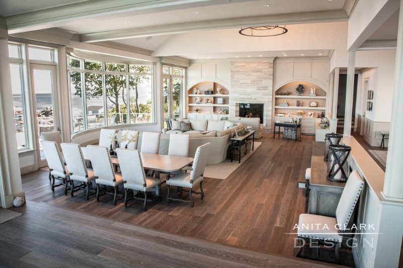
The home’s great room has spaces for dining, gathering, working, and cooking.
Anita Clark Design, Salem, Mass.
Share
![NEH-Logo_Black[1] NEH-Logo_Black[1]](https://b2915716.smushcdn.com/2915716/wp-content/uploads/2022/08/NEH-Logo_Black1-300x162.jpg?lossy=1&strip=1&webp=1)



You must be logged in to post a comment.