A Renovated Vermont Lake House
May 5, 2020
Text by Bob Curley Photography by Jim Westphalen
Walls are typically built to keep people out, or keep things in. In New England, rock walls have been used for centuries to create boundaries around farmers’ fields or property lines, but it’s the rare wall that provides connection rather than separation.
The new owners of a 140-acre property on Lake Champlain in Panton, Vermont, knew they had a unique opportunity to reshape the mixed landscape of woodlands, open fields, and lakeshore to match their vision of a pastoral New England home.
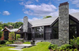
A stone-sided house, dating to the 1920s, was ideally sited for spectacular lake views, but a historic farmhouse along the main road at the property entrance was too distant to serve as a guest house. Working together, builder Birdseye and architectural firm TruexCullins separated the old farmhouse and barn and moved them a quarter-mile deeper into the property, re-siting each close to the lake. The Arnold House—so named because Benedict Arnold once slept within—was renovated as a guest house overlooking Arnold Bay, while a onetime barn was restored as additional guest quarters facing White Bay.
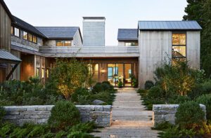
Taking advantage of the spectacular views, however, necessitated placing the guest houses at a remove from the main house. That’s where Wagner Hodgson Landscape Architecture stepped in, designing and building a gracefully arched, 350-foot-long wall and accompanying footpaths to provide a physical and design link between the three distinctive buildings.
“The serpentine stone wall becomes the stitch that links the main house to the other buildings,” says the firm’s Keith Wagner. “The arc of the wall traces the arc of the bay in a symmetrical way off the centerline of the house. How it dances through the trees and links the pool and guest houses is really about the wall taking a walk through the property.”
Most of the interior design and construction took place within the existing footprint of the house. Birdseye combined a warren of smaller rooms into larger spaces: the first floor of the central, stone-walled section of the house became a spacious living room, while a sizable section of the former second floor was removed to create a generous kitchen and a circular stairway leading to the master bedroom.
The owners—avid cooks—“wanted the kitchen to be the most important room in the house,” says TruexCullins architect Rolf Kielman.
Designer Cathy Chapman’s vision for the interior included mismatched kitchen cabinetry for visual interest, a stove placed in an alcove designed to resemble a repurposed fireplace, and sconces and pendants used in place of recessed lighting to help retain a vintage feel. “It’s made to look like an old farmhouse, which it was,” says Chapman.
The one major addition to the house was an elliptical screened-in porch at the rear, warmed by a stone fireplace with comfy all-season chairs arrayed around a table made from wood salvaged from a tree on the property.
Kielman says the key to the project’s success was restraint. “The owners understood that not everything needed to be pumped up,” he says. “The house didn’t need to get a lot bigger.” Instead, the clients and their team wisely adhered to the “less is more” philosophy of New England’s building tradition.
Project Team:
Architecture: Rolf Kielman and Josh Chafe, TruexCullins
Interior design: Cathy Chapman, Chapman Design
Builder: Birdseye
Landscape design: Wagner Hodgson Landscape Architecture
[WPSM_COLORBOX id=73546]
Share
![NEH-Logo_Black[1] NEH-Logo_Black[1]](https://b2915716.smushcdn.com/2915716/wp-content/uploads/2022/08/NEH-Logo_Black1-300x162.jpg?lossy=1&strip=1&webp=1)



You must be logged in to post a comment.