A Modern Masterpiece on Beacon Hill
November 19, 2019
Text by Bob Curley Photography by Jane Messinger


When you buy a home near the most photographed Colonial-era street in Boston, you know your exterior improvements are going to be limited to minimal touches like ensuring that the paint on the wrought-iron balcony railings is touched up and the brass knockers stay polished. Beacon Hill is firmly rooted in the eighteenth-century, and intends to stay that way.
The interior, however, is a different story—six of them, to be precise, in the case of this refurbished townhouse.
When the design team reimagined the interiors for a client seeking a minimalist design and uncluttered spaces, they didn’t begin with half-measures. All six floors were gutted and re-skinned to the extent that nary a trace of the ancient brick remained visible. In their place came whitewashed walls, custom cabinetry precisely milled to appear almost seamless, and trifold window shutters that look traditional from the street but fold neatly into fitted alcoves. “We wanted to give the home the weight of Beacon Hill’s elegance without the fussiness,” explains architect Joseph Kennard.
An exquisitely carved and constructed Danish oak staircase, with a gracefully curved railing custom fitted to the owner’s handspan, stands as a centerpiece. Three-dimensional modeling was used to ensure that the fit and feel of the staircase was perfect. Similar care was taken to make sure that there was no gap wider than an eighth of an inch between cabinet doors and wall panels. “We basically had to start with a perfectly level house,” recalls builder Richard Cantelli—no easy task with a centuries-old home. “It took weeks and months of planning to make sure everything was built right.”
Or, as Kennard wryly puts it: “We had to be incredibly fussy to not look fussy.”
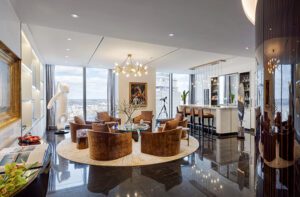
The front door opens to a sparely furnished living room with stone floors that remain cool in summer and are warmed by radiant heat in winter. “The bustle of the city immediately feels a long way away,” the owner says. “It’s deliberately sparse and open, and somewhere easy to sit, eat, drink, and chat.”
In place of a formal dining room is a large John Pawson table of oak and walnut for friends to gather, and a satellite kitchen for serving food and drink (the main kitchen is one level up).
“We followed principles like less is more, keep it simple,” designer Amy McFadden explains. “The palette was kept to neutral tones, mostly grays and white, darker limestone on the lower floors, going lighter with Carrara marble as you go higher up.”
The marble backsplashes in the second-story kitchen stretch to the ceiling, with slabs cut into linear but non-repeating patterns for visual interest. On the fourth floor, an office has custom alcoves and shelves. And on the top floor is the home’s “sanctum sanctorum,” a master suite with a Japanese-inspired spa space that includes a steam room and a Hinoki soaking tub.
Above all, the design is neat and orderly. “I said, ‘I’d like it to be really cold and unwelcoming,’” the owner says. “Joe, Amy, and Rick thought I was joking. And I was—a little. But I wanted them always to remember the goal was decluttered and simple.”
Project Team
Architecture: Joseph Kennard, Kennard Architects
Interior design: Amy McFadden, Amy McFadden Interior Design
Builder: Richard Cantelli, C-Concept
[WPSM_COLORBOX id=73546]
Share


You must be logged in to post a comment.