A Modern Classic on Nantucket
May 9, 2019
Text by Debra Judge Silber Photography by Michael Partenio Produced by Stacy Kunstel
Built in the glory days of New England’s whaling industry, the house is postcard Nantucket. Its shingles are weathered gray, its divided-light windows are regimentally spaced, and a center chimney pokes from the roof. Nearly three centuries after it was built, it’s conceivable that Barnabas Gardner, the long-ago occupant for whom the house is named, might still recognize it.
On the outside, at least.
It was the definitive charm of the circa-1730 home that enticed its current owners, a husband and wife from the suburbs of Boston, to purchase it in 2015. They’d always wanted an island getaway, and Gardner’s homestead measured up both in location and antique appeal.
“They love Nantucket and spend a lot of time there,” says Mystic, Connecticut-based Maureen Griffin Balsbaugh, who has been the couple’s go-to interior designer for more than a decade. “They were particularly interested in the historical value of the house, and they loved where it is, that they could walk to town.”
There was, however, a significant challenge. The placid symmetry of the home’s facade concealed an interior which, while updated, still suffered from the complications inherent in antique houses. Ceilings were oppressively low, and floors replaced over many decades were mismatched. Small openings between rooms reduced the first floor to a series of unrelated boxes. Just inside the front door, a narrow stair twisted upward to a maze of interconnected rooms on the second floor. “Nothing made sense up there,” says Balsbaugh. “You had to walk through a closet to get to the next room.”
“My first impression was, wow, what are we going to do with this?” says contractor Robert Alves, recalling his initial glimpse of the home’s interior. Like Balsbaugh, the owner of Leicester, Massachusetts-based Premier Contracting is a longtime collaborator with the clients and has worked with them on several investment properties.
After consulting with Balsbaugh and the homeowners, Alves set about disassembling the inside of the house, taking it down to its pegged post-and-beam frame. The team had only the vaguest of plans, but as they watched the walls disappear, the new layout fell into place. “Once we got everything out, we could see the big picture,” Alves says.
Deteriorated plaster walls and ceilings were removed and judiciously rebuilt to create an open, breathable interior. Narrow openings were widened, their sidewalls accentuated with the same Belgian oak planks used to unify the floors. First-floor ceilings were stripped out to gain precious headroom and celebrate the structure that had been hidden by plaster. The attic was removed as well, boosting the vertical volume of the dining room and adding much needed height to the second-floor bedrooms, all of which were remodeled with en suite baths.
In what was perhaps the most dramatic move, after removing the ceiling above the dining room, the homeowners and their design pros decided to leave only the centuries-old beams that once supported the second floor. They traverse the dining area, ending as support for a balcony-like walkway that runs past the second-floor bedrooms. Ringing the walkway is a railing made of glass panels on metal mounts—counter-colonial elements that are reprised in the rods and globes of two chandeliers that dangle in the air nearby. “I wanted something airy and modern, that would work with the glass and metal railing system,” Balsbaugh says. “I loved the connectiveness.”
The approach may seem radical, but stripping the interior of the house served to expose the home’s authentic structure, which then became a stylistic bridge between its colonial origins and the Danish-modern aesthetic that Balsbaugh and her client envisioned for the interior. “We were both sort of infatuated with Piet Boon at the time,” Balsbaugh explains. It’s not surprising then, that the Amsterdam-based designer’s pieces crop up through the house, and his Northern European sensibility is reflected in the delicate balance of black accents and white walls, rough-hewn lumber and contemporary furniture. It adds up to a casual, beachy vibe that seems remarkably at home in the historic island house.
For the wife, celebrating the structure’s surviving colonial details was key. “That’s why we fell for this home,” she says. “It had the low ceiling beams, it had all the original fireplaces. We wanted to keep that integrity; we just wanted to modernize it.”
The home’s five brick fireplaces remain woodburning and retain their colonial proportions—which, in the case of the one in the dining room, includes a bread oven. But they’ve been updated with a facing of matte black granite that transports them instantly into the twenty-first century.
For an antidote to the 1970s-era kitchen, Balsbaugh called on SieMatic of Boston. The room was rearranged and re-plumbed and brought into the present with a marble backsplash, lacquered cabinets capped with slender white quartz, and an island with a three-inch-thick oak breakfast bar.
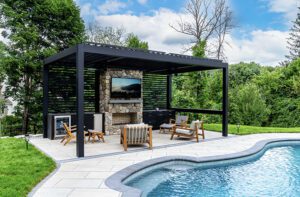
Alterations to other parts of the 4,900-square-foot house were less dramatic, but no less necessary. A spacious walk-out basement was converted into two bedrooms, a family room, and a full bath. Plumbing, electrical, heating, and cooling systems were replaced throughout. An ell at the rear of the original house was also updated, and a pool, pool house, and garage were added.
The street-facing side, meanwhile, was refreshed in accordance with the dictates of local historical authorities: existing twelve-over-twelve windows were repaired and protected with all-but-invisible storms, and new wood siding and shingles were installed and left to age gracefully. Boxed lanterns and pilasters adorn the front door, offering no hint of the surprise that awaits just over the threshold.
“You walk through the door and it just feels good,” says Balsbaugh in an effort to explain the pleasing balance between the home’s antiquity and its newfound modernity. Her client, too, attributes the success of the design to the emotions it inspires, rather than the time or place it might be thought to represent. “I feel like it’s a very calm house, a very minimalist house,” she says. “For me, it’s like serenity. I just love everything about it.”
Project Team
Interior design: Maureen Griffin Balsbaugh, Griffin Balsbaugh Interiors
Builder: Robert Alves, Premier Contracting
Share
![NEH-Logo_Black[1] NEH-Logo_Black[1]](https://b2915716.smushcdn.com/2915716/wp-content/uploads/2022/08/NEH-Logo_Black1-300x162.jpg?lossy=1&strip=1&webp=1)







You must be logged in to post a comment.