A Historic Home in Brookline Gets a Fresh Update
November 29, 2018
A renovation plays up the graceful architectural details of an old Boston-area house and introduces a fresh, contemporary vibe to the interiors.
Text by Fred Albert Photography by Eric Piasecki/OTTO

Expectations weren’t high the day a Brookline, Massachusetts, couple went to visit a home for sale on the other side of town. The pair had been house-hunting for nearly five years with no success, and the place they were about to see—a grand old relic, now faded with time—had languished on the market almost as long. If the couple didn’t like the place, their real estate agent assured them, they could always demolish it and start over.
Any thoughts of demolition vanished the moment they stepped inside. “There’s no way we would ever knock this house down!” the wife exclaims. “It had these incredible bones. It had incredible personality. We couldn’t have destroyed all that beauty and handiwork and artistry.”
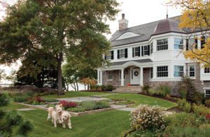
Built in 1911 on a generous parcel overlooking a reservoir and the city skyline, the colonial-revival manse had clearly seen better days. But the broad stucco exterior and spacious, elegant rooms were well-designed and retained much of their original detailing, despite some updates to the 10,625-square-foot interior. The sense of bygone graciousness spoke to the civic-minded buyers, who enjoy hosting charitable events as well as casual gatherings with friends. “It was really as perfect a house as we could have imagined for ourselves and our family,” says the wife.
The couple enlisted architect Treff LaFleche and contractor Charles Gadbois to bring new life to this aging artifact. But before they could add any architectural flourishes, the house was taken down to the studs and fitted with new plumbing and electric, insulation, double-pane replacement windows, and roof. Most of the exterior was treated to a fresh coat of stucco, and long-absent shutters were introduced once again, adding depth and interest to the facade—which now included a new attached garage.
“We weren’t making an old house look brand new,” explains Gadbois. “We were making a period home look updated and crisp.”
Interior detailing that couldn’t be saved was carefully reproduced, instilling a sense of grandeur that interior designer Nina Farmer tried to honor—but not imitate. “The house is imposing in its architecture, so I was trying to bring that down a notch,” she explains. Farmer mixed periods and styles throughout, adding healthy doses of art deco and midcentury modern furnishings to the expected ration of traditional and antique pieces. Since the owners have two young children, upholstery fabrics were treated with stain protectant and coffee tables were customized with upholstered tops to encourage leisurely sprawling. “We didn’t want anything seriously formal, because we knew we wouldn’t use it,” says the wife.
The eclecticism not only enhances the home’s comfort, but makes it look like the furnishings were assembled over time. That comes through most emphatically in the living room, where a tufted roll-arm sofa is paired with streamlined art deco chairs and a modern stacking coffee table festooned with rivets. Contemporary light fixtures illuminate the assemblage, which includes a grand piano that was a wedding gift to the wife’s great-grandparents.
The dining room, which sat at the rear of the house, was moved to the front, alongside the other formal spaces. “I wanted the detailing of that room to rise to the level that the reception hall and living room had,” says LaFleche, who collaborated on the project with colleagues Dean Hofelich and Thomas Jonak. The team rejected colonial flourishes in favor of a geometric design that riffs on traditional coffered ceilings, but was crafted from layers of wood, for a solution that proved both elegant and economical.
While Farmer pondered what kind of chandelier to hang from that ceiling, her clients took her to a Boston Symphony Orchestra concert. During the performance, she admired the fixtures hanging in Symphony Hall, and had the Urban Electric Co. make a small-scale version inspired by the McKim, Mead and White originals. The chandelier illuminates the upholstered silk walls, custom table, and the couple’s old dining chairs, which Farmer revived with brown velvet seats and retro bargello-patterned backs.
Like most residences of the period, the house was oriented to the street and lacked adequate kitchen or family space. LaFleche seized the opportunity to introduce these rooms at the rear of the house with an addition that opened the interior to the backyard, light, and views. The new rooms are wrapped in ribbons of horizontal glass, making it clear that they are contemporary interventions. “We’re not being a slave to the original house; we’re bringing our own interpretation,” the architect says. “But it’s done in a way that respects the elegance and formality of the front.”
The spacious new kitchen includes an eight-burner Lacanche range, which the husband commands with consummate skill while family and friends watch from the twelve-foot island or expansive breakfast nook—sized to accommodate guests. Serviceberry branches fill the adjacent windows, entertaining diners with flitting birds and frolicking squirrels.
The same horizontal windows surround the old sunporch, enfolding the room in a pastoral panorama that makes you forget you’re only a few miles from downtown Boston. “You get that thrill of being both outside and inside simultaneously,” notes LaFleche, who added a radiant-heated floor to fend off winter chills. The husband uses the space as an office, but it doubles as a family retreat, augmenting the family room that was added alongside the kitchen.
The garden got a new lease on life thanks to landscape architect Matthew Cunningham, who cast aside formal conventions to create a contemporary garden teeming with native plants. “We were trying to work with materials that will be habitat-friendly and more durable than the materials you might typically find on an estate like this,” says Cunningham, who was assisted on the project by Jen Stephens.
Since the family is often away in the summer, the landscape architect eschewed billowing flower beds in favor of shrubs that showcase their color in spring and fall. A procession of white magnolia trees bisects the front lawn, buffering the home from the street and lending a sense of scale to the facade. “A fence wouldn’t have been right,” Cunningham says. “It was all about opening it up and making it feel stately.”
With its blend of Old World grandeur and up-to-date appointments, the renovated home offers its owners the best of yesterday and today—and the satisfaction of knowing they’ve preserved a gracious relic for generations to come.
Project Team
Architecture: LDa Architecture & Interiors
Interior design: Nina Famer, Nina Farmer Interiors
Builder: Charles Gadbois, Wellen Construction
Landscape design: Matthew Cunningham, Matthew Cunningham Landscape Design
Share
![NEH-Logo_Black[1] NEH-Logo_Black[1]](https://b2915716.smushcdn.com/2915716/wp-content/uploads/2022/08/NEH-Logo_Black1-300x162.jpg?lossy=1&strip=1&webp=1)


You must be logged in to post a comment.