A Classic Cape-Style Home Reimagined
January 2, 2018
A few structural fixes and a stylish makeover entice a couple to fall in love with their house—again.
Text by Debra Judge Silber Photography by Michael J. Lee Produced by Karin Lidbeck Brent
John and his wife, Annmarie, had been searching for a new home for months. Having given up on finding a lot on which to build, John found himself in Boxford, Massachusetts, standing at the door of yet another colonial, yet another house that just didn’t match his idea of a home.
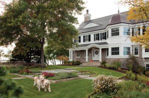
Then he turned and saw the house across the cul-de-sac. The expanded Cape-style home was just what he and Annemarie had been looking for. It wasn’t for sale, but when his agent approached its empty-nester owners, they agreed to let John have a look inside. “I opened the door and said, ‘I’ll take it,’ ” John remembers. The traditional style and the bright, unpretentious interior spoke to him immediately. And it said, “home.”
A dozen years and three children later, the couple still loved their house. But it hardly looked different from when they had first moved in. The furniture felt uninspired. The red and gold color scheme they favored had begun to look dull and repetitive. “They were stuck,” explains designer Jenn Sanborn. “Sometimes when you don’t know where to start, you don’t do anything.”
Like her clients, Sanborn appreciated the home’s positive features. But as someone whose ability to pick up on architecture gone wrong borders on a sixth sense, she knew the house needed more than a coat of paint here or a potted plant there. “It was a well-built house and it had very good bones, but there were things that absolutely did not work,” she says.
Architectural missteps included an oddly angled wall in the dining room and a host of troubles in the great room, among them a partially vaulted ceiling that clashed with the room’s graceful Serlian window. Smoothing out these architectural glitches would be the first step in making those rooms more inviting. But the rest of the rooms needed attention as well. To bring them alive, Sanborn would apply “layers”—wallcovering and paint, carpeting, millwork, artwork, furniture, window treatments, accessories, lights—with each stratum contributing to the beauty and comfort of the room.
Finding the right furniture pieces, materials, and fabrics to layer involves both consultation with the client, and a bit of convincing to be open-minded. “Part of it is trying to decipher what makes your clients tick,” Sanborn says. “John’s a good dresser, so I incorporated aspects of menswear as an homage to that,” including herringbone and plaid patterns that appear in stonework, rugs, and upholstery throughout the house. Combining this aesthetic with her clients’ reverence for antiques, Sanborn nurtured an English Country style that speaks subtly through the fabrics, patterns, and vintage pieces she sourced based on the couple’s tastes.
At the same time, she upended the home’s traditionalism with creative approaches that sent predictability packing. In the dining room, the couple’s mahogany table and matching shield-back chairs were elegant, but all too familiar. Sanborn had the chairs stripped, painted light gray, and reupholstered, creating a contrast that emphasizes the table’s detailing. She placed them all atop a wool-and-jute rug. “It gives the room a crisper, fresher feel, even though it’s still formal,” she says.
For the kitchen, Sanborn designed a unique island that embeds a Wolf cooktop in a quartz countertop. Bold blue drawers and pullouts feature locally fabricated stainless-steel strapping and bronze corners. Both the island and a freestanding pantry cabinet, designed by Sanborn to look like an old-fashioned icebox, were crafted by the carpentry team from Platt Builders. Details include authentic icebox hardware and chamfered edges characteristic of British wall paneling. Inside, it’s all business, with shelves and door racks supplying ample room for food and small appliance storage.
Inspired functionality also reigns in the mudroom, where Sanborn replaced the multiple closets with lockers for each family member and a built-in grab-and-go/stop-and-drop space that includes a bench seat and storage drawers along with a wine cooler and refrigerator and freezer drawers.
Functionality—with a stroke of fun—also rescued the living room. In place of two lonely wingchairs, Sanborn introduced an antique pool table, outfitted the bay window as a cushioned bench seat, and cloaked it all in tones of gray and purple. The wall colors weave together in a tartan rug.
The designer’s ingenuity left an even more striking mark in the home’s not-so-great great room. Beyond bland, the space suffered from a number of architectural indignities. The angle of the vaulted ceiling felt wrong, and even more disturbing was a double French door cast as a window halfway up the interior wall. The fireplace was set awkwardly to one side, and was undersized, forcing it into a losing battle with the TV for focal-point dominance. The main sofa, placed against the far wall, was disengaged from both. “It didn’t work on so many levels,” Sanborn says. “It was a great room that was anything but great.”
She introduced both style and balance by incorporating the fireplace and the TV in a paneled wall that maximizes the former and helps the latter disappear. A limestone surround in a herringbone pattern gives the fireplace new stature amid the gray panels that wrap three walls of the room, including the one where the door-in-the-wall was replaced with an elegant half-moon window.
Platt Builders reworked the awkward ceiling into a sleek barrel vault, using prefabricated oak ribs sourced specifically for this project. “It was Jenn’s vision, and then it took a team effort to bring it into focus,” says project manager Lawrence Howell. The barrel shape required a soffit on the wall opposite the fireplace that improved the balance in the room and also allowed Sanborn to nudge the faraway sofa a few inches closer to the action. A comfortable checkered Chesterfield and a rug in glen plaid tie it all together.
John remembers when the family returned from vacation to see the finished home. His reaction was the same as it had been the day he first spied the house, only better: “It was unbelievably beautiful, but it was homey. It felt like it was ours.”
Interior design: Jenn Sanborn, Sacris Design
Builder: Platt Builders
Share
![NEH-Logo_Black[1] NEH-Logo_Black[1]](https://b2915716.smushcdn.com/2915716/wp-content/uploads/2022/08/NEH-Logo_Black1-300x162.jpg?lossy=1&strip=1&webp=1)




You must be logged in to post a comment.