A Bold Move
November 20, 2018
A dad with a sense of adventure and a designer unafraid to make a splash team up on a Boston condo that even the kids think is pretty cool.
Text by Debra Judge Silber Photography by Michael J. Lee Produced by Kyle Hoepner
“You’ve got to break a lot of eggs to make an omelet” isn’t something you hear a lot in conversations about interior design. But it seems oddly fitting when Dee Elms’s client uses it to describe the creative collaboration that transformed a bland Back Bay apartment into a boldly beautiful home that reflects him—and his family—to a T.
Cracking the mold wasn’t necessarily the aim when the recently divorced dad purchased the single-floor unit overlooking the Charles River. His goal was a comfortable, stylish, but not stuffy home base for himself and his three teenage children, two of whom would be living with him. “I didn’t want it to be a traditional ‘Boston’ place,” he explains. “I didn’t want it to be boring.”
“He said, ‘I want a place that’s super comfortable, that I love, and that’s cool enough that my kids’ friends will want to visit,’ ” recalls Elms. She had met the client previously in consultation on another project, and he asked her to walk through the 2,800-square-foot condominium before he purchased it. She remembers its rooms as blandly traditional, monochromatic, with tray ceilings and pilastered fireplaces. “It was white, white, white, and white,” Elms says. Still, she told her client, “This could be amazing.”
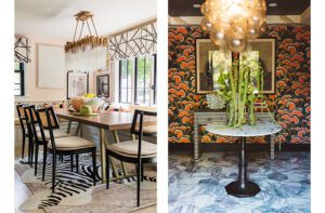
That Elms succeeded in her prediction is clear the moment one steps off the elevator into the entry hall, where the fluid brushstrokes of hand-painted Porter Teleo wallpaper draw immediate attention to the nearby dining room. A playful chandelier from Apparatus Studio hovers like a fistful of balloons over the dining table, around which chartreuse velvet dining chairs pop against the graphic backdrop. “I wanted it to make a splash,” Elms says. “The dining room became a kind of statement that we’re not too serious in this home. We’re having fun.”
Having fun with the design process seemed a natural consequence of the designer-client relationship, which both say was marked by a lively give-and-take that balanced the homeowner’s ideas and expectations with the designer’s experience. “We’d have these debates on what would work,” the client says, referring to conversations with Elms and project manager Carolyn Kotowski. “I think I surprised them with the things I was willing to do, and they surprised me with the things they came up with.”
Elms concurs. “We’d talk about what he liked and what he didn’t like. I knew he had a cool, hip vibe and we could play that up. But I also had to understand how far he would go.”
This was tested in the dining room, where Elms’s choice of the chandelier led to a slew of agonizing phone calls. “I kept thinking, this will look ridiculous,” he says, “and then it goes up and . . . she was right.”
Other conversations were easier, such as the one about the kitchen, where Elms proposed painting the existing cabinets. “I said, ‘I want to paint your cabinets black,’ ” she says. “And he was like, ‘I’m cool with that.’ “
Nor did he flinch when she suggested carrying the black into the wall treatment. “He just had so much trust,” Elms says. Threaded with silver, the paper actually appears much lighter than one would expect.
“It was really a great marriage of client to designer and designer to contractor, with outstanding results,” says Chris Rapczynski, president of Sleeping Dog Properties, which managed the construction. He praises Elms’s ability to communicate as well as her understanding of the choices required to achieve high-end results. “In the end, what you see is a glossy paint finish that looks great,” he says, pointing to the shine on the living-room woodwork. “But beneath that is so many layers of decision-making. Those are the discussions we have with Dee.”
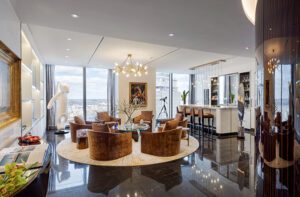
The high-gloss shine Rapczynski refers to belongs to a storage wall Elms designed for the living room that pumps up the room’s sophistication while providing closet space for the client’s son when he visits. She also ditched the formal fireplace, putting in its place a gas unit trimmed with riveted brass and framed in marble. On the opposite end of the entry hall, the fireplace in the family room got a modern makeover as well. In both rooms, Elms had deep window seats built into the curve of the existing bay windows. “He loved that idea,” she says of her client. “It’s another place for people to crash.”
Crashing—or let’s say recumbent relaxation—is further encouraged by the family room’s cushiony sectional. “All three of my kids said, can we please get a couch we can all sit on?” the homeowner says. “It was the very first piece we picked out.”
Throughout the project, Elms consulted with the children, the daughters particularly, to make sure the space would reflect their tastes as much as their father’s. Despite this, the client says, some people describe the home as “masculine.” But he’s fine with that. “If it comes off masculine, I’d say, mission accomplished.” He also adds, “When my daughters’ friends come over, they absolutely love the place.”
Elms has her own take. “I would never call it overly masculine,” she says. “If you’re in a dude zone, you’re not going to be using pale lavender drapery fabric. I think we balanced him, his kids, and his life really well.”
Even, it turns out, when her client returned from a trip to New Orleans with a new purchase: a large painting by artist Ashley Longshore depicting an oversize hundred-dollar bill stamped with the words: Grow a Pair. “I have to be honest. I hoped it wasn’t going in the dining room,” Elms says.
Their compromise (which the client good-naturedly describes as a four-to-one vote) landed the artwork in the master bedroom’s walk-in closet, where it stands out against the flannel pinstriped wallpaper.
“It fits perfectly there,” Elms says. And, she adds. “It’s so him.”
Project Team
Interior design: Dee Elms, Elms Interior Design
Builder: Chris Rapczynski, Sleeping Dog Properties
Share
![NEH-Logo_Black[1] NEH-Logo_Black[1]](https://b2915716.smushcdn.com/2915716/wp-content/uploads/2022/08/NEH-Logo_Black1-300x162.jpg?lossy=1&strip=1&webp=1)




You must be logged in to post a comment.