Bathing Beauties
November 29, 2020
Text by Jaci Conry
Deco-Inspired Delight
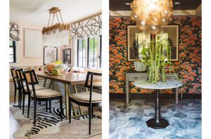
Initially, a large tub dominated this bathroom. “It was a big room that felt small because of the giant, very dated tub in the middle. The colors were muted and blah,” says interior designer Elizabeth Georgantas, who transformed the space by removing the tub and existing shower in favor of an ample curved-glass walk-in one. “The glass almost makes the shower disappear,” says Georgantas. “All you really notice is the design of the space.” Glass tile with a blue latex backing sheaths the shower walls, and the graphic New Ravenna mosaic black-and-white marble on the floors has an art deco feel.
To tie the room together, Georgantas opted for black lacquer paint on the moldings and window trim.
Interior Design: Georgantas Design + Development
Builder: KVC Builders
Photography: Michael J. Lee
Outdoor Integration
A choppy layout configured into separate areas for the shower and vanity made this bathroom feel small and dark. Interior designer Jeanne Racioppi wanted to optimize the room’s access to natural light and views of the rustic setting, so she opened up the layout and installed a freestanding tub with a custom marble surround under the windows. “The client wanted a relaxing retreat,” says Racioppi. “I went with a classic old Hollywood glam feel, mixed with a desire to bring the outside in.” The floor tile is a blend of honed and polished Thassos marble and looks “broken like you’d see in an old garden,” says Racioppi. The expansive new curb-less shower features walls with a leaf mosaic tile inset, and Rohl satin gold fixtures feel timeless and luxurious. A striking light fixture made of ceramic flowers by Corbett Lighting enhances the outdoor theme.
Interior design: Jeanne Racioppi Designs
Photography: Michael J. Lee
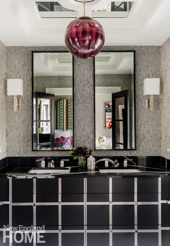
London-based brand Justin Van Breda created the black-and-stainless-steel vanity. “In person, it’s truly spectacular,” says Liz Caan.
Five-Star Style
This main bathroom belongs to a homeowner who loves staying in Firmdale Hotels, says interior designer Liz Caan, noting that part of her goal was to recreate the vibe at one of the boutique brand’s locations in New York or London. “We wanted a dressy bathroom that felt luxurious and not overly sterile, one that felt residential but also experiential like a hotel room can,” says Caan. The designer used Calacatta marble tile in a hexagon pattern for the floors. The same material in an oversized format shows up on the shower walls, lending a slab-like effect and allowing the beautiful veining to steal the show. The original ceiling had detailing that needed repair, so Caan redesigned it slightly and reframed it with a mirror inset. Now it serves as a great canopy for a beautiful amethyst Murano glass pendant that emanates a rose-hued glow. “We felt it was the icing on the cake,” says Caan.
Interior design: Liz Caan & Co.
Builder: Cordis Management
Photography: Michael J. Lee
Palette Pleaser
Accessed by a sliding pocket door that usually stays open, the new bathroom cried out for a pop of color. “It’s visible from a guest room and an office, which are very neutral-toned spaces,” says interior designer Cecilia Casagrande. “The homeowner can see the pop of beautiful green from her desk.” The room is all about the cement hexagon floor tile, which hails from Clé in San Rafael, California. “The tile is art for the room,” says Casagrande, who selected a matching shade of green for the wall. In the shower, yellow penny tile adds a little extra splash. Above the Duravit vanity, the mirror is from Schoolhouse.
Interior Design: Cecilia Casagrande Interiors
Architecture: Noury-Ello Architects
Photography: Sean Litchfield
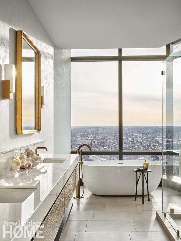
To avoid competing with the captivating view of the city, the designers paired natural finishes with neutral hues and added gilded flourishes for a subtle wow factor.
Room with a View
This entire home is devoted to maximizing the utterly unrivaled views of the city skyline, and the main bathroom is no exception. When the homeowners purchased the Millennium Tower residence, they tapped Marcus Gleysteen to reconfigure several spaces to suit their taste; Brookes + Hill Custom Builders handled all aspects of construction. While the footprint of the main bathroom remained intact, the space was gutted. Kochman Reidt + Haigh designed and fabricated an elongated marble-topped vanity, and added brass and gold finishes and fixtures to enhance the room’s elegance. Brookes + Hill installed radiant floors and motorized integrated shades on the floor-to-ceiling windows in front of the deep soaking tub.
Architecture: Marcus Gleysteen Architects
Builder: Brookes + Hill Custom Builders
Cabinetry: Kochman Reidt + Haigh Cabinetmakers
Photography: Douglas Friedman
Seeing Blue
To revive and add interest to this dated bathroom, interior designer Vivian Robins called for board-and-batten siding on the walls and an infusion of the color blue. By removing the bathtub, there was space to add a walk-in shower with walls clad in penny-round tiles inspired by Japanese brush painting and glass subway tile in pacific blue. The designer created three functional areas within the room, including dressing space. She swapped shiny brass hardware for powder-blue glass drawer and cabinet pulls that connect to the hues of the shower tile. “The room now has an aesthetic that is classic and timeless with a twist of
modern,” says Robins.
Interior design: Vivian Robins Design
Builder: Shestok Bros.
Cabinetry: Metropolitan Cabinets and Countertops
Photography: Sabrina Cole Quinn
Share
![NEH-Logo_Black[1] NEH-Logo_Black[1]](https://b2915716.smushcdn.com/2915716/wp-content/uploads/2022/08/NEH-Logo_Black1-300x162.jpg?lossy=1&strip=1&webp=1)





You must be logged in to post a comment.